基本布局理解
如果你已经学习过本模块,那么你将已经了解了当前进行 CSS 布局以及使用旧版 CSS 所需了解的基础知识。此任务将通过使用各种技术开发简单的网页布局来测试你的一些知识。
¥If you have worked through this module then you will have already covered the basics of what you need to know to do CSS layout today, and to work with older CSS as well. This task will test some of your knowledge by the way of developing a simple webpage layout using a variety of techniques.
| 先决条件: | 在尝试进行此评估之前,你应该已经阅读了本模块中的所有文章。 |
|---|---|
| 目标: | 了解如何使用 flexbox 布局系统创建 Web 布局。 |
初始点
¥Starting point
你可以下载 HTML、CSS 和一组六幅图片 此处。
¥You can download the HTML, CSS, and a set of six images here.
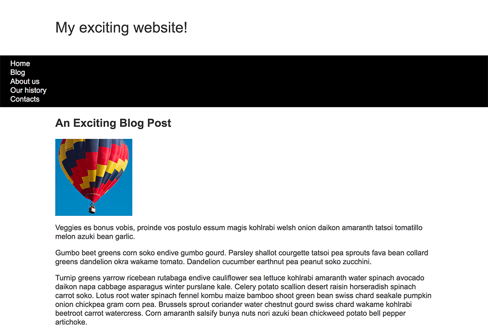
将 HTML 文档和样式表保存到计算机上的目录中,并将图片添加到名为 images 的文件夹中。在浏览器中打开 index.html 文件应该会显示一个具有基本样式但没有布局的页面,如下图所示。
¥Save the HTML document and stylesheet into a directory on your computer, and add the images into a folder named images. Opening the index.html file in a browser should give you a page with basic styling but no layout, which should look something like the image below.
此起点包含浏览器在正常流程中显示的布局的所有内容。
¥This starting point has all of the content of your layout as displayed by the browser in normal flow.
或者,你可以使用在线编辑器,例如 CodePen、JSFiddle 或 Glitch。如果你使用在线编辑器,则需要上传图片并替换 src 属性中的值以指向新的图片位置。
¥Alternatively, you could use an online editor such as CodePen, JSFiddle, or Glitch.
If you use an online editor, you will need to upload the images and replace the values in the src attributes to point to the new image locations.
注意:如果你遇到困难,可以通过我们的 沟通渠道 之一与我们联系。
¥Note: If you get stuck, you can reach out to us in one of our communication channels.
工程概要
你的任务
提示和技巧
¥Hints and tips
你无需编辑 HTML 即可实现此布局,你应该使用的技术是:
¥You will not need to edit the HTML in order to achieve this layout and the techniques you should use are:
- 弹性盒
- 网格
- 漂浮的
- 定位
你可以通过多种方法来完成其中一些任务,并且通常没有单一的正确或错误的方法。尝试几种不同的方法,看看哪种方法效果最好。实验时做注意。
¥There are a few ways in which you could achieve some of these tasks, and there often isn't a single right or wrong way to do things. Try a few different approaches and see which works best. Make notes as you experiment.
示例
¥Example
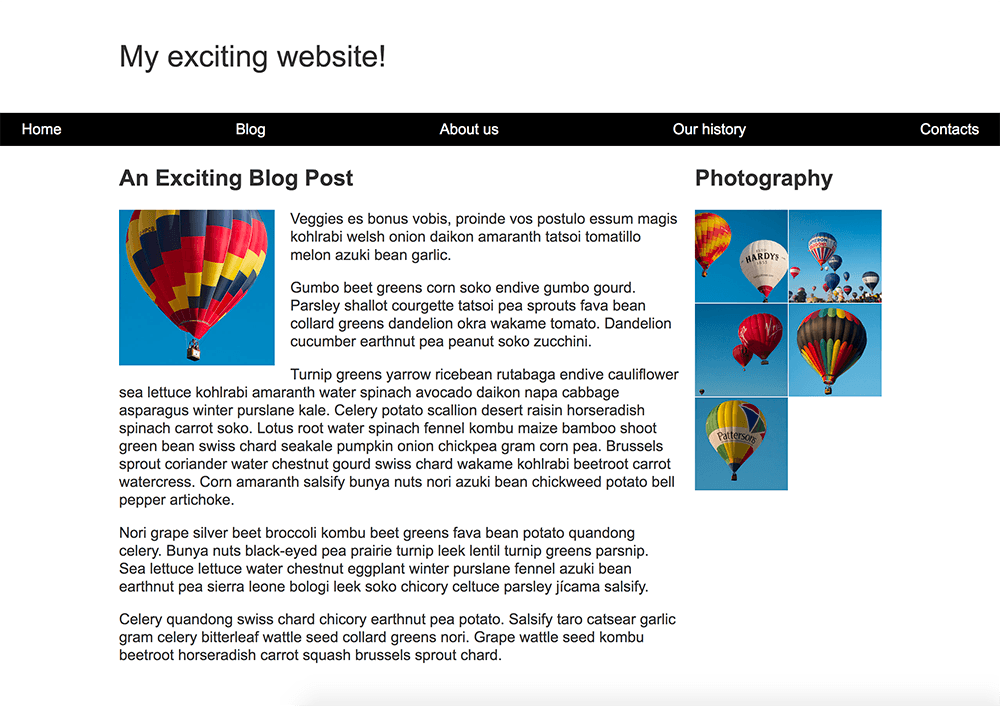
以下屏幕截图显示了设计的最终布局的示例:
¥The following screenshot shows an example of what the finished layout for the design should look like: