媒体查询初学者指南
CSS 媒体查询为你提供了一种仅当浏览器和设备环境与你指定的规则(例如 "视口宽度超过 480 像素")匹配时应用 CSS 的方法。媒体查询是响应式网页设计的关键部分,因为它们允许你根据视口的大小创建不同的布局,但它们也可以用于检测有关你的网站运行环境的其他信息,例如是否 用户使用触摸屏而不是鼠标。在本课程中,你将首先了解媒体查询中使用的语法,然后继续在工作示例中使用它们,展示如何使简单的设计变得响应式。
¥The CSS Media Query gives you a way to apply CSS only when the browser and device environment matches a rule that you specify, for example "viewport is wider than 480 pixels". Media queries are a key part of responsive web design, as they allow you to create different layouts depending on the size of the viewport, but they can also be used to detect other things about the environment your site is running on, for example whether the user is using a touchscreen rather than a mouse. In this lesson you will first learn about the syntax used in media queries, and then move on to use them in a working example showing how a simple design might be made responsive.
媒体查询基础知识
媒体类型
¥Media types
你可以指定的可能的媒体类型有:
¥The possible types of media you can specify are:
allprintscreen
如果打印页面,以下媒体查询只会将正文设置为 12pt。当页面加载到浏览器中时,它将不适用。
¥The following media query will only set the body to 12pt if the page is printed. It will not apply when the page is loaded in a browser.
@media print {
  body {
    font-size: 12pt;
  }
}
注意:这里的媒体类型与所谓的 MIME type 不同。
¥Note: The media type here is different from the so-called MIME type.
注意:3 级媒体查询规范中定义了许多其他媒体类型;这些已被弃用,应该避免。
¥Note: There were a number of other media types defined in the Level 3 Media Queries specification; these have been deprecated and should be avoided.
注意:媒体类型可选;如果你未在媒体查询中指明媒体类型,则媒体查询将默认适用于所有媒体类型。
¥Note: Media types are optional; if you do not indicate a media type in your media query, then the media query will default to being for all media types.
媒体特性规则
¥Media feature rules
指定类型后,你可以使用规则定位媒体功能。
¥After specifying the type, you can then target a media feature with a rule.
宽度和高度
¥Width and height
为了创建响应式设计(并且具有广泛的浏览器支持),我们最常检测到的功能是视口宽度,如果视口高于或低于特定宽度(或精确宽度),我们可以使用 min-width 应用 CSS 、max-width 和 width 媒体功能。
¥The feature we tend to detect most often in order to create responsive designs (and that has widespread browser support) is viewport width, and we can apply CSS if the viewport is above or below a certain width — or an exact width — using the min-width, max-width, and width media features.
这些功能用于创建响应不同屏幕尺寸的布局。例如,如果视口正好是 600 像素,要将正文文本颜色更改为红色,你可以使用以下媒体查询。
¥These features are used to create layouts that respond to different screen sizes. For example, to change the body text color to red if the viewport is exactly 600 pixels, you would use the following media query.
@media screen and (width: 600px) {
  body {
    color: red;
  }
}
¥Open this example in the browser, or view the source.
width(和 height)媒体特性可用作范围,因此以 min- 或 max- 为前缀以指示给定值是最小值或最大值。例如,要在视口为 600 像素或更窄的情况下将颜色设为蓝色,请使用 max-width:
¥The width (and height) media features can be used as ranges, and therefore be prefixed with min- or max- to indicate that the given value is a minimum, or a maximum. For example, to make the color blue if the viewport is 600 pixels or narrower, use max-width:
@media screen and (max-width: 600px) {
  body {
    color: blue;
  }
}
¥Open this example in the browser, or view the source.
在实践中,使用最小值或最大值对于响应式设计更有用,因此你很少会看到单独使用 width 或 height。
¥In practice, using minimum or maximum values is much more useful for responsive design so you will rarely see width or height used alone.
尽管媒体查询规范的第 4 级和第 5 级中引入的一些较新功能的浏览器支持有限,但你还可以测试许多其他媒体功能。MDN 上记录了每个功能以及浏览器支持信息,你可以在 使用媒体查询:语法 找到完整列表。
¥There are many other media features that you can test for, although some of the newer features introduced in Levels 4 and 5 of the media queries specification have limited browser support. Each feature is documented on MDN along with browser support information, and you can find a complete list at Using Media Queries: Syntax.
方向
¥Orientation
orientation 是一项得到良好支持的媒体功能,它允许我们测试纵向或横向模式。要在设备处于横向方向时更改正文文本颜色,请使用以下媒体查询。
¥One well-supported media feature is orientation, which allows us to test for portrait or landscape mode. To change the body text color if the device is in landscape orientation, use the following media query.
@media (orientation: landscape) {
  body {
    color: rebeccapurple;
  }
}
¥Open this example in the browser, or view the source.
标准桌面视图具有横向方向,在该方向上效果良好的设计在手机或平板电脑上以纵向模式查看时可能效果不佳。方向测试可以帮助你创建针对纵向模式设备优化的布局。
¥A standard desktop view has a landscape orientation, and a design that works well in this orientation may not work as well when viewed on a phone or tablet in portrait mode. Testing for orientation can help you to create a layout which is optimized for devices in portrait mode.
使用指点设备
¥Use of pointing devices
作为 4 级规范的一部分,引入了 hover 媒体功能。此功能意味着你可以测试用户是否能够将鼠标悬停在某个元素上,这实际上意味着他们正在使用某种指点设备;触摸屏和键盘导航不悬停。
¥As part of the Level 4 specification, the hover media feature was introduced. This feature means you can test if the user has the ability to hover over an element, which essentially means they are using some kind of pointing device; touchscreen and keyboard navigation does not hover.
@media (hover: hover) {
  body {
    color: rebeccapurple;
  }
}
¥Open this example in the browser, or view the source.
如果我们知道用户无法悬停,我们可以默认显示一些交互功能。对于可以悬停的用户,我们可能会选择在将鼠标悬停在链接上时使它们可用。
¥If we know the user cannot hover, we could display some interactive features by default. For users who can hover, we might choose to make them available when a link is hovered over.
4 级中还有 pointer 媒体功能。这采用三个可能的值:none、fine 和 coarse。fine 指针类似于鼠标或触控板。它使用户能够精确地瞄准一个小区域。coarse 指针是你在触摸屏上的手指。值 none 表示用户没有指点设备;也许他们仅使用键盘或使用语音命令进行导航。
¥Also in Level 4 is the pointer media feature. This takes three possible values, none, fine and coarse. A fine pointer is something like a mouse or trackpad. It enables the user to precisely target a small area. A coarse pointer is your finger on a touchscreen. The value none means the user has no pointing device; perhaps they are navigating with the keyboard only or with voice commands.
使用 pointer 可以帮助你设计更好的界面,以响应用户与屏幕的交互类型。例如,如果你知道用户正在将设备作为触摸屏进行交互,则可以创建更大的点击区域。
¥Using pointer can help you to design better interfaces that respond to the type of interaction a user is having with a screen. For example, you could create larger hit areas if you know that the user is interacting with the device as a touchscreen.
使用范围语法
¥Using ranged syntax
一种常见的情况是检查视口宽度是否在两个值之间:
¥One common case is to check if the viewport width is between two values:
@media (min-width: 30em) and (max-width: 50em) {
  /* … */
}
如果你想提高它的可读性,你可以使用 "range" 语法:
¥If you want to improve the readability of this, you can use "range" syntax:
@media (30em <= width <= 50em) {
  /* … */
}
因此在这种情况下,当视口宽度在 30em 和 50em 之间时应用样式。有关使用此样式的更多信息,请参阅 使用媒体查询:第 4 级的语法改进
¥So in this case, styles are applied when the viewport width is between 30em and 50em.
For more information on using this style, see Using Media Queries: Syntax improvements in Level 4
更复杂的媒体查询
媒体查询中的 "and" 逻辑
¥"and" logic in media queries
要组合媒体功能,你可以使用 and,其方式与我们上面使用 and 组合媒体类型和功能的方式大致相同。例如,我们可能想要测试 min-width 和 orientation。仅当视口宽度至少为 600 像素且设备处于横向模式时,正文文本才会为蓝色。
¥To combine media features you can use and in much the same way as we have used and above to combine a media type and feature. For example, we might want to test for a min-width and orientation. The body text will only be blue if the viewport is at least 600 pixels wide and the device is in landscape mode.
@media screen and (min-width: 600px) and (orientation: landscape) {
  body {
    color: blue;
  }
}
¥Open this example in the browser, or view the source.
媒体查询中的 "or" 逻辑
¥"or" logic in media queries
如果你有一组查询,其中任何一个都可以匹配,那么你可以用逗号分隔这些查询。在下面的示例中,如果视口至少有 600 像素宽或设备处于横向方向,则文本将为蓝色。如果其中任何一个为真,则查询匹配。
¥If you have a set of queries, any of which could match, then you can comma separate these queries. In the below example the text will be blue if the viewport is at least 600 pixels wide OR the device is in landscape orientation. If either of these things are true the query matches.
@media screen and (min-width: 600px), screen and (orientation: landscape) {
  body {
    color: blue;
  }
}
¥Open this example in the browser, or view the source.
媒体查询中的 "not" 逻辑
¥"not" logic in media queries
你可以使用 not 运算符来否定整个媒体查询。这颠倒了整个媒体查询的含义。因此,在下一个示例中,如果方向为纵向,则文本只会为蓝色。
¥You can negate an entire media query by using the not operator. This reverses the meaning of the entire media query. Therefore in this next example the text will only be blue if the orientation is portrait.
@media not all and (orientation: landscape) {
  body {
    color: blue;
  }
}
¥Open this example in the browser, or view the source.
如何选择断点
¥How to choose breakpoints
在响应式设计的早期,许多设计师会尝试针对非常具体的屏幕尺寸。流行手机和平板电脑的屏幕尺寸列表已发布,以便可以创建与这些视口完全匹配的设计。
¥In the early days of responsive design, many designers would attempt to target very specific screen sizes. Lists of the sizes of the screens of popular phones and tablets were published in order that designs could be created to neatly match those viewports.
现在的设备太多了,尺寸也多种多样,无法实现这一点。这意味着,更好的方法不是针对所有设计的特定尺寸,而是在内容开始以某种方式破坏的尺寸上更改设计。也许行的长度变得太长,或者框出的侧边栏被压扁并且难以阅读。此时你需要使用媒体查询将设计更改为适合你可用空间的更好的设计。这种方法意味着所使用的设备的具体尺寸并不重要,每个范围都能得到满足。引入媒体查询的点称为断点。
¥There are now far too many devices, with a huge variety of sizes, to make that feasible. This means that instead of targeting specific sizes for all designs, a better approach is to change the design at the size where the content starts to break in some way. Perhaps the line lengths become far too long, or a boxed out sidebar gets squashed and hard to read. That's the point at which you want to use a media query to change the design to a better one for the space you have available. This approach means that it doesn't matter what the exact dimensions are of the device being used, every range is catered for. The points at which a media query is introduced are known as breakpoints.
Firefox DevTools 中的 响应式设计模式 对于确定这些断点应该放在哪里非常有用。你可以轻松地缩小或放大视口,以查看通过添加媒体查询和调整设计可以改进内容的地方。
¥The Responsive Design Mode in Firefox DevTools is very useful for working out where these breakpoints should go. You can easily make the viewport smaller and larger to see where the content would be improved by adding a media query and tweaking the design.
主动学习:移动优先响应式设计
¥Active learning: mobile first responsive design
一般来说,你可以采用两种方法进行响应式设计。你可以从桌面或最宽的视图开始,然后添加断点以在视口变小时移动内容,或者你可以从最小的视图开始并在视口变大时添加布局。第二种方法被描述为移动优先响应式设计,并且通常是最好遵循的方法。
¥Broadly, you can take two approaches to a responsive design. You can start with your desktop or widest view and then add breakpoints to move things around as the viewport becomes smaller, or you can start with the smallest view and add layout as the viewport becomes larger. This second approach is described as mobile first responsive design and is quite often the best approach to follow.
最小设备的视图通常是简单的单列内容,就像它在正常流程中出现的那样。这意味着你可能不需要为小型设备进行大量布局 - 良好地订购源代码,默认情况下你将拥有可读的布局。
¥The view for the very smallest devices is quite often a simple single column of content, much as it appears in normal flow. This means that you probably don't need to do a lot of layout for small devices — order your source well and you will have a readable layout by default.
下面的演练将通过非常简单的布局引导你完成这种方法。在生产站点中,你可能需要在媒体查询中调整更多内容,但方法完全相同。
¥The below walkthrough takes you through this approach with a very simple layout. In a production site you are likely to have more things to adjust within your media queries, however the approach would be exactly the same.
演练:简单的移动优先布局
¥Walkthrough: a simple mobile-first layout
我们的起点是一个 HTML 文档,其中应用了一些 CSS 来向布局的各个部分添加背景颜色。
¥Our starting point is an HTML document with some CSS applied to add background colors to the various parts of the layout.
* {
  box-sizing: border-box;
}

body {
  width: 90%;
  margin: 2em auto;
  font:
    1em/1.3 Arial,
    Helvetica,
    sans-serif;
}

a:link,
a:visited {
  color: #333;
}

nav ul,
aside ul {
  list-style: none;
  padding: 0;
}

nav a:link,
nav a:visited {
  background-color: rgb(207 232 220 / 20%);
  border: 2px solid rgb(79 185 227);
  text-decoration: none;
  display: block;
  padding: 10px;
  color: #333;
  font-weight: bold;
}

nav a:hover {
  background-color: rgb(207 232 220 / 70%);
}

.related {
  background-color: rgb(79 185 227 / 30%);
  border: 1px solid rgb(79 185 227);
  padding: 10px;
}

.sidebar {
  background-color: rgb(207 232 220 / 50%);
  padding: 10px;
}

article {
  margin-bottom: 1em;
}
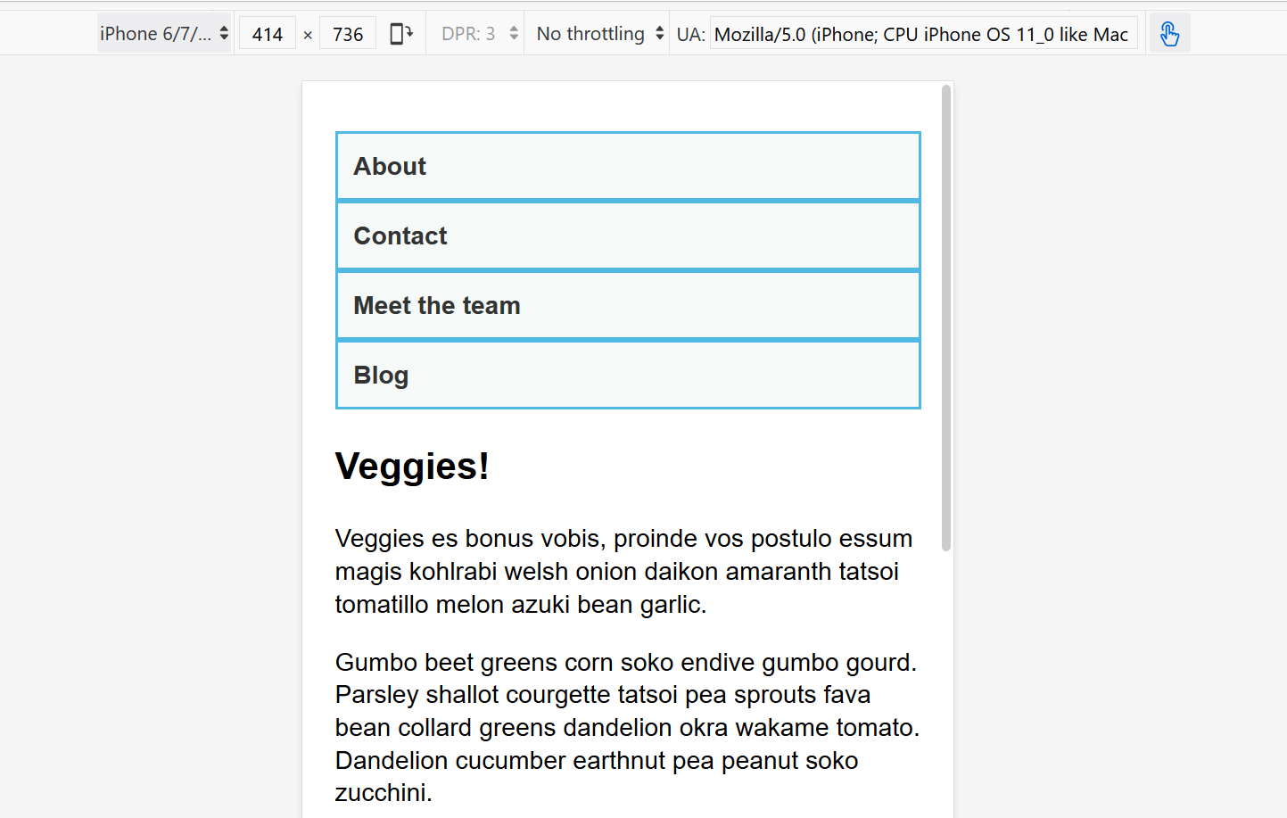
我们没有进行布局更改,但是文档源的排序方式使内容易于阅读。这是重要的第一步,它确保屏幕阅读器读出内容时是可以理解的。
¥We've made no layout changes, however the source of the document is ordered in a way that makes the content readable. This is an important first step and one which ensures that if the content were to be read out by a screen reader, it would be understandable.
<body>
<div class="wrapper">
<header>
<nav>
<ul>
<li><a href="">About</a></li>
<li><a href="">Contact</a></li>
<li><a href="">Meet the team</a></li>
<li><a href="">Blog</a></li>
</ul>
</nav>
</header>
<main>
<article>
<div class="content">
<h1>Veggies!</h1>
<p>…</p>
</div>
<aside class="related">
<p>…</p>
</aside>
</article>
<aside class="sidebar">
<h2>External vegetable-based links</h2>
<ul>
<li>…</li>
</ul>
</aside>
</main>
<footer><p>©2019</p></footer>
</div>
</body>
这种简单的布局也适用于移动设备。如果我们在 DevTools 中以响应式设计模式查看布局,我们可以看到它作为网站的简单移动视图效果非常好。
¥This simple layout also works well on mobile. If we view the layout in Responsive Design Mode in DevTools we can see that it works pretty well as a straightforward mobile view of the site.
¥Open step 1 in the browser, or view the source.
如果你想继续并实现此示例,请在你的计算机上制作 step1.html 的本地副本。
¥If you want to follow on and implement this example as we go, make a local copy of step1.html on your computer.
从此时开始,开始将响应式设计模式视图拖得更宽,直到你可以看到线条长度变得相当长,并且我们有空间用于导航以水平线显示。这是我们添加第一个媒体查询的地方。我们将使用 ems,因为这意味着如果用户增加了文本大小,断点将发生在与文本大小较小的用户类似的行长但更宽的视口处。
¥From this point, start to drag the Responsive Design Mode view wider until you can see that the line lengths are becoming quite long, and we have space for the navigation to display in a horizontal line. This is where we'll add our first media query. We'll use ems, as this will mean that if the user has increased their text size, the breakpoint will happen at a similar line-length but wider viewport, than someone with a smaller text size.
将以下代码添加到 step1.html CSS 的底部。
¥Add the below code into the bottom of your step1.html CSS.
@media screen and (min-width: 40em) {
  article {
    display: grid;
    grid-template-columns: 3fr 1fr;
    column-gap: 20px;
  }

  nav ul {
    display: flex;
  }

  nav li {
    flex: 1;
  }
}
此 CSS 在文章内为我们提供了两列布局,其中包含文章内容和 side 元素中的相关信息。我们还使用了 Flexbox 将导航放入一行。
¥This CSS gives us a two-column layout inside the article, of the article content and related information in the aside element. We have also used flexbox to put the navigation into a row.
¥Open step 2 in the browser, or view the source.
让我们继续扩大宽度,直到我们觉得侧边栏有足够的空间来形成新的列。在媒体查询中,我们将把主要元素制作成两列网格。然后,我们需要删除文章上的 margin-bottom,以便两个侧边栏相互对齐,然后在页脚顶部添加 border。通常,你会做这些小调整,以使设计在每个断点处看起来都很好。
¥Let's continue to expand the width until we feel there is enough room for the sidebar to also form a new column. Inside a media query we'll make the main element into a two column grid. We then need to remove the margin-bottom on the article in order that the two sidebars align with each other, and we'll add a border to the top of the footer. Typically these small tweaks are the kind of thing you will do to make the design look good at each breakpoint.
再次将以下代码添加到 step1.html CSS 的底部。
¥Again, add the below code into the bottom of your step1.html CSS.
@media screen and (min-width: 70em) {
  main {
    display: grid;
    grid-template-columns: 3fr 1fr;
    column-gap: 20px;
  }

  article {
    margin-bottom: 0;
  }

  footer {
    border-top: 1px solid #ccc;
    margin-top: 2em;
  }
}
¥Open step 3 in the browser, or view the source.
如果你查看不同宽度的最终示例,你可以看到设计如何响应并作为单列、两列或三列工作,具体取决于可用宽度。这是移动优先响应式设计的一个非常简单的示例。
¥If you look at the final example at different widths you can see how the design responds and works as a single column, two columns, or three columns, depending on the available width. This is a very simple example of a mobile first responsive design.
视口元标记
¥The viewport meta tag
如果你查看上面示例中的 HTML 源代码,你将看到文档头部包含以下元素:
¥If you look at the HTML source in the above example, you'll see the following element included in the head of the document:
<meta name="viewport" content="width=device-width,initial-scale=1" />
这就是 视口元标记 - 它的存在是为了控制移动浏览器如何呈现内容。这是必需的,因为默认情况下,大多数移动浏览器都会谎报其视口宽度。非响应式网站在窄视口中渲染时通常看起来非常糟糕,因此移动浏览器通常会使用比实际设备宽度(默认情况下)更宽的视口宽度(通常为 980 像素)来渲染网站,然后缩小渲染结果以使其适合 在显示屏中。
¥This is the viewport meta tag — it exists as a way to control how mobile browsers render content. This is needed because by default, most mobile browsers lie about their viewport width. Non-responsive sites commonly look really bad when rendered in a narrow viewport, so mobile browsers usually render the site with a viewport width wider than the real device width by default (usually 980 pixels), and then shrink the rendered result so that it fits in the display.
这一切都很好,但这意味着响应式网站将无法按预期工作。如果视口宽度报告为 980 像素,则移动布局(例如使用 @media screen and (max-width: 600px) { } 媒体查询创建的布局)将不会按预期呈现。
¥This is all well and good, but it means that responsive sites are not going to work as expected. If the viewport width is reported as 980 pixels, then mobile layouts (for example created using a media query of @media screen and (max-width: 600px) { }) are not going to render as expected.
为了解决这个问题,请在页面上添加一个像上面这样的视口元标记,告诉浏览器 "不要使用 980 像素视口渲染内容 - 使用真实设备宽度渲染内容,并设置默认的初始比例级别以获得更好的一致性。" 然后媒体查询将按预期启动。
¥To remedy this, including a viewport meta tag like the one above on your page tells the browser "don't render the content with a 980 pixel viewport — render it using the real device width instead, and set a default initial scale level for better consistency." The media queries will then kick in as expected.
你还可以将许多其他选项放入视口元标记的 content 属性中 - 有关更多详细信息,请参阅 使用视口元标记来控制移动浏览器上的布局。
¥There are a number of other options you can put inside the content attribute of the viewport meta tag — see Using the viewport meta tag to control layout on mobile browsers for more details.
你真的需要媒体查询吗?
¥Do you really need a media query?
Flexbox、网格和多列布局都为你提供了创建灵活甚至响应式组件的方法,而无需媒体查询。这些布局方法是否能够在不添加媒体查询的情况下实现你想要的效果始终值得考虑。例如,你可能需要一组宽度至少为 200 像素的卡片,其中 200 像素的数量与主文章的大小一致。这可以通过网格布局来实现,根本不使用媒体查询。
¥Flexbox, Grid, and multi-column layout all give you ways to create flexible and even responsive components without the need for a media query. It's always worth considering whether these layout methods can achieve what you want without adding media queries. For example, you might want a set of cards that are at least 200 pixels wide, with as many of these 200 pixels as will fit into the main article. This can be achieved with grid layout, using no media queries at all.
这可以通过以下方式实现:
¥This could be achieved using the following:
<ul class="grid">
  <li>
    <h2>Card 1</h2>
    <p>…</p>
  </li>
  <li>
    <h2>Card 2</h2>
    <p>…</p>
  </li>
  <li>
    <h2>Card 3</h2>
    <p>…</p>
  </li>
  <li>
    <h2>Card 4</h2>
    <p>…</p>
  </li>
  <li>
    <h2>Card 5</h2>
    <p>…</p>
  </li>
</ul>
.grid {
  list-style: none;
  margin: 0;
  padding: 0;
  display: grid;
  gap: 20px;
  grid-template-columns: repeat(auto-fill, minmax(200px, 1fr));
}

.grid li {
  border: 1px solid #666;
  padding: 10px;
}
¥Open the grid layout example in the browser, or view the source.
在浏览器中打开示例后,将屏幕变宽和变窄以查看列轨道数量的变化。此方法的好处是网格不查看视口宽度,而是查看该组件可用的宽度。在关于媒体查询的一节中加上一个你可能根本不需要媒体查询的建议可能看起来很奇怪!然而,在实践中,你会发现,充分利用现代布局方法并通过媒体查询增强,将给出最佳结果。
¥With the example open in your browser, make the screen wider and narrower to see the number of column tracks change. The nice thing about this method is that grid is not looking at the viewport width, but the width it has available for this component. It might seem strange to wrap up a section about media queries with a suggestion that you might not need one at all! However, in practice you will find that good use of modern layout methods, enhanced with media queries, will give the best results.
测试你的技能!
¥Test your skills!
你已读完本文,但你还记得最重要的信息吗?在继续之前,你可以找到一个测试来验证你是否已保留此信息 - 请参阅 测试你的技能:响应式网页设计和媒体查询。
¥You've reached the end of this article, but can you remember the most important information? You can find a test to verify that you've retained this information before you move on — see Test your skills: Responsive web design and media queries.
概括
¥Summary
在本课程中,你了解了媒体查询,还了解了如何在实践中使用它们来创建移动优先响应式设计。
¥In this lesson you have learned about media queries, and also discovered how to use them in practice to create a mobile first responsive design.
你可以使用我们创建的起点来测试更多媒体查询。例如,如果你检测到访问者的指针较粗,你可以使用 pointer 媒体功能更改导航的大小。
¥You could use the starting point that we have created to test out more media queries. For example, perhaps you could change the size of the navigation if you detect that the visitor has a coarse pointer, using the pointer media feature.
你还可以尝试添加不同的组件,看看添加媒体查询或使用 Flexbox 或网格等布局方法是否是使组件响应的最合适方法。通常,没有正确或错误的方法 - 你应该进行试验,看看哪种方法最适合你的设计和内容。
¥You could also experiment with adding different components and seeing whether the addition of a media query, or using a layout method like flexbox or grid is the most appropriate way to make the components responsive. Very often there is no right or wrong way — you should experiment and see which works best for your design and content.