响应式图片
在本文中,我们将了解响应式图片的概念(在屏幕尺寸、分辨率和其他此类功能差异很大的设备上运行良好的图片),并了解 HTML 提供了哪些工具来帮助实现它们。这有助于提高不同设备上的性能。响应式图片只是 响应式设计 的一部分,未来 CSS 主题供你学习。
¥In this article, we'll learn about the concept of responsive images — images that work well on devices with widely differing screen sizes, resolutions, and other such features — and look at what tools HTML provides to help implement them. This helps to improve performance across different devices. Responsive images are just one part of responsive design, a future CSS topic for you to learn.
| 先决条件: | 你应该已经了解 HTML 基础知识 以及如何使用 将静态图片添加到网页。 |
|---|---|
| 目标: |
了解如何使用
srcset 和 <picture> 元素等功能在网站上实现响应式图片解决方案。
|
为什么要使用响应式图片?
¥Why responsive images?
让我们看一个典型的场景。典型的网站可能包含标题图片和标题下方的一些内容图片。标题图片可能会跨越标题的整个宽度,而内容图片将适合内容列内的某个位置。这是一个简单的例子:
¥Let's examine a typical scenario. A typical website may contain a header image and some content images below the header. The header image will likely span the whole of the width of the header, and the content image will fit somewhere inside the content column. Here's a simple example:
这在宽屏设备上效果很好,例如注意本电脑或台式机(你可以在 GitHub 上找到 查看实时示例 并找到 源代码。)我们在本课中不会过多讨论 CSS,只是说:
¥This works well on a wide screen device, such as a laptop or desktop (you can see the example live and find the source code on GitHub.) We won't discuss the CSS much in this lesson, except to say that:
- 正文内容的最大宽度已设置为 1200 像素 - 在高于该宽度的视口中,正文保持在 1200 像素,并在可用空间中居中。在低于该宽度的视口中,主体将保持为视口宽度的 100%。
- 标题图片已设置为使其中心始终位于标题的中心,无论标题设置为什么宽度。如果在较窄的屏幕上查看网站,仍然可以看到图片中心的重要细节(人物),而两侧的多余细节就会丢失。它的高度为 200 像素。
- 内容图片已设置为,如果主体元素变得小于图片,则图片开始缩小,以便它们始终保留在主体内部,而不是溢出主体。
但是,当你开始在窄屏幕设备上查看网站时,就会出现问题。下面的标题看起来不错,但它开始占用移动设备的大量屏幕高度。在这种尺寸下,很难在第一张内容图片中看到两个人的面孔。
¥However, issues arise when you start to view the site on a narrow screen device. The header below looks OK, but it's starting to take up a lot of the screen height for a mobile device. And at this size, it is difficult to see faces of the two people within the first content image.

一种改进是显示图片的裁剪版本,当在窄屏幕上查看网站时,该版本会显示图片的重要细节。可以为中宽屏幕设备(例如平板电脑)显示第二个裁剪图片。你想要以这种方式为各种布局提供不同的裁剪图片的一般问题通常称为艺术指导问题。
¥An improvement would be to display a cropped version of the image which displays the important details of the image when the site is viewed on a narrow screen. A second cropped image could be displayed for a medium-width screen device, like a tablet. The general problem whereby you want to serve different cropped images in that way, for various layouts, is commonly known as the art direction problem.
此外,如果在手机屏幕上查看,则无需在页面上嵌入如此大的图片。这样做会浪费带宽;特别是,移动用户不希望通过下载适用于桌面用户的大图片来浪费带宽,而小图片就适合他们的设备。相反,当显示大于其原始尺寸时,小 光栅图片 开始看起来有颗粒感(光栅图片是一定数量的像素宽和一定数量的像素高,正如我们在查看 矢量图形 时看到的那样)。理想情况下,用户的网络浏览器可以使用多种分辨率。然后,浏览器可以根据用户设备的屏幕尺寸确定要加载的最佳分辨率。这称为分辨率切换问题。
¥In addition, there is no need to embed such large images on the page if it is being viewed on a mobile screen. Doing so can waste bandwidth; in particular, mobile users don't want to waste bandwidth by downloading a large image intended for desktop users, when a small image would do for their device. Conversely, a small raster image starts to look grainy when displayed larger than its original size (a raster image is a set number of pixels wide and a set number of pixels tall, as we saw when we looked at vector graphics). Ideally, multiple resolutions would be made available to the user's web browser. The browser could then determine the optimal resolution to load based on the screen size of the user's device. This is called the resolution switching problem.
让事情变得更复杂的是,某些设备具有高分辨率屏幕,需要比你期望的更大的图片才能很好地显示。这本质上是同一个问题,但背景略有不同。
¥To make things more complicated, some devices have high resolution screens that need larger images than you might expect to display nicely. This is essentially the same problem, but in a slightly different context.
你可能认为矢量图片可以解决这些问题,而且它们在一定程度上确实做到了 - 它们的文件大小小且缩放比例良好,你应该尽可能使用它们。但是,它们并不适合所有图片类型。矢量图片非常适合简单的图形、图案、界面元素等,但创建具有照片等细节的基于矢量的图片会变得非常复杂。JPEG 等光栅图片格式更适合我们在上面示例中看到的图片类型。
¥You might think that vector images would solve these problems, and they do to a certain degree — they are small in file size and scale well, and you should use them wherever possible. However, they aren't suitable for all image types. Vector images are great for simple graphics, patterns, interface elements, etc., but it starts to get very complex to create a vector-based image with the kind of detail that you'd find in say, a photo. Raster image formats such as JPEGs are more suited to the kind of images we see in the above example.
当网络刚出现时,也就是 90 年代初到中期,这种问题并不存在 - 当时浏览网络的唯一设备是台式机和注意本电脑,因此浏览器工程师和规范编写者甚至没有想到要实现 解决方案。最近实现了响应式图片技术,通过让你向浏览器提供多个图片文件来解决上述问题,这些图片文件要么全部显示相同的内容但包含不同数量的像素(分辨率切换),要么适合不同空间分配的不同图片(艺术指导) )。
¥This kind of problem didn't exist when the web first existed, in the early to mid 90s — back then the only devices in existence to browse the Web were desktops and laptops, so browser engineers and spec writers didn't even think to implement solutions. Responsive image technologies were implemented recently to solve the problems indicated above by letting you offer the browser several image files, either all showing the same thing but containing different numbers of pixels (resolution switching), or different images suitable for different space allocations (art direction).
注意:本文讨论的新功能 -
srcset/sizes/<picture>- 均受现代桌面和移动浏览器支持。¥Note: The new features discussed in this article —
srcset/sizes/<picture>— are all supported in modern desktop and mobile browsers.
如何创建响应式图片?
¥How do you create responsive images?
在本节中,我们将研究上面说明的两个问题,并展示如何使用 HTML 的响应式图片功能来解决它们。你应该注意,本节我们将重点关注 <img> 元素,如上例的内容区域所示 - 站点标题中的图片仅用于装饰,因此使用 CSS 背景图片实现。CSS 可以说拥有更好的响应式设计工具 比 HTML 更重要,我们将在未来的 CSS 模块中讨论这些内容。
¥In this section, we'll look at the two problems illustrated above and show how to solve them using HTML's responsive image features. You should note that we will be focusing on <img> elements for this section, as seen in the content area of the example above — the image in the site header is only for decoration, and therefore implemented using CSS background images. CSS arguably has better tools for responsive design than HTML, and we'll talk about those in a future CSS module.
分辨率切换:不同尺寸
¥Resolution switching: Different sizes
那么,分辨率切换我们要解决的问题是什么呢?我们想要显示相同的图片内容,只是根据设备更大或更小 - 这就是我们示例中第二个内容图片的情况。传统上,标准 <img> 元素仅允许你将浏览器指向单个源文件:
¥So, what is the problem that we want to solve with resolution switching? We want to display identical image content, just larger or smaller depending on the device — this is the situation we have with the second content image in our example. The standard <img> element traditionally only lets you point the browser to a single source file:
<img src="elva-fairy-800w.jpg" alt="Elva dressed as a fairy" />
然而,我们可以使用两个属性 - srcset 和 sizes - 来提供一些额外的源图片以及提示,以帮助浏览器选择正确的图片。你可以在 GitHub 上的 responsive.html 示例中看到这样的示例(另请参阅 源代码):
¥We can however use two attributes — srcset and sizes — to provide several additional source images along with hints to help the browser pick the right one. You can see an example of this in our responsive.html example on GitHub (see also the source code):
<img
  srcset="elva-fairy-480w.jpg 480w, elva-fairy-800w.jpg 800w"
  sizes="(max-width: 600px) 480px,
         800px"
  src="elva-fairy-800w.jpg"
  alt="Elva dressed as a fairy" />
srcset 和 sizes 属性看起来很复杂,但是如果按照上面所示对它们进行格式化,并在每行上使用属性值的不同部分,那么它们并不难理解。每个值都包含一个以逗号分隔的列表,这些列表的每个部分都由三个子部分组成。现在让我们浏览一下每个内容:
¥The srcset and sizes attributes look complicated, but they're not too hard to understand if you format them as shown above, with a different part of the attribute value on each line. Each value contains a comma-separated list, and each part of those lists is made up of three sub-parts. Let's run through the contents of each now:
srcset 定义了我们允许浏览器选择的图片集,以及每个图片的大小。每组图片信息与前一组图片信息之间用逗号分隔。对于每一个,我们写:
¥**srcset** defines the set of images we will allow the browser to choose between, and what size each image is. Each set of image information is separated from the previous one by a comma. For each one, we write:
- 图片文件名 (
elva-fairy-480w.jpg) - 空间
-
图片的固有宽度(以像素为单位)(
480w) — 请注意,这使用w单位,而不是你可能期望的px。图片的 内在尺寸 是其实际大小,可以通过检查计算机上的图片文件找到该图片(例如,在 Mac 上,你可以在 Finder 中选择图片并按 Cmd . I 打开信息屏幕)。
sizes 定义了一组媒体条件(例如屏幕宽度),并指示当某些媒体条件成立时最好选择什么图片尺寸 - 这些是我们之前讨论过的提示。在这种情况下,在每个逗号之前我们写:
¥**sizes** defines a set of media conditions (e.g. screen widths) and indicates what image size would be best to choose, when certain media conditions are true — these are the hints we talked about earlier. In this case, before each comma we write:
- 媒体条件 (
(max-width:600px)) — 你将在 CSS 主题 中了解有关这些的更多信息,但现在我们只说媒体条件描述了屏幕可能处于的状态。在本例中,我们说的是 "当视口宽度为 600 像素或更小时"。 - 空间
- 当介质条件为 true 时图片将填充的槽的宽度 (
480px)
注意:在
sizes中,你可以使用任何 长度值。例如,你可以提供相对于视口的宽度(例如50vw),而不是提供绝对宽度(例如480px)。但是,你不能使用百分比作为插槽宽度。你可能已经注意到,最后一个槽宽度没有介质条件(这是在没有介质条件为 true 时选择的默认值)。浏览器会忽略第一个匹配条件之后的所有内容,因此请注意媒体条件的排序方式。¥Note: In
sizes, you can use any length value. For example, rather than providing an absolute width (for example,480px), you can alternatively provide a width relative to the viewport (for example,50vw). However, you cannot use a percentage as the slot width. You may have noticed that the last slot width has no media condition (this is the default that is chosen when none of the media conditions are true). The browser ignores everything after the first matching condition, so be careful how you order the media conditions.
因此,有了这些属性,浏览器将:
¥So, with these attributes in place, the browser will:
- 查看屏幕尺寸、像素密度、缩放级别、屏幕方向和网络速度。
- 找出
sizes列表中第一个为真的介质条件。 - 查看为该媒体查询指定的槽大小。
- 加载
srcset列表中引用的与插槽大小相同的图片,或者如果没有,则加载第一个大于所选插槽大小的图片。
就是这样!此时,如果视口宽度为 480px 的支持浏览器加载页面,则 (max-width: 600px) 媒体条件将为 true,因此浏览器会选择 480px 插槽。将加载 elva-fairy-480w.jpg,因为其固有宽度 (480w) 最接近插槽尺寸。800 像素图片在磁盘上的大小为 128 KB,而 480 像素版本仅为 63 KB,节省了 65 KB。现在,想象一下如果这是一个包含很多图片的页面。使用这种技术可以为移动用户节省大量带宽。
¥And that's it! At this point, if a supporting browser with a viewport width of 480px loads the page, the (max-width: 600px) media condition will be true, and so the browser chooses the 480px slot. The elva-fairy-480w.jpg will be loaded, as its inherent width (480w) is closest to the slot size. The 800px picture is 128KB on disk, whereas the 480px version is only 63KB — a saving of 65KB. Now, imagine if this was a page that had many pictures on it. Using this technique could save mobile users a lot of bandwidth.
注意:当使用桌面浏览器进行测试时,如果当你将窗口设置为最窄宽度时,浏览器无法加载较窄的图片,请查看视口是什么(你可以通过进入浏览器的 JavaScript 控制台来近似它) 并输入
document.querySelector('html').clientWidth)。不同的浏览器都有允许你将窗口宽度减小到的最小尺寸,并且它们可能比你想象的更宽。当使用移动浏览器进行测试时,你可以使用 Firefox 的about:debugging页面等工具来使用桌面开发者工具检查移动设备上加载的页面。¥Note: When testing this with a desktop browser, if the browser fails to load the narrower images when you've got its window set to the narrowest width, have a look at what the viewport is (you can approximate it by going into the browser's JavaScript console and typing in
document.querySelector('html').clientWidth). Different browsers have minimum sizes that they'll let you reduce the window width to, and they might be wider than you'd think. When testing it with a mobile browser, you can use tools like Firefox'sabout:debuggingpage to inspect the page loaded on the mobile using the desktop developer tools.要查看加载了哪些图片,你可以使用 Firefox DevTools 的 网络监控器 选项卡或 Chrome DevTools 的 网络 面板。对于 Chrome,你可能还需要 禁用缓存 以防止它选择已下载的图片。
¥To see which images were loaded, you can use Firefox DevTools's Network Monitor tab or Chrome DevTools's Network panel. For Chrome, you may also want to disable cache to prevent it from picking already downloaded images.
不支持这些功能的旧版浏览器将忽略它们。相反,这些浏览器将继续正常加载 src 属性中引用的图片。
¥Older browsers that don't support these features will just ignore them. Instead, those browsers will go ahead and load the image referenced in the src attribute as normal.
注意:在上面链接的示例的
<head>中,你将找到<meta name="viewport" content="width=device-width">行:这迫使移动浏览器采用其真实的视口宽度来加载网页(某些移动浏览器谎报其视口宽度,而是以较大的视口宽度加载页面,然后缩小加载的页面,这对于响应式图片或设计没有太大帮助 )。¥Note: In the
<head>of the example linked above, you'll find the line<meta name="viewport" content="width=device-width">: this forces mobile browsers to adopt their real viewport width for loading web pages (some mobile browsers lie about their viewport width, and instead load pages at a larger viewport width then shrink the loaded page down, which is not very helpful for responsive images or design).
分辨率切换:相同尺寸,不同分辨率
¥Resolution switching: Same size, different resolutions
假设你有一张图片将在具有不同屏幕分辨率的显示器上以相同的实际尺寸呈现。你可以通过提供更高分辨率版本的图片来在高分辨率显示器上提供更好的用户体验。
¥Suppose you have an image that will be rendered at the same real-world size on displays that have different screen resolutions. You can provide a better user experience on high resolution displays by serving a higher resolution version of the image.
为了实现这一点,你可以允许浏览器通过使用带有 x 描述符而不使用 sizes 的 srcset 来选择合适的分辨率图片 - 这是一种更简单的语法!你可以在 srcset-resolutions.html 中找到一个示例(另请参见 源代码):
¥To achieve this you can allow the browser to choose an appropriate resolution image by using srcset with x-descriptors and without sizes — a somewhat easier syntax! You can find an example of what this looks like in srcset-resolutions.html (see also the source code):
<img
  srcset="elva-fairy-320w.jpg, elva-fairy-480w.jpg 1.5x, elva-fairy-640w.jpg 2x"
  src="elva-fairy-640w.jpg"
  alt="Elva dressed as a fairy" />
请注意,即使图片始终以相同的大小显示,在更高分辨率的显示器上,你也可以看到更多细节。
¥Note that even though the image is always displayed with the same size, on higher resolution displays you get to see more details.

在此示例中,将以下 CSS 应用到图片,使其在屏幕上的宽度为 320 像素(也称为 CSS 像素):
¥In this example, the following CSS is applied to the image so that it will have a width of 320 pixels on the screen (also called CSS pixels):
img {
  width: 320px;
}
在这种情况下,不需要 sizes - 浏览器会计算出显示的显示器的分辨率,并提供 srcset 中引用的最合适的图片。因此,如果访问页面的设备具有标准/低分辨率显示器,并且一个设备像素代表每个 CSS 像素,则将加载 elva-fairy-320w.jpg 图片(隐含 1x,因此你不需要包含它。)如果设备 具有每个 CSS 像素两个设备像素或更多的高分辨率,将加载 elva-fairy-640w.jpg 图片。640px 图片为 93KB,而 320px 图片仅为 39KB。
¥In this case, sizes is not needed — the browser works out what resolution the display is that it is being shown on, and serves the most appropriate image referenced in the srcset. So if the device accessing the page has a standard/low resolution display, with one device pixel representing each CSS pixel, the elva-fairy-320w.jpg image will be loaded (the 1x is implied, so you don't need to include it.) If the device has a high resolution of two device pixels per CSS pixel or more, the elva-fairy-640w.jpg image will be loaded. The 640px image is 93KB, whereas the 320px image is only 39KB.
艺术方向
¥Art direction
回顾一下,艺术指导问题涉及想要更改显示的图片以适应不同的图片显示尺寸。例如,当在桌面浏览器上查看时,Webpack 含一个中间有一个人的大风景照片。当在移动浏览器上查看时,同一张图片会缩小,使图片中的人变得很小并且很难看到。在移动设备上显示较小的肖像图片可能会更好,该图片会放大人物。<picture> 元素使我们能够实现这种解决方案。
¥To recap, the art direction problem involves wanting to change the image displayed to suit different image display sizes. For example, a web page includes a large landscape shot with a person in the middle when viewed on a desktop browser. When viewed on a mobile browser, that same image is shrunk down, making the person in the image very small and hard to see. It would probably be better to show a smaller, portrait image on mobile, which zooms in on the person. The <picture> element allows us to implement just this kind of solution.
回到我们最初的 not-responsive.html 示例,我们有一个非常需要艺术指导的图片:
¥Returning to our original not-responsive.html example, we have an image that badly needs art direction:
<img src="elva-800w.jpg" alt="Chris standing up holding his daughter Elva" />
让我们用 <picture> 来解决这个问题!与 <video> 和 <audio> 一样,<picture> 元素是一个包含多个 <source> 元素的封装器,这些元素为浏览器提供不同的源以供选择,后面是非常重要的 <img> 元素。responsive.html 中的代码如下所示:
¥Let's fix this, with <picture>! Like <video> and <audio>, the <picture> element is a wrapper containing several <source> elements that provide different sources for the browser to choose from, followed by the all-important <img> element. The code in responsive.html looks like so:
<picture>
  <source media="(max-width: 799px)" srcset="elva-480w-close-portrait.jpg" />
  <source media="(min-width: 800px)" srcset="elva-800w.jpg" />
  <img src="elva-800w.jpg" alt="Chris standing up holding his daughter Elva" />
</picture>
<source>元素包括一个包含媒体条件的media属性 - 与第一个srcset示例一样,这些条件是决定显示哪个图片的测试 - 将显示第一个返回 true 的图片。在这种情况下,如果视口宽度为 799px 或更小,则将显示第一个<source>元素的图片。如果视口宽度为 800px 或以上,则为第二个。srcset属性包含要显示的图片的路径。正如我们在上面的<img>中看到的那样,<source>可以采用引用多个图片的srcset属性以及sizes属性。因此,你可以通过<picture>元素提供多个图片,但也可以为每个图片提供多种分辨率。实际上,你可能不想经常做这种事情。- 在所有情况下,你都必须在
</picture>之前提供<img>元素,以及src和alt,否则不会显示任何图片。这提供了一个默认情况,当没有任何媒体条件返回 true 时(你实际上可以删除本示例中的第二个<source>元素),以及不支持<picture>元素的浏览器的后备情况。
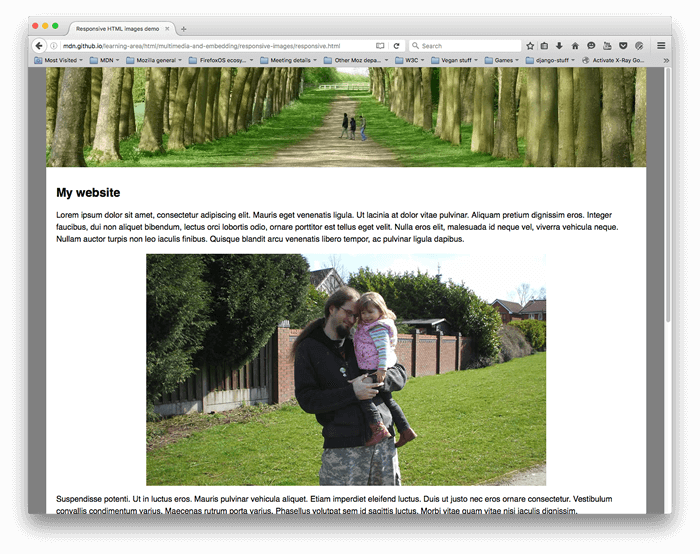
这段代码允许我们在宽屏和窄屏显示器上显示合适的图片,如下所示:
¥This code allows us to display a suitable image on both wide screen and narrow screen displays, as shown below:

注意:你应该仅在艺术指导场景中使用
media属性;当你使用media时,请勿在sizes属性中同时提供媒体条件。¥Note: You should use the
mediaattribute only in art direction scenarios; when you do usemedia, don't also offer media conditions within thesizesattribute.
为什么我们不能只使用 CSS 或 JavaScript 来做到这一点?
¥Why can't we just do this using CSS or JavaScript?
当浏览器开始加载页面时,它会在主解析器开始加载和解释页面的 CSS 和 JavaScript 之前开始下载(预加载)所有图片。该机制通常对于减少页面加载时间很有用,但对于响应式图片没有帮助 - 因此需要实现像 srcset 这样的解决方案。例如,你无法加载 <img> 元素,然后使用 JavaScript 检测视口宽度,然后根据需要动态地将源图片更改为较小的图片。到那时,原始图片已经被加载,并且你还将加载小图片,这在响应图片方面更糟糕。
¥When the browser starts to load a page, it starts to download (preload) any images before the main parser has started to load and interpret the page's CSS and JavaScript. That mechanism is useful in general for reducing page load times, but it is not helpful for responsive images — hence the need to implement solutions like srcset. For example, you couldn't load the <img> element, then detect the viewport width with JavaScript, and then dynamically change the source image to a smaller one if desired. By then, the original image would already have been loaded, and you would load the small image as well, which is even worse in responsive image terms.
主动学习:实现你自己的响应式图片
¥Active learning: Implementing your own responsive images
对于这种主动学习,我们希望你能够勇敢并大部分时间独自完成。我们希望你使用 <picture> 实现适合你自己的艺术指导的窄屏幕/宽屏幕截图,以及使用 srcset 的分辨率切换示例。
¥For this active learning, we're expecting you to be brave and do it alone, mostly. We want you to implement your own suitable art-directed narrow screen/wide screenshot using <picture>, and a resolution switching example that uses srcset.
- 编写一些简单的 HTML 来包含你的代码(如果你愿意,可以使用
not-responsive.html作为起点)。 - 找到一张漂亮的宽屏风景图片,其中包含某种细节。使用图形编辑器创建一个 Web 大小的版本,然后将其裁剪以显示放大细节的较小部分,并创建第二个图片(大约 480 像素宽适合此操作)。
- 使用
<picture>元素实现艺术指导图片切换器! - 创建多个不同大小的图片文件,每个文件显示相同的图片。
- 使用
srcset/sizes创建分辨率切换器示例,根据设备分辨率以不同的分辨率提供相同大小的图片,或者根据视口宽度提供不同的图片大小。
概括
¥Summary
这是响应式图片的封装 - 我们希望你喜欢使用这些新技术。回顾一下,我们在这里讨论了两个不同的问题:
¥That's a wrap for responsive images — we hope you enjoyed playing with these new techniques. As a recap, there are two distinct problems we've been discussing here:
- 艺术方向:你想要为不同布局提供裁剪图片的问题 - 例如,桌面布局显示完整场景的横向图片,以及移动布局显示放大的主要主题的纵向图片。你可以使用
<picture>元素解决此问题。 - 分辨率切换:你希望向窄屏幕设备提供较小的图片文件的问题,因为它们不需要像桌面显示器那样需要巨大的图片,并且向高密度/低密度屏幕提供不同分辨率的图片。你可以使用 矢量图形(SVG 图片)和具有
sizes属性的srcset来解决此问题。
至此整个 多媒体和嵌入 模块也画上了圆满的句号!在继续之前,现在唯一要做的就是尝试一下我们的 多媒体和嵌入评估,看看你进展如何。玩得开心!
¥This also draws to a close the entire Multimedia and embedding module! The only thing to do now before moving on is to try our Multimedia and embedding assessment, and see how you get on. Have fun!
也可以看看
¥See also
- Jason Grigsby 对响应式图片的精彩介绍
- 响应式图片:如果你只是更改分辨率,请使用 srcset — 包括有关浏览器如何确定要使用哪个图片的更多说明
<img><picture><source>