<input type="radio">
类型 radio 的 <input> 元素通常用在单选组中,即描述一组相关选项的单选按钮的集合。
¥<input> elements of type radio are generally used in radio groups—collections of radio buttons describing a set of related options.
同一时间只能选择给定组中的一个单选按钮。单选按钮通常呈现为小圆圈,在选择时会被填充或高亮。
¥Only one radio button in a given group can be selected at the same time. Radio buttons are typically rendered as small circles, which are filled or highlighted when selected.
Try it
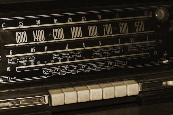
它们被称为单选按钮,因为它们的外观和操作方式与老式单选框上的按钮类似,如下所示。
¥They are called radio buttons because they look and operate in a similar manner to the push buttons on old-fashioned radios, such as the one shown below.
注意:复选框 与单选按钮类似,但有一个重要区别:单选按钮设计用于从一组值中选择一个值,而复选框可让你打开和关闭单个值。当存在多个控件时,单选按钮允许从所有控件中选择一个,而复选框允许选择多个值。
¥Note: Checkboxes are similar to radio buttons, but with an important distinction: radio buttons are designed for selecting one value out of a set, whereas checkboxes let you turn individual values on and off. Where multiple controls exist, radio buttons allow one to be selected out of them all, whereas checkboxes allow multiple values to be selected.
值
¥Value
value 属性是一个包含单选按钮值的字符串。该值永远不会通过 user agent 向用户显示。相反,它用于识别选择了组中的哪个单选按钮。
¥The value attribute is a string containing the radio button's value. The value is never shown to the user by their user agent. Instead, it's used to identify which radio button in a group is selected.
定义单选框组
¥Defining a radio group
单选组是通过为组中的每个单选按钮赋予相同的 name 来定义的。建立单选组后,选择该组中的任何单选按钮都会自动取消选择同一组中当前选定的任何单选按钮。
¥A radio group is defined by giving each of radio buttons in the group the same name. Once a radio group is established, selecting any radio button in that group automatically deselects any currently-selected radio button in the same group.
你可以在一个页面上拥有任意多个单选框组,只要每个单选框组都有自己独特的 name。
¥You can have as many radio groups on a page as you like, as long as each has its own unique name.
例如,如果你的表单需要询问用户首选的联系方式,你可以创建三个单选按钮,每个按钮的 name 属性设置为 contact,但其中一个的值为 email,一个的值为 phone,另一个的值为 phone。 mail。用户永远看不到 value 或 name(除非你明确添加代码来显示它)。
¥For example, if your form needs to ask the user for their preferred contact method, you might create three radio buttons, each with the name property set to contact but one with the value email, one with the value phone, and one with the value mail. The user never sees the value or the name (unless you expressly add code to display it).
生成的 HTML 如下所示:
¥The resulting HTML looks like this:
<form>
  <fieldset>
    <legend>Please select your preferred contact method:</legend>
    <div>
      <input type="radio" id="contactChoice1" name="contact" value="email" />
      <label for="contactChoice1">Email</label>

      <input type="radio" id="contactChoice2" name="contact" value="phone" />
      <label for="contactChoice2">Phone</label>

      <input type="radio" id="contactChoice3" name="contact" value="mail" />
      <label for="contactChoice3">Mail</label>
    </div>
    <div>
      <button type="submit">Submit</button>
    </div>
  </fieldset>
</form>
在这里你可以看到三个单选按钮,每个按钮的 name 设置为 contact,并且每个按钮都有一个唯一的 value,用于唯一标识组中的单个单选按钮。它们每个还具有唯一的 id,<label> 元素的 for 属性使用该 id 将标签与单选按钮关联起来。
¥Here you see the three radio buttons, each with the name set to contact and each with a unique value that uniquely identifies that individual radio button within the group. They each also have a unique id, which is used by the <label> element's for attribute to associate the labels with the radio buttons.
你可以在这里尝试这个示例:
¥You can try out this example here:
单选框组的数据表示
¥Data representation of a radio group
当以上表单在选择单选按钮的情况下提交时,表单的数据包括表单 contact=value 中的条目。例如,如果用户单击 "调用" 单选按钮然后提交表单,则表单的数据将包括行 contact=phone。
¥When the above form is submitted with a radio button selected, the form's data includes an entry in the form contact=value. For example, if the user clicks on the "Phone" radio button then submits the form, the form's data will include the line contact=phone.
如果你在 HTML 中省略 value 属性,则提交的表单数据会将值 on 分配给该组。在这种情况下,如果用户单击 "调用" 选项并提交表单,则生成的表单数据将是 contact=on,这没有帮助。所以不要忘记设置你的 value 属性!
¥If you omit the value attribute in the HTML, the submitted form data assigns the value on to the group. In this scenario, if the user clicked on the "Phone" option and submitted the form, the resulting form data would be contact=on, which isn't helpful. So don't forget to set your value attributes!
注意:如果提交表单时未选择单选按钮,则单选按钮组根本不包含在提交的表单数据中,因为没有要报告的值。
¥Note: If no radio button is selected when the form is submitted, the radio group is not included in the submitted form data at all, since there is no value to report.
实际上想要允许在没有选择组中任何单选按钮的情况下提交表单的情况相当罕见,因此将一个默认值设置为 checked 状态通常是明智的。参见下面的 默认选择单选按钮。
¥It's fairly uncommon to actually want to allow the form to be submitted without any of the radio buttons in a group selected, so it is usually wise to have one default to the checked state. See Selecting a radio button by default below.
让我们在示例中添加一些代码,以便我们可以检查此表单生成的数据。修改 HTML 以添加 <pre> 块以将表单数据输出到:
¥Let's add a bit of code to our example so we can examine the data generated by this form. The HTML is revised to add a <pre> block to output the form data into:
<form>
  <fieldset>
    <legend>Please select your preferred contact method:</legend>
    <div>
      <input type="radio" id="contactChoice1" name="contact" value="email" />
      <label for="contactChoice1">Email</label>
      <input type="radio" id="contactChoice2" name="contact" value="phone" />
      <label for="contactChoice2">Phone</label>
      <input type="radio" id="contactChoice3" name="contact" value="mail" />
      <label for="contactChoice3">Mail</label>
    </div>
    <div>
      <button type="submit">Submit</button>
    </div>
  </fieldset>
</form>
<pre id="log"></pre>
然后我们添加一些 JavaScript 来设置 submit 事件的事件监听器,该事件在用户单击 "提交" 按钮时发送:
¥Then we add some JavaScript to set up an event listener on the submit event, which is sent when the user clicks the "Submit" button:
const form = document.querySelector("form");
const log = document.querySelector("#log");

form.addEventListener(
  "submit",
  (event) => {
    const data = new FormData(form);
    let output = "";
    for (const entry of data) {
      output = `${output}${entry[0]}=${entry[1]}\r`;
    }
    log.innerText = output;
    event.preventDefault();
  },
  false,
);
尝试一下这个示例,看看 contact 组的结果为何永远不会超过一个。
¥Try this example out and see how there's never more than one result for the contact group.
附加属性
¥Additional attributes
除了所有 <input> 元素共享的公共属性外,radio 输入还支持以下属性。
¥In addition to the common attributes shared by all <input> elements, radio inputs support the following attributes.
checked-
一个布尔属性,如果存在,则表明该单选按钮是组中默认选定的单选按钮。
与其他浏览器不同,Firefox 默认情况下会跨页面加载 保持动态检查状态 或
<input>。使用autocomplete属性来控制此功能。 value-
value属性是所有<input>共享的属性;然而,它对于radio类型的输入有特殊用途:提交表单时,仅将当前选中的单选按钮提交给服务器,报告的值为value属性的值。如果不另外指定value,则默认为字符串on。这在上面的 值 节中得到了证明。 required-
required属性是大多数<input>共有的属性。如果同名单选按钮组中的任何单选按钮具有required属性,则必须选中该组中的单选按钮,尽管它不必是应用了该属性的单选按钮。
使用单选框输入
默认选择单选按钮
¥Selecting a radio button by default
要使单选按钮默认处于选中状态,请包含 checked 属性,如上一示例的修订版本所示:
¥To make a radio button selected by default, you include checked attribute, as shown in this revised version of the previous example:
<form>
  <fieldset>
    <legend>Please select your preferred contact method:</legend>
    <div>
      <input
        type="radio"
        id="contactChoice1"
        name="contact"
        value="email"
        checked />
      <label for="contactChoice1">Email</label>

      <input type="radio" id="contactChoice2" name="contact" value="phone" />
      <label for="contactChoice2">Phone</label>

      <input type="radio" id="contactChoice3" name="contact" value="mail" />
      <label for="contactChoice3">Mail</label>
    </div>
    <div>
      <button type="submit">Submit</button>
    </div>
  </fieldset>
</form>
在这种情况下,现在默认选择第一个单选按钮。
¥In this case, the first radio button is now selected by default.
注意:如果你将
checked属性放在多个单选按钮上,则后面的实例将覆盖前面的实例;也就是说,最后一个checked单选按钮将被选中。这是因为一次只能选择一组中的一个单选按钮,并且每次将新单选按钮标记为选中时,用户代理都会自动取消选择其他单选按钮。¥Note: If you put the
checkedattribute on more than one radio button, later instances will override earlier ones; that is, the lastcheckedradio button will be the one that is selected. This is because only one radio button in a group can ever be selected at once, and the user agent automatically deselects others each time a new one is marked as checked.
为你的单选按钮提供更大的点击区域
¥Providing a bigger hit area for your radio buttons
在上面的示例中,你可能已经注意到,可以通过单击关联的 <label> 元素以及单选按钮本身来选择单选按钮。这是 HTML 表单标签的一个非常有用的功能,它使用户可以更轻松地单击他们想要的选项,尤其是在智能手机等小屏幕设备上。
¥In the above examples, you may have noticed that you can select a radio button by clicking on its associated <label> element, as well as on the radio button itself. This is a really useful feature of HTML form labels that makes it easier for users to click the option they want, especially on small-screen devices like smartphones.
除了可访问性之外,这是在表单上正确设置 <label> 元素的另一个好理由。
¥Beyond accessibility, this is another good reason to properly set up <label> elements on your forms.
验证
¥Validation
对于设置了 required 属性的单选按钮,或至少有一个成员设置了 required 的同名单选按钮组,需要选择一个单选按钮才能使控件被视为有效。如果未选中任何单选按钮,则 ValidityState 对象的 valueMissing 属性将在验证期间返回 true,浏览器将要求用户选择一个选项。
¥In the case of a radio button with the required attribute set, or a same-named group of radio buttons in which at least one member has required set, a radio button needs to be selected for the control to be considered valid. If no radio button is checked, the valueMissing property of a ValidityState object will return true during validation, and the browser will ask the user to select an option.
设置单选框输入的样式
¥Styling radio inputs
以下示例显示了我们在整篇文章中看到的示例的稍微更彻底的版本,具有一些附加样式,并通过使用专用元素建立了更好的语义。HTML 看起来像这样:
¥The following example shows a slightly more thorough version of the example we've seen throughout the article, with some additional styling, and with better semantics established through use of specialized elements. The HTML looks like this:
<form>
  <fieldset>
    <legend>Please select your preferred contact method:</legend>
    <div>
      <input
        type="radio"
        id="contactChoice1"
        name="contact"
        value="email"
        checked />
      <label for="contactChoice1">Email</label>

      <input type="radio" id="contactChoice2" name="contact" value="phone" />
      <label for="contactChoice2">Phone</label>

      <input type="radio" id="contactChoice3" name="contact" value="mail" />
      <label for="contactChoice3">Mail</label>
    </div>
    <div>
      <button type="submit">Submit</button>
    </div>
  </fieldset>
</form>
这个例子中涉及到的 CSS 比较重要一点:
¥The CSS involved in this example is a bit more significant:
html {
  font-family: sans-serif;
}

div:first-of-type {
  display: flex;
  align-items: flex-start;
  margin-bottom: 5px;
}

label {
  margin-right: 15px;
  line-height: 32px;
}

input {
  appearance: none;

  border-radius: 50%;
  width: 16px;
  height: 16px;

  border: 2px solid #999;
  transition: 0.2s all linear;
  margin-right: 5px;

  position: relative;
  top: 4px;
}

input:checked {
  border: 6px solid black;
}

button,
legend {
  color: white;
  background-color: black;
  padding: 5px 10px;
  border-radius: 0;
  border: 0;
  font-size: 14px;
}

button:hover,
button:focus {
  color: #999;
}

button:active {
  background-color: white;
  color: black;
  outline: 1px solid black;
}
这里最值得注意的是 appearance 属性的使用(带有支持某些浏览器所需的前缀)。默认情况下,单选按钮(和 checkboxes)的样式采用操作系统这些控件的原生样式。通过指定 appearance: none,你可以完全删除原生样式,并为它们创建你自己的样式。在这里,我们使用 border 以及 border-radius 和 transition 来创建一个漂亮的动画单选框选择。另请注意 :checked 伪类如何用于指定单选按钮被选中时的外观样式。
¥Most notable here is the use of the appearance property (with prefixes needed to support some browsers). By default, radio buttons (and checkboxes) are styled with the operating system's native styles for those controls. By specifying appearance: none, you can remove the native styling altogether, and create your own styles for them. Here we've used a border along with border-radius and a transition to create a nice animating radio selection. Notice also how the :checked pseudo-class is used to specify the styles for the radio button's appearance when selected.
注意:如果你想使用
appearance属性,你应该非常仔细地测试它。尽管大多数现代浏览器都支持它,但其实现差异很大。在较旧的浏览器中,即使是关键字none在不同浏览器之间的效果也不尽相同,有些浏览器根本不支持。在最新的浏览器中差异较小。¥Note: If you wish to use the
appearanceproperty, you should test it very carefully. Although it is supported in most modern browsers, its implementation varies widely. In older browsers, even the keywordnonedoes not have the same effect across different browsers, and some do not support it at all. The differences are smaller in the newest browsers.
请注意,单击单选按钮时,随着两个按钮更改状态,会出现良好、平滑的淡出/淡入效果。此外,图例和提交按钮的样式和颜色都经过定制,具有强烈的对比度。这可能不是你在真正的 Web 应用中想要的外观,但它确实展示了可能性。
¥Notice that when clicking on a radio button, there's a nice, smooth fade out/in effect as the two buttons change state. In addition, the style and coloring of the legend and submit button are customized to have strong contrast. This might not be a look you'd want in a real web application, but it definitely shows off the possibilities.
技术总结
规范
| Specification |
|---|
| HTML Standard # radio-button-state-(type=radio) |
浏览器兼容性
BCD tables only load in the browser
也可以看看
¥See also
<input>和实现它的HTMLInputElement接口。RadioNodeList:描述单选按钮列表的界面- CSS 属性的兼容性