<input type="search">
Baseline Widely available
This feature is well established and works across many devices and browser versions. It’s been available across browsers since July 2015.
search 类型的 <input> 元素是设计用于用户输入搜索查询的文本字段。它们在功能上与 text 输入相同,但 user agent 的样式可能不同。
¥<input> elements of type search are text fields designed for the user to enter search queries into. These are functionally identical to text inputs, but may be styled differently by the user agent.
Try it
值
¥Value
value 属性包含一个字符串,表示搜索字段中包含的值。你可以使用 JavaScript 中的 HTMLInputElement.value 属性来检索它。
¥The value attribute contains a string representing the value contained in the search field. You can retrieve this using the HTMLInputElement.value property in JavaScript.
searchTerms = mySearch.value;
如果输入没有验证约束(有关更多详细信息,请参阅 验证),则该值可以是任何文本字符串或空字符串 ("")。
¥If no validation constraints are in place for the input (see Validation for more details), the value can be any text string or an empty string ("").
附加属性
list
列表属性的值是位于同一文档中的 <datalist> 元素的 id。<datalist> 提供了一个预定义值列表来建议用户进行此输入。列表中与 type 不兼容的任何值都不包含在建议选项中。提供的值是建议,而不是要求:用户可以从此预定义列表中进行选择或提供不同的值。
¥The values of the list attribute is the id of a <datalist> element located in the same document. The <datalist> provides a list of predefined values to suggest to the user for this input. Any values in the list that are not compatible with the type are not included in the suggested options. The values provided are suggestions, not requirements: users can select from this predefined list or provide a different value.
maxlength
用户可以在搜索字段中输入的最大字符串长度(以 UTF-16 代码单位测量)。这必须是 0 或更大的整数值。如果未指定 maxlength,或者指定了无效值,则搜索字段没有最大长度。该值还必须大于或等于 minlength 的值。
¥The maximum string length (measured in UTF-16 code units) that the user can enter into the search field. This must be an integer value of 0 or higher. If no maxlength is specified, or an invalid value is specified, the search field has no maximum length. This value must also be greater than or equal to the value of minlength.
如果输入字段的文本长度大于 maxlength UTF-16 代码单元长度,则输入将失败 约束验证。仅当用户更改值时才应用约束验证。
¥The input will fail constraint validation if the length of the text entered into the field is greater than maxlength UTF-16 code units long. Constraint validation is only applied when the value is changed by the user.
minlength
用户可以在搜索字段中输入的最小字符串长度(以 UTF-16 代码单位测量)。该值必须是小于或等于 maxlength 指定值的非负整数值。如果未指定 minlength,或指定了无效值,则搜索输入没有最小长度。
¥The minimum string length (measured in UTF-16 code units) that the user can enter into the search field. This must be a non-negative integer value smaller than or equal to the value specified by maxlength. If no minlength is specified, or an invalid value is specified, the search input has no minimum length.
如果输入到字段中的文本长度小于 minlength UTF-16 代码单元长度,则搜索字段将失败 约束验证。仅当用户更改值时才应用约束验证。
¥The search field will fail constraint validation if the length of the text entered into the field is fewer than minlength UTF-16 code units long. Constraint validation is only applied when the value is changed by the user.
pattern
指定时,pattern 属性是一个正则表达式,输入的 value 必须与该正则表达式匹配才能传递 约束验证 的值。它必须是有效的 JavaScript 正则表达式,如 RegExp 类型所使用的,以及我们的 正则表达式指南 中记录的;编译正则表达式时指定 'u' 标志,以便将模式视为 Unicode 代码点序列,而不是 ASCII。模式文本周围不应指定正斜杠。
¥The pattern attribute, when specified, is a regular expression that the input's value must match for the value to pass constraint validation. It must be a valid JavaScript regular expression, as used by the RegExp type, and as documented in our guide on regular expressions; the 'u' flag is specified when compiling the regular expression so that the pattern is treated as a sequence of Unicode code points, instead of as ASCII. No forward slashes should be specified around the pattern text.
如果指定的模式未指定或无效,则不应用正则表达式,并且完全忽略该属性。
¥If the specified pattern is not specified or is invalid, no regular expression is applied and this attribute is ignored completely.
注意:使用
title属性指定大多数浏览器将显示为工具提示的文本,以解释匹配模式的要求。你还应该在附近添加其他解释性文字。¥Note: Use the
titleattribute to specify text that most browsers will display as a tooltip to explain what the requirements are to match the pattern. You should also include other explanatory text nearby.
有关详细信息和示例,请参阅第 指定模式 节。
¥See the section Specifying a pattern for details and an example.
placeholder
placeholder 属性是一个字符串,向用户提供有关该字段中期望的信息类型的简短提示。它应该是一个单词或短语,展示预期的数据类型,而不是解释性消息。文本不得包含回车或换行。
¥The placeholder attribute is a string that provides a brief hint to the user as to what kind of information is expected in the field. It should be a word or short phrase that demonstrates the expected type of data, rather than an explanatory message. The text must not include carriage returns or line feeds.
如果控件的内容具有一个方向性(LTR 或 RTL),但需要以相反的方向性呈现占位符,则可以使用 Unicode 双向算法格式化字符来覆盖占位符内的方向性;请参阅 如何使用 Bidi 文本的 Unicode 控件 了解更多信息。
¥If the control's content has one directionality (LTR or RTL) but needs to present the placeholder in the opposite directionality, you can use Unicode bidirectional algorithm formatting characters to override directionality within the placeholder; see How to use Unicode controls for bidi text for more information.
注意:如果可以的话,请避免使用
placeholder属性。它在语义上不如解释表单的其他方法那么有用,并且可能会导致内容出现意外的技术问题。请参阅<input>标签 了解更多信息。¥Note: Avoid using the
placeholderattribute if you can. It is not as semantically useful as other ways to explain your form, and can cause unexpected technical issues with your content. See<input>labels for more information.
readonly
布尔属性,如果存在,则意味着用户无法编辑该字段。然而,它的 value 仍然可以通过 JavaScript 代码直接设置 HTMLInputElement value 属性来更改。
¥A Boolean attribute which, if present, means this field cannot be edited by the user. Its value can, however, still be changed by JavaScript code directly setting the HTMLInputElement value property.
注意:由于只读字段不能有值,因此
required对同时指定了readonly属性的输入没有任何影响。¥Note: Because a read-only field cannot have a value,
requireddoes not have any effect on inputs with thereadonlyattribute also specified.
size
size 属性是一个数值,指示输入字段应有多少个字符宽。该值必须是大于零的数字,默认值为 20。由于字符宽度各不相同,因此这可能准确,也可能不准确,因此不应依赖于此;结果输入可能比指定的字符数更窄或更宽,具体取决于字符和字体(使用的 font 设置)。
¥The size attribute is a numeric value indicating how many characters wide the input field should be. The value must be a number greater than zero, and the default value is 20. Since character widths vary, this may or may not be exact and should not be relied upon to be so; the resulting input may be narrower or wider than the specified number of characters, depending on the characters and the font (font settings in use).
这不会限制用户可以在该字段中输入的字符数。它仅指定一次大约可以看到多少个。要设置输入数据长度的上限,请使用 maxlength 属性。
¥This does not set a limit on how many characters the user can enter into the field. It only specifies approximately how many can be seen at a time. To set an upper limit on the length of the input data, use the maxlength attribute.
spellcheck
spellcheck 是一个全局属性,用于指示是否对元素启用拼写检查。它可以用于任何可编辑内容,但在这里我们考虑与在 <input> 元素上使用 spellcheck 相关的细节。spellcheck 的允许值为:
¥spellcheck is a global attribute which is used to indicate whether to enable spell checking for an element. It can be used on any editable content, but here we consider specifics related to the use of spellcheck on <input> elements. The permitted values for spellcheck are:
false-
禁用该元素的拼写检查。
true-
对此元素启用拼写检查。
- ""(空字符串)或无值
-
遵循元素的默认行为进行拼写检查。这可能基于父级的
spellcheck设置或其他因素。
如果输入字段没有设置 readonly 属性且未禁用,则可以启用拼写检查。
¥An input field can have spell checking enabled if it doesn't have the readonly attribute set and is not disabled.
如果 user agent's 首选项覆盖该设置,则读取 spellcheck 返回的值可能不会反映控件内拼写检查的实际状态。
¥The value returned by reading spellcheck may not reflect the actual state of spell checking within a control, if the user agent's preferences override the setting.
非标准属性
autocorrect
incremental
布尔属性 incremental 是一个 WebKit 和 Blink 扩展(因此受 Safari、Opera、Chrome 等支持),如果存在,它会告诉 user agent 将输入作为实时搜索进行处理。当用户编辑字段的值时,用户代理将 search 事件发送到表示搜索框的 HTMLInputElement 对象。这允许你的代码在用户编辑搜索时实时更新搜索结果。
¥The Boolean attribute incremental is a WebKit and Blink extension (so supported by Safari, Opera, Chrome, etc.) which, if present, tells the user agent to process the input as a live search. As the user edits the value of the field, the user agent sends search events to the HTMLInputElement object representing the search box. This allows your code to update the search results in real time as the user edits the search.
如果未指定 incremental,则仅当用户显式启动搜索时(例如在编辑字段时按 Enter 或 Return 键)才会发送 search 事件。
¥If incremental is not specified, the search event is only sent when the user explicitly initiates a search (such as by pressing the Enter or Return key while editing the field).
search 事件是有速率限制的,因此它的发送频率不会超过实现定义的间隔。
¥The search event is rate-limited so that it is not sent more frequently than an implementation-defined interval.
动作提示 {{deprecated\_inline}}
¥mozactionhint {{deprecated\_inline}}
一个 Mozilla 扩展,它提供有关如果用户在编辑字段时按 Enter 或 Return 键将采取何种操作的提示。
¥A Mozilla extension, which provides a hint as to what sort of action will be taken if the user presses the Enter or Return key while editing the field.
已弃用:请改用 enterkeyhint。
¥Deprecated: Use enterkeyhint instead.
results
results 属性(仅 Safari 支持)是一个数值,可让你覆盖 <input> 元素原生提供的先前搜索查询下拉菜单中显示的最大条目数。
¥The results attribute—supported only by Safari—is a numeric value that lets you override the maximum number of entries to be displayed in the <input> element's natively-provided drop-down menu of previous search queries.
该值必须是非负十进制数。如果未提供或给出了无效值,则使用浏览器的默认最大条目数。
¥The value must be a non-negative decimal number. If not provided, or an invalid value is given, the browser's default maximum number of entries is used.
使用搜索输入
¥Using search inputs
search 类型的 <input> 元素与 text 类型的元素非常相似,只是它们专门用于处理搜索项。它们在行为上基本上是相同的,但是用户代理可以选择默认情况下以不同的方式设置它们的样式(当然,站点可以使用样式表将自定义样式应用于它们)。
¥<input> elements of type search are very similar to those of type text, except that they are specifically intended for handling search terms. They are basically equivalent in behavior, but user agents may choose to style them differently by default (and, of course, sites may use stylesheets to apply custom styles to them).
基本示例
¥Basic example
<form>
  <div>
    <input type="search" id="mySearch" name="q" />
    <button>Search</button>
  </div>
</form>
呈现如下:
¥This renders like so:
q 是搜索输入中最常见的 name,尽管它不是强制性的。提交后,发送到服务器的数据名称/值对将为 q=searchterm。
¥q is the most common name given to search inputs, although it's not mandatory. When submitted, the data name/value pair sent to the server will be q=searchterm.
注意:你必须记住为你的输入设置
name,否则将不会提交任何内容。¥Note: You must remember to set a
namefor your input, otherwise nothing will be submitted.
搜索和文本类型之间的差异
¥Differences between search and text types
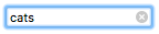
主要的基本差异在于浏览器处理它们的方式。首先要注意的是,某些浏览器会显示一个十字图标,如果需要,可以单击该图标立即删除搜索词,在 Chrome 中,按转义键也会触发此操作。以下截图来自 Chrome:
¥The main basic differences come in the way browsers handle them. The first thing to note is that some browsers show a cross icon that can be clicked on to remove the search term instantly if desired, in Chrome this action is also triggered when pressing escape. The following screenshot comes from Chrome:
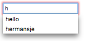
此外,现代浏览器还倾向于自动存储先前跨域输入的搜索词,然后在该域的搜索输入中执行后续搜索时,这些搜索词将作为自动补齐选项出现。这可以帮助那些倾向于随着时间的推移对相同或相似的搜索查询进行搜索的用户。此屏幕截图来自 Firefox:
¥In addition, modern browsers also tend to automatically store search terms previously entered across domains, which then come up as autocomplete options when subsequent searches are performed in search inputs on that domain. This helps users who tend to do searches on the same or similar search queries over time. This screenshot is from Firefox:
现在,让我们看看一些可以应用于搜索表单的有用技术。
¥At this point, let's look at some useful techniques you can apply to your search forms.
设置占位符
¥Setting placeholders
你可以在搜索输入中提供有用的占位符,该占位符可以提示如何使用 placeholder 属性。看下面的例子:
¥You can provide a useful placeholder inside your search input that could give a hint on what to do using the placeholder attribute. Look at the following example:
<form>
  <div>
    <input
      type="search"
      id="mySearch"
      name="q"
      placeholder="Search the site…" />
    <button>Search</button>
  </div>
</form>
你可以在下面看到占位符的呈现方式:
¥You can see how the placeholder is rendered below:
搜索表单标签和辅助功能
¥Search form labels and accessibility
搜索表单的一个问题是其可访问性。常见的设计实践是不为搜索字段提供标签(尽管可能有放大镜图标或类似图标),因为由于位置的原因,搜索表单的目的通常对于视力正常的用户来说相当明显(这个例子展示了一个典型的模式)。
¥One problem with search forms is their accessibility; a common design practice is not to provide a label for the search field (although there might be a magnifying glass icon or similar), as the purpose of a search form is normally fairly obvious for sighted users due to placement (this example shows a typical pattern).
然而,这可能会导致屏幕阅读器用户感到困惑,因为他们不会有任何关于搜索输入是什么的口头指示。解决此问题的一种不会影响视觉设计的方法是使用 WAI-ARIA 功能:
¥This could, however, cause confusion for screen reader users, since they will not have any verbal indication of what the search input is. One way around this that won't impact on your visual design is to use WAI-ARIA features:
<form>元素上值为search的role属性将导致屏幕阅读器宣布该表单是搜索表单。- 如果这还不够,你可以在
<input>本身上使用aria-label属性。这应该是一个描述性文本标签,将由屏幕阅读器读出;它用作<label>的非视觉等效项。
让我们看一个例子:
¥Let's have a look at an example:
<form role="search">
  <div>
    <input
      type="search"
      id="mySearch"
      name="q"
      placeholder="Search the site…"
      aria-label="Search through site content" />
    <button>Search</button>
  </div>
</form>
你可以在下面看到它是如何呈现的:
¥You can see how this is rendered below:
与前面的示例没有视觉差异,但屏幕阅读器用户可以获得更多信息。
¥There is no visual difference from the previous example, but screen reader users have way more information available to them.
注意:有关此类辅助功能的更多信息,请参阅 路标/地标。
¥Note: See Signposts/Landmarks for more information about such accessibility features.
物理输入元素大小
¥Physical input element size
输入框的物理尺寸可以使用 size 属性来控制。使用它,你可以指定输入框一次可以显示的字符数。例如,在此示例中,搜索框的宽度为 30 个字符:
¥The physical size of the input box can be controlled using the size attribute. With it, you can specify the number of characters the input box can display at a time. In this example, for instance, the search box is 30 characters wide:
<form>
  <div>
    <input
      type="search"
      id="mySearch"
      name="q"
      placeholder="Search the site…"
      size="30" />
    <button>Search</button>
  </div>
</form>
结果是这个更宽的输入框:
¥The result is this wider input box:
验证
¥Validation
search 类型的 <input> 元素具有与常规 text 输入相同的验证功能。你不太可能希望对搜索框使用一般验证功能。在许多情况下,应该允许用户搜索任何内容,但有一些情况需要考虑,例如针对已知格式的数据进行搜索。
¥<input> elements of type search have the same validation features available to them as regular text inputs. It is less likely that you'd want to use validation features in general for search boxes. In many cases, users should just be allowed to search for anything, but there are a few cases to consider, such as searches against data of a known format.
注意:HTML 表单验证不能替代确保输入数据格式正确的脚本。对于某人来说,对 HTML 进行调整以绕过验证或完全删除它太容易了。其他人也有可能完全绕过你的 HTML 并将数据直接提交到你的服务器。如果你的服务器端代码无法验证其接收到的数据,则当格式不正确的数据(或数据太大、类型错误等)输入数据库时,可能会发生灾难。
¥Note: HTML form validation is not a substitute for scripts that ensure that the entered data is in the proper format. It's far too easy for someone to make adjustments to the HTML that allow them to bypass the validation, or to remove it entirely. It's also possible for someone to bypass your HTML entirely and submit the data directly to your server. If your server-side code fails to validate the data it receives, disaster could strike when improperly-formatted data (or data which is too large, is of the wrong type, and so forth) is entered into your database.
关于样式的注意事项
¥A note on styling
有一些有用的伪类可用于设置有效/无效表单元素的样式::valid 和 :invalid。在本节中,我们将使用以下 CSS,它将在包含有效值的输入旁边放置一个检查(勾选),并在包含无效值的输入旁边放置一个十字。
¥There are useful pseudo-classes available for styling valid/invalid form elements: :valid and :invalid. In this section, we'll use the following CSS, which will place a check (tick) next to inputs containing valid values, and a cross next to inputs containing invalid values.
input:invalid ~ span::after {
  content: "✖";
  padding-left: 5px;
  position: absolute;
}

input:valid ~ span::after {
  content: "✓";
  padding-left: 5px;
  position: absolute;
}
该技术还要求将 <span> 元素放置在表单元素之后,该元素充当图标的支架。这是必要的,因为某些浏览器上的某些输入类型不能很好地显示直接放置在它们后面的图标。
¥The technique also requires a <span> element to be placed after the form element, which acts as a holder for the icons. This was necessary because some input types on some browsers don't display icons placed directly after them very well.
要求输入
¥Making input required
你可以使用 required 属性作为在允许表单提交之前输入所需值的简单方法:
¥You can use the required attribute as an easy way of making entering a value required before form submission is allowed:
<form>
  <div>
    <input
      type="search"
      id="mySearch"
      name="q"
      placeholder="Search the site…"
      required />
    <button>Search</button>
    <span class="validity"></span>
  </div>
</form>
input {
  margin-right: 10px;
}

input:invalid ~ span::after {
  content: "✖";
  padding-left: 5px;
  position: absolute;
}

input:valid ~ span::after {
  content: "✓";
  padding-left: 5px;
  position: absolute;
}
呈现如下:
¥This renders like so:
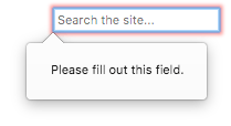
此外,如果你尝试提交未输入搜索词的表单,浏览器将显示一条消息。以下示例来自 Firefox:
¥In addition, if you try to submit the form with no search term entered into it, the browser will show a message. The following example is from Firefox:
当你尝试提交输入中包含不同类型的无效数据的表单时,将会显示不同的消息;请参阅下面的示例。
¥Different messages will be shown when you try to submit the form with different types of invalid data contained inside the inputs; see the below examples.
输入值长度
¥Input value length
你可以使用 minlength 属性指定输入值的最小长度(以字符为单位);同样,使用 maxlength 设置输入值的最大长度。
¥You can specify a minimum length, in characters, for the entered value using the minlength attribute; similarly, use maxlength to set the maximum length of the entered value.
下面的示例要求输入的值长度为 4-8 个字符。
¥The example below requires that the entered value be 4–8 characters in length.
<form>
  <div>
    <label for="mySearch">Search for user</label>
    <input
      type="search"
      id="mySearch"
      name="q"
      placeholder="User IDs are 4–8 characters in length"
      required
      size="30"
      minlength="4"
      maxlength="8" />
    <button>Search</button>
    <span class="validity"></span>
  </div>
</form>
input {
  margin-right: 10px;
}

input:invalid ~ span::after {
  content: "✖";
  padding-left: 5px;
  position: absolute;
}

input:valid ~ span::after {
  content: "✓";
  padding-left: 5px;
  position: absolute;
}
呈现如下:
¥This renders like so:
如果你尝试提交少于 4 个字符的表单,你将收到一条相应的错误消息(该消息因浏览器而异)。如果你尝试长度超过 8 个字符,浏览器将不允许你这样做。
¥If you try to submit the form with less than 4 characters, you'll be given an appropriate error message (which differs between browsers). If you try to go beyond 8 characters in length, the browser won't let you.
指定模式
¥Specifying a pattern
你可以使用 pattern 属性指定一个正则表达式,输入的值必须遵循该正则表达式才能被视为有效(有关简单的速成课程,请参阅 根据正则表达式进行验证)。
¥You can use the pattern attribute to specify a regular expression that the inputted value must follow to be considered valid (see Validating against a regular expression for a simple crash course).
让我们看一个例子。假设我们要提供一个产品 ID 搜索表单,ID 都是由两个字母后跟四个数字组成的代码。以下示例涵盖了它:
¥Let's look at an example. Say we wanted to provide a product ID search form, and the IDs were all codes of two letters followed by four numbers. The following example covers it:
<form>
  <div>
    <label for="mySearch">Search for product by ID:</label>
    <input
      type="search"
      id="mySearch"
      name="q"
      placeholder="two letters followed by four numbers"
      required
      size="30"
      pattern="[A-z]{2}[0-9]{4}" />
    <button>Search</button>
    <span class="validity"></span>
  </div>
</form>
input {
  margin-right: 10px;
}

input:invalid ~ span::after {
  content: "✖";
  padding-left: 5px;
  position: absolute;
}

input:valid ~ span::after {
  content: "✓";
  padding-left: 5px;
  position: absolute;
}
呈现如下:
¥This renders like so:
示例
¥Examples
你可以在我们的 website-aria-roles 示例 (现场观看) 中看到在上下文中使用的搜索表单的一个很好的示例。
¥You can see a good example of a search form used in context at our website-aria-roles example (see it live).
技术总结
¥Technical summary
| 值 | 表示搜索字段中包含的值的字符串。 | |
| 活动 | change 和 input |
|
| 支持的通用属性 |
autocomplete,
list,
maxlength,
minlength,
pattern,
placeholder,
required,
size.
|
|
| IDL 属性 | value |
|
| DOM 接口 | ||
| 方法 | select(), setRangeText(), setSelectionRange(). |
|
| 隐式 ARIA 角色 | 没有 list 属性: searchbox |
具有 list 属性: combobox |
规范
| Specification |
|---|
| HTML Standard # text-(type=text)-state-and-search-state-(type=search) |
浏览器兼容性
BCD tables only load in the browser
也可以看看
¥See also