<table>: The Table element
<table> HTML 元素表示表格数据,即二维表中呈现的信息,该二维表由包含数据的单元格的行和列组成。
¥The <table> HTML element represents tabular data—that is, information presented in a two-dimensional table comprised of rows and columns of cells containing data.
Try it
属性
已弃用的属性
¥Deprecated attributes
以下属性已被弃用,不应使用。下面记录了它们,供更新现有代码时参考,并且仅供历史参考。
¥The following attributes are deprecated and should not be used. They are documented below for reference when updating existing code and for historical interest only.
alignDeprecated-
指定表格在其父元素内的水平对齐方式。可能的 enumerated 值为
left、center和right。请改用margin-inline-start和margin-inline-endCSS 属性,因为此属性已弃用。 bgcolorDeprecated-
定义表格的背景颜色。该值是 HTML 颜色;6 位十六进制 RGB 代码(前缀为“
#”)或 颜色关键词。不支持其他 CSS<color>值。请改用background-colorCSS 属性,因为此属性已弃用。 borderDeprecated-
将表格周围框架的大小定义为非负整数值(以像素为单位)。如果设置为
0,则frame属性设置为 void。请改用borderCSS 属性,因为此属性已弃用。 cellpaddingDeprecated-
定义单元格内容与其边框之间的空间。该属性已过时:不要使用它,而是将
paddingCSS 属性应用于<th>和<td>元素。 cellspacingDeprecated-
定义两个单元之间的空间大小。该属性已过时:不要使用它,而是在
<table>元素上设置border-spacingCSS 属性。请注意,如果<table>元素的border-collapseCSS 属性设置为collapse,则此操作无效。 frameDeprecated-
定义必须显示表格周围框架的哪一侧。可能的 enumerated 值为
void、above、below、hsides、vsides、lhs、rhs、box和border。请改用border-style和border-widthCSS 属性,因为此属性已弃用。 rulesDeprecated-
定义规则(边框)在表中的显示位置。可能的 enumerated 值为
none(默认值)、groups(<thead>、<tbody>和<tfoot>元素)、rows(水平线)、cols(垂直线)和all(每个单元格周围的边框)。请在适当的表相关元素以及<table>本身上使用borderCSS 属性,因为此属性已弃用。 summaryDeprecated-
定义总结表格内容的替代文本。请改用
<caption>元素,因为此属性已弃用。 widthDeprecated-
指定表格的宽度。请改用
widthCSS 属性,因为此属性已弃用。注意:虽然没有 HTML 规范将
height包含为<table>属性,但某些浏览器支持height的非标准解释。无单位值设置最小绝对高度(以像素为单位)。如果设置为百分比值,则最小表格高度将相对于父容器的高度。请改用min-heightCSS 属性,因为此属性已弃用。¥Note: While no HTML specification includes
heightas a<table>attribute, some browsers support a non-standard interpretation ofheight. The unitless value sets a minimum absolute height in pixels. If set as a percent value, the minimum table height will be relative to the parent container's height. Use themin-heightCSS property instead, as this attribute is deprecated.
表格内容的视觉布局
¥Visual layout of table contents
以下元素是表结构的一部分:
¥Following elements are part of the table structure:
<table> 框建立表格格式化上下文。<table> 内的元素生成矩形框。每个框根据以下规则占用多个表格单元格:
¥The <table> box establishes a table formatting context. Elements inside the <table> generate rectangular boxes. Each box occupies a number of table cells according to the following rules:
- 行框按照源代码顺序从上到下填充表格。每个行框占据一行单元格。
- 一个行组框占用一个或多个行框。
- 列框按源代码顺序彼此相邻放置。根据
dir属性的值,列按从左到右或从右到左的方向放置。列框占据一列或多列表格单元格。 - 一个列组框占用一个或多个列框。
- 单元格框可以跨越多行和多列。用户代理修剪单元格以适合可用的行数和列数。
表格单元格确实有填充。组成表格的框没有边距。
¥Table cells do have padding. Boxes that make up a table do not have margins.
表格图层和透明度
¥Table layers and transparency
出于样式目的,可以将表格元素视为放置在六个叠加层上:
¥For styling purpose the table elements may be thought of as being put on six superimposed layers:
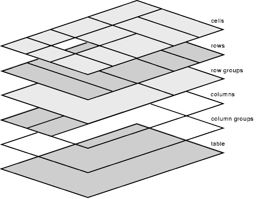
仅当其上方的图层具有透明背景时,在一层中的元素上设置的背景才可见。丢失的单元格将被呈现,就像匿名表格单元格框占据了该位置一样。
¥The background set on an element in one layer will be visible only if the layers above it have transparent background. A missing cell is rendered as if an anonymous table-cell box occupied that place.
无障碍
字幕
¥Captions
通过提供一个 <caption> 元素,其值清楚、简洁地描述了表格的用途,它可以帮助人们决定是否需要检查表格的其余内容或跳过它。
¥By supplying a <caption> element whose value clearly and concisely describes the table's purpose, it helps the people decide if they need to check the rest of the table content or skip over it.
这可以帮助人们借助屏幕阅读器等辅助技术、视力低下的人和有认知问题的人进行导航。
¥This helps people navigating with the aid of assistive technology such as a screen reader, people experiencing low vision conditions, and people with cognitive concerns.
确定行和列的范围
¥Scoping rows and columns
标题单元格(<th> 元素)上的 scope 属性在简单上下文中是多余的,因为范围是推断出来的。但是,某些辅助技术可能无法得出正确的推论,因此指定标头范围可能会改善用户体验。在复杂的表格中,可以指定 scope 以提供与标题相关的单元格的必要信息。
¥The scope attribute on header cells (<th> elements) is redundant in simple contexts, because scope is inferred. However, some assistive technologies may fail to draw correct inferences, so specifying header scope may improve user experiences. In complex tables, scope can be specified to provide necessary information about the cells related to a header.
复杂的表格
¥Complicated tables
屏幕阅读器等辅助技术可能难以解析过于复杂的表格,以至于标题单元格无法以严格的水平或垂直方式关联。这通常由 colspan 和 rowspan 属性的存在来指示。
¥Assistive technologies such as screen readers may have difficulty parsing tables that are so complex that header cells can't be associated in a strictly horizontal or vertical way. This is typically indicated by the presence of the colspan and rowspan attributes.
理想情况下,请考虑采用其他方式来呈现表的内容,包括将其分解为一组较小的相关表,这些表不必依赖于使用 colspan 和 rowspan 属性。除了帮助使用辅助技术的人理解表格的内容之外,这还可能使有认知问题的人受益,因为他们可能难以理解表格布局所描述的关联。
¥Ideally, consider alternate ways to present the table's content, including breaking it apart into a collection of smaller, related tables that don't have to rely on using the colspan and rowspan attributes. In addition to helping people who use assistive technology understand the table's content, this may also benefit people with cognitive concerns who may have difficulty understanding the associations the table layout is describing.
如果无法拆分表格,请使用 id 和 headers 属性的组合以编程方式将每个表格单元格与单元格关联的标题(<th> 元素)关联起来。
¥If the table cannot be broken apart, use a combination of the id and headers attributes to programmatically associate each table cell with the header(s) (<th> elements) the cell is associated with.
示例
¥Examples
下面的示例包括复杂性逐渐增加的表格。有关其他示例(包括深入教程),请参阅 学习网络开发 区域中的 HTML 表格 系列,你将在其中学习如何使用表元素及其属性来正确构建表格数据。样式表 指南提供了表格样式信息,包括常见、有用的技术。
¥The examples below include tables of progressively increasing complexity. For additional examples, including an in-depth tutorial, see the HTML tables series in the Learn web development area, where you'll learn how to use the table elements and their attributes to correctly structure your tabular data. A Styling tables guide provides table styling information, including common, useful techniques.
由于 <table> 的结构涉及使用多个与表相关的 HTML 元素以及各种关联属性,因此以下示例旨在提供涵盖基础知识和通用标准的简化说明。其他和更详细的信息可以在相应的链接页面上找到。
¥Since the structure of a <table> involves the use of several table-related HTML elements along with various associated attributes, the following examples are intended to provide a simplified explanation that covers the basics and common standards. Additional and more detailed information can be found on the corresponding linked pages.
这些表格示例演示了如何创建使用 HTML 构建并使用 CSS 设计样式的 accessible 表。
¥These table examples demonstrate how to create an accessible table that is structured with HTML and styled with CSS.
由于 HTML 表的结构,markup 可以快速增长。因此,明确定义表格的用途和最终外观以创建适当的结构非常重要。使用 semantic 标记开发的逻辑结构不仅更易于设计样式,而且支持每个人(包括搜索引擎和辅助技术用户)都可以理解和导航的有用且可访问的表格。
¥Because of how HTML tables are structured, the markup can quickly grow. For this reason, it is important to clearly define the table's purpose and final appearance to create the appropriate structure. A logical structure developed with semantic markup is not only easier to style, but enables useful and accessible tables that can be understood and navigated by everyone, including search engines and users of assistive technologies.
第一个示例是基本的,后续示例会变得越来越复杂。首先,我们将为表格开发一个非常基本的 HTML 表格结构。前两个示例不包含表格部分组,例如定义的头部、主体或脚部,并且不涉及单元格跨越或显式定义的单元格关系。甚至没有提供标题。当我们完成这些示例时,它们将逐步增强,以包含复杂数据表应具备的所有表功能。
¥The first example is basic, with subsequent examples growing in complexity. First, we will develop a very basic HTML table structure for the table. The first two examples contain no table section groups such as a defined head, body, or foot, and involve no cell spanning or explicitly defined cell relationships. Not even a caption is provided. As we work through the examples, they will be progressively enhanced to include all the table features that a complex data table should possess.
基本表
¥Basic table
此示例包括一个非常基本的三行两列表。为了演示默认的浏览器表格样式,本示例中未包含任何 CSS。
¥This example includes a very basic table with three rows and two columns. To demonstrate default browser table styles, no CSS has been included in this example.
HTML
表行由 <tr> 元素定义,列由表标题和其中的数据单元定义。第一行包含用作数据单元格(<td> 元素)的列标题的标题单元格(<th> 元素)。每行的每个元素(<th> 或 <td>)位于其各自的列中,即,行的第一个元素位于第一列中,该行的第二个元素位于第二列中。
¥The table rows are defined with <tr> elements, and the columns are defined with table header and data cells within them. The first row contains the header cells (<th> elements) that serve as column headers for the data cells (<td> elements). Each element (<th> or <td>) per row is in its respective column—that is, the first element of a row is in the first column, and the second element of that row is in the second column.
<table>
  <tr>
    <th>名称</th>
    <th>年龄</th>
  </tr>
  <tr>
    <td>玛丽亚·桑切斯</td>
    <td>28</td>
  </tr>
  <tr>
    <td>迈克尔·约翰逊</td>
    <td>34</td>
  </tr>
</table>
结果
¥Result
没有自定义 CSS 或 用户样式表 应用于此表。造型纯粹源自 用户代理样式表。
¥There is no custom CSS or user stylesheet applied to this table. The styling results purely from the user-agent stylesheet.
带有标题单元格的扩展表格
¥Expanded table with header cells
本示例扩展了 基本表,扩展了内容并添加了基本的 CSS 样式。
¥This example extends the basic table, extending the content and adding basic CSS styles.
HTML
该表现在包含四行(<tr> 元素),每行四列。第一行是一行标题单元格(第一行仅包含 <th> 个元素)。后续行包括标题列(<th> 元素作为每行的第一个子元素)和三个数据列(<td> 元素)。由于不使用表分段元素,浏览器会自动定义内容组结构,即所有行都包含在隐式 <tbody> 元素的表主体内。
¥The table comprises four rows (<tr> elements) now, with four columns each. The first row is a row of header cells (The first row contains only <th> elements). Subsequent rows include a header column (<th> elements as the first child elements of each row) and three data columns (<td> elements). As table sectioning elements are not used, the browser automatically defines the content group structure, i.e., all rows are wrapped within the body of the table of an implicit <tbody> element.
<table>
  <tr>
    <th>名称</th>
    <th>ID</th>
    <th>会员自</th>
    <th>平衡</th>
  </tr>
  <tr>
    <th>玛格丽特·阮</th>
    <td>427311</td>
    <td><time datetime="2010-06-03">2010 年 6 月 3 日</time></td>
    <td>0.00</td>
  </tr>
  <tr>
    <th>爱德华·加林斯基</th>
    <td>533175</td>
    <td><time datetime="2011-01-13">2011 年 1 月 13 日</time></td>
    <td>37.00</td>
  </tr>
  <tr>
    <th>中村星</th>
    <td>601942</td>
    <td><time datetime="2012-07-23">2012 年 7 月 23 日</time></td>
    <td>15.00</td>
  </tr>
</table>
CSS
通过 CSS,我们提供了基本样式来在表格组件周围创建线条,以使数据结构更加清晰。CSS 在 <table> 周围和每个表格单元格(包括使用 <th> 和 <td> 元素指定的单元格)周围添加实心边框,以划分每个标题和数据单元格。
¥With CSS, we provide the basic styling to create lines around the components of the table to make the data structure clearer. The CSS adds a solid border around the <table> and around each of the table's cells, including those specified with both <th> and <td> elements, demarcating every header and data cells.
table {
  border: 2px solid rgb(140 140 140);
}

th,
td {
  border: 1px solid rgb(160 160 160);
}
结果
¥Result
指定表格单元格关系
¥Specifying table cell relations
在继续以更高级的方式扩展表格之前,建议通过定义标题和数据单元格(<th> 和 <td> 元素)之间的关系来改进 accessibility。
¥Before moving on to extend the table in more advanced ways, it's advisable to improve accessibility by defining relationships between the header and data cells (<th> and <td> elements).
HTML
这是通过在 <th> 元素上引入 scope 属性并将值设置为相应的 col(列)或 row 值来实现的。
¥This is accomplished by introducing the scope attribute on the <th> elements and setting the values to the corresponding col (column) or row value.
<table>
  <tr>
    <th scope="col">名称</th>
    <th scope="col">ID</th>
    <th scope="col">会员自</th>
    <th scope="col">平衡</th>
  </tr>
  <tr>
    <th scope="row">玛格丽特·阮</th>
    <td>427311</td>
    <td><time datetime="2010-06-03">2010 年 6 月 3 日</time></td>
    <td>0.00</td>
  </tr>
  <tr>
    <th scope="row">爱德华·加林斯基</th>
    <td>533175</td>
    <td><time datetime="2011-01-13">2011 年 1 月 13 日</time></td>
    <td>37.00</td>
  </tr>
  <tr>
    <th scope="row">中村星</th>
    <td>601942</td>
    <td><time datetime="2012-07-23">2012 年 7 月 23 日</time></td>
    <td>15.00</td>
  </tr>
</table>
CSS 和视觉结果保持不变,这种调整为辅助技术(例如屏幕阅读器)提供了有价值的上下文信息,以帮助识别标题与哪些单元格相关。
¥The CSS and visual result are unchanged—the adaptation provides valuable contextual information for assistive technologies such as screen readers to help identify which cells the headers relate to.
注意:如果表结构更加复杂,则在
<th>和<td>元素上(额外)使用headers属性可以提高可访问性并帮助辅助技术识别单元格之间的关系;见 复杂的表格。¥Note: If the table structure is even more complex, the (additional) use of the
headersattribute on the<th>and<td>elements may improve accessibility and help assistive technologies identify the relationships between cells; see Complicated tables.
显式指定表节组
¥Explicitly specifying table section groups
除了通过 指定单元关系 提高可访问性之外,还可以通过引入表节组来提高表的 semantics。
¥In addition to improving accessibility by specifying cell relations, the semantics of the table can be improved by introducing table section groups.
HTML
由于第一行(<tr> 元素)仅包含列标题单元格并为表的其余内容提供标题,因此可以将其包含在 <thead> 元素中以显式指定该行作为表的标题部分。此外,浏览器自动补齐的工作也可以显式定义 - 表的主体部分包含表的主要数据,通过将相应的行括在 <tbody> 元素中来指定。显式使用 <tbody> 元素有助于浏览器创建预期的表结构,避免出现不需要的结果。
¥Since the first row (<tr> element) contains only column header cells and provides the header for the rest of the table's contents, it can be enclosed in the <thead> element to explicitly specify that row as the head section of the table. Moreover, what is automatically accomplished by the browser can also be defined explicitly—the body section of the table, which contains the main data of the table, is specified by enclosing the corresponding rows in the <tbody> element. The explicit use of the <tbody> element helps the browser to create the intended table structure, avoiding unwanted results.
<table>
  <thead>
    <tr>
      <th scope="col">名称</th>
      <th scope="col">ID</th>
      <th scope="col">会员自</th>
      <th scope="col">平衡</th>
    </tr>
  </thead>
  <tbody>
    <tr>
      <th scope="row">玛格丽特·阮</th>
      <td>427311</td>
      <td><time datetime="2010-06-03">2010 年 6 月 3 日</time></td>
      <td>0.00</td>
    </tr>
    <tr>
      <th scope="row">爱德华·加林斯基</th>
      <td>533175</td>
      <td><time datetime="2011-01-13">2011 年 1 月 13 日</time></td>
      <td>37.00</td>
    </tr>
    <tr>
      <th scope="row">中村星</th>
      <td>601942</td>
      <td><time datetime="2012-07-23">2012 年 7 月 23 日</time></td>
      <td>15.00</td>
    </tr>
  </tbody>
</table>
再次,CSS 和视觉结果保持不变 - 指定这样的表格部分组为辅助技术(包括屏幕阅读器和搜索引擎)以及 CSS 中的样式提供了有价值的上下文信息,这将在后面的示例中显示。
¥Once again, the CSS and visual result are unchanged—specifying such table section groups provides valuable contextual information for assistive technologies, including screen readers and search engines, as well as for styling in the CSS, which will be shown in a later example.
列和行跨越
¥Column and row spanning
在此示例中,我们通过添加列并引入多行头部部分来进一步扩展表格。
¥In this example, we extend the table even more by adding a column and introducing a multi-row head section.
HTML
在迄今为止创建的表的基础上,在每个正文行中添加了一个 "会员资格结束日期" 的新列以及 <td> 元素。还在头部(<thead> 元素)内添加了附加行(<tr> 元素),以引入 "会员日期" 标题作为 "已加入" 和 "取消" 列的标题。
¥Building on the table created so far, a new column for a "Membership End Date" is added in each body row with the <td> element. An additional row (<tr> element) is also added within the head section (<thead> element) to introduce a "Membership Dates" header as a heading for the "Joined" and "Canceled" columns.
第二个标题行的创建涉及将 colspan 和 rowspan 属性添加到 <th> 元素,以将标题单元格分配到正确的列和行。
¥The creation of the second header row involves adding colspan and rowspan attributes to the <th> elements to allocate the header cells to the correct columns and rows.
<table>
  <thead>
    <tr>
      <th scope="col" rowspan="2">名称</th>
      <th scope="col" rowspan="2">ID</th>
      <th scope="col" colspan="2">会员日期</th>
      <th scope="col" rowspan="2">平衡</th>
    </tr>
    <tr>
      <th scope="col">已加入</th>
      <th scope="col">取消</th>
    </tr>
  </thead>
  <tbody>
    <tr>
      <th scope="row">玛格丽特·阮</th>
      <td>427311</td>
      <td><time datetime="2010-06-03">2010 年 6 月 3 日</time></td>
      <td>n/a</td>
      <td>0.00</td>
    </tr>
    <tr>
      <th scope="row">爱德华·加林斯基</th>
      <td>533175</td>
      <td><time datetime="2011-01-13">2011 年 1 月 13 日</time></td>
      <td><time datetime="2017-04-08">2017 年 4 月 8 日</time></td>
      <td>37.00</td>
    </tr>
    <tr>
      <th scope="row">中村星</th>
      <td>601942</td>
      <td><time datetime="2012-07-23">2012 年 7 月 23 日</time></td>
      <td>n/a</td>
      <td>15.00</td>
    </tr>
  </tbody>
</table>
table {
  border: 2px solid rgb(140 140 140);
}

th,
td {
  border: 1px solid rgb(160 160 160);
}
结果
¥Result
头部现在有两行,第一行包含标题(<th> 元素)"名称"、"ID"、"会员日期" 和 "平衡",第二行包含 "会员日期" 标题,其中包含两个子标题:"已加入" 和 "取消"。这是通过以下方式完成的:
¥The head section now has two rows, one with the headers (<th> elements) "Name", "ID", "Membership Dates", and "Balance", and a "Membership Dates" header with two subheaders that are in a second row: "Joined" and "Canceled". This is accomplished by:
表格标题和列摘要
¥Table caption and column summary
提供表格内容的摘要是一种常见且明智的做法,使用户能够快速确定表格的相关性。此外,"平衡" 列通过显示各个成员的余额总和进行汇总。
¥It's a common and advisable practice to provide a summary for the table's content, allowing users to quickly determine the table's relevance. Furthermore, the "Balance" column is summarized by displaying the sum of the balances of the individual members.
HTML
通过使用表 caption(<caption> 元素)作为 <table> 的第一个子元素来添加表摘要。标题提供了表格的 accessible description。
¥A table summary is added by using a table caption (<caption> element) as the first child element of the <table>. The caption provides the accessible description for the table.
最后,在正文下方添加一个表脚部分(<tfoot> 元素),其中一行通过显示总和来总结 "平衡" 列。应用前面介绍的元素和属性。
¥Lastly, a table foot section (<tfoot> element) is added below the body, with a row that summarizes the "Balance" column by displaying a sum. The elements and attributes introduced earlier are applied.
<table>
  <caption>
    Status of the club members 2021
  </caption>
  <thead>
    <tr>
      <th scope="col" rowspan="2">名称</th>
      <th scope="col" rowspan="2">ID</th>
      <th scope="col" colspan="2">会员日期</th>
      <th scope="col" rowspan="2">平衡</th>
    </tr>
    <tr>
      <th scope="col">已加入</th>
      <th scope="col">取消</th>
    </tr>
  </thead>
  <tbody>
    <tr>
      <th scope="row">玛格丽特·阮</th>
      <td>427311</td>
      <td><time datetime="2010-06-03">2010 年 6 月 3 日</time></td>
      <td>n/a</td>
      <td>0.00</td>
    </tr>
    <tr>
      <th scope="row">爱德华·加林斯基</th>
      <td>533175</td>
      <td><time datetime="2011-01-13">2011 年 1 月 13 日</time></td>
      <td><time datetime="2017-04-08">2017 年 4 月 8 日</time></td>
      <td>37.00</td>
    </tr>
    <tr>
      <th scope="row">中村星</th>
      <td>601942</td>
      <td><time datetime="2012-07-23">2012 年 7 月 23 日</time></td>
      <td>n/a</td>
      <td>15.00</td>
    </tr>
  </tbody>
  <tfoot>
    <tr>
      <th scope="row" colspan="4">总余额</th>
      <td>52.00</td>
    </tr>
  </tfoot>
</table>
table {
  border: 2px solid rgb(140 140 140);
}

th,
td {
  border: 1px solid rgb(160 160 160);
}
结果
¥Result
基本表格样式
¥Basic table styling
让我们对表格应用基本样式来调整字体,并向头行和脚行添加 background-color。这次 HTML 没有改变,所以让我们直接进入 CSS。
¥Let's apply a basic style to the table to adjust the typeface and add a background-color to the head and foot rows. The HTML is unchanged this time, so let's dive right into the CSS.
<table>
  <caption>
    Status of the club members 2021
  </caption>
  <thead>
    <tr>
      <th scope="col" rowspan="2">名称</th>
      <th scope="col" rowspan="2">ID</th>
      <th scope="col" colspan="2">会员日期</th>
      <th scope="col" rowspan="2">平衡</th>
    </tr>
    <tr>
      <th scope="col">已加入</th>
      <th scope="col">取消</th>
    </tr>
  </thead>
  <tbody>
    <tr>
      <th scope="row">玛格丽特·阮</th>
      <td>427311</td>
      <td><time datetime="2010-06-03">2010 年 6 月 3 日</time></td>
      <td>n/a</td>
      <td>0.00</td>
    </tr>
    <tr>
      <th scope="row">爱德华·加林斯基</th>
      <td>533175</td>
      <td><time datetime="2011-01-13">2011 年 1 月 13 日</time></td>
      <td><time datetime="2017-04-08">2017 年 4 月 8 日</time></td>
      <td>37.00</td>
    </tr>
    <tr>
      <th scope="row">中村星</th>
      <td>601942</td>
      <td><time datetime="2012-07-23">2012 年 7 月 23 日</time></td>
      <td>n/a</td>
      <td>15.00</td>
    </tr>
  </tbody>
  <tfoot>
    <tr>
      <th scope="row" colspan="4">总余额</th>
      <td>52.00</td>
    </tr>
  </tfoot>
</table>
CSS
虽然此处将 font 属性添加到 <table> 元素以设置更具视觉吸引力的字体(或令人讨厌的无衬线字体,具体取决于你个人的意见),但有趣的部分是第二种样式,其中 <tr> 元素位于 <thead> 内 和 <tfoot> 的款式添加了浅蓝色的 background-color。这是一种同时快速将背景颜色应用于特定部分中的所有单元格的方法。
¥While a font property is added to the <table> element here to set a more visually appealing typeface (or an abominable sans-serif typeface, depending on your personal opinion), the interesting part is the second style, where the <tr> elements located within the <thead> and <tfoot> are styled adding a light blue background-color. This is a way to quickly apply a background color to all the cells in specific sections simultaneously.
table {
  border: 2px solid rgb(140 140 140);
  font:
    16px "Open Sans",
    Helvetica,
    Arial,
    sans-serif;
}

thead > tr,
tfoot > tr {
  background-color: rgb(228 240 245);
}

th,
td {
  border: 1px solid rgb(160 160 160);
}
结果
¥Result
高级表格样式
¥Advanced table styling
现在我们将全力以赴,在标题和正文区域的行上设置样式,包括交替行颜色、根据行内位置使用不同颜色的单元格等等。我们先来看看这次的结果。
¥Now we'll go all-out, with styles on rows in the header and body areas both, including alternating row colors, cells with different colors depending on position within a row, and so forth. Let's take a look at the result first this time.
结果
¥Result
决赛桌如下:
¥Here's what the final table will look like:
HTML 不再发生变化。看看正确准备 HTML 结构可以做什么?
¥There is no change to the HTML again. See what proper preparation of the HTML structure can do?
<table>
  <caption>
    Status of the club members 2021
  </caption>
  <thead>
    <tr>
      <th scope="col" rowspan="2">名称</th>
      <th scope="col" rowspan="2">ID</th>
      <th scope="col" colspan="2">会员日期</th>
      <th scope="col" rowspan="2">平衡</th>
    </tr>
    <tr>
      <th scope="col">已加入</th>
      <th scope="col">取消</th>
    </tr>
  </thead>
  <tbody>
    <tr>
      <th scope="row">玛格丽特·阮</th>
      <td>427311</td>
      <td><time datetime="2010-06-03">2010 年 6 月 3 日</time></td>
      <td>n/a</td>
      <td>0.00</td>
    </tr>
    <tr>
      <th scope="row">爱德华·加林斯基</th>
      <td>533175</td>
      <td><time datetime="2011-01-13">2011 年 1 月 13 日</time></td>
      <td><time datetime="2017-04-08">2017 年 4 月 8 日</time></td>
      <td>37.00</td>
    </tr>
    <tr>
      <th scope="row">中村星</th>
      <td>601942</td>
      <td><time datetime="2012-07-23">2012 年 7 月 23 日</time></td>
      <td>n/a</td>
      <td>15.00</td>
    </tr>
  </tbody>
  <tfoot>
    <tr>
      <th scope="row" colspan="4">总余额</th>
      <td>52.00</td>
    </tr>
  </tfoot>
</table>
CSS
这次 CSS 的参与程度要高得多。这并不复杂,但是发生了很多事情。让我们来分解一下。
¥The CSS is much more involved this time. It's not complicated, but there's a lot going on. Let's break it down.
这里添加了 border-collapse 和 border-spacing 属性,以消除单元格之间的间距,并将彼此接触的边框折叠为单个边框,而不是形成双边框。此外,使用 caption-side 属性将 <caption> 放置在表的 bottom 处:
¥Here the border-collapse and border-spacing properties are added to eliminate spacing between cells and collapse borders that touch one another to be a single border instead of winding up with double borders. Additionally, the <caption> is placed at the bottom of the table using the caption-side property:
table {
  border-collapse: collapse;
  border-spacing: 0;
  border: 2px solid rgb(140 140 140);
  font:
    16px "Open Sans",
    Helvetica,
    Arial,
    sans-serif;
}

caption {
  caption-side: bottom;
  padding: 10px;
  font-weight: bold;
}
接下来,padding 属性用于为所有表格单元格的内容周围留出空间。vertical-align 属性将标题单元格的内容与单元格的 bottom 对齐,这可以在跨越两行的标题单元格上看到:
¥Next, the padding property is used to give all the table cells space around their content. The vertical-align property aligns the content of the header cells to the bottom of the cell, which can be seen on the cells in the head that span two rows:
th,
td {
  border: 1px solid rgb(160 160 160);
  padding: 4px 6px;
}

th {
  vertical-align: bottom;
}
下一个 CSS 规则设置表头中所有 <tr> 元素的 background-color(如使用 <thead> 指定的)。然后头部的底部边框设置为两像素宽的线。但请注意,我们使用 :nth-of-type 选择器将 border-bottom 属性应用到头部的第二行。为什么?因为头部由两行组成,其中一些细胞横跨两行。这意味着那里实际上有两行;将样式应用于第一行不会给我们预期的结果:
¥The next CSS rule sets the background-color of all <tr> elements in the table's head (as specified using <thead>). Then the bottom border of the head is set to be a two-pixel wide line. Notice, however, that we're using the :nth-of-type selector to apply the border-bottom property to the second row in the head. Why? Because the head is made of two rows that are spanned by some of the cells. That means there are actually two rows there; applying the style to the first row would not give us the expected result:
thead > tr {
  background-color: rgb(228 240 245);
}

thead > tr:nth-of-type(2) {
  border-bottom: 2px solid rgb(140 140 140);
}
让我们用绿色和红色来设置两个标题单元格 "已加入" 和 "取消" 的样式,以代表新会员的 "good" 和已取消会员的 "bummer"。在这里,我们使用 :last-of-type 选择器深入研究表格头部的最后一行,并将其中的第一个标题单元格("已加入" 标题)设置为绿色,将其中的第二个标题单元格("取消" 标题)设置为红色:
¥Let's style the two header cells "Joined" and "Canceled" with green and red hues to represent the "good" of a new member and the "bummer" of a canceled membership. Here we dig into the last row of the table's head section using the :last-of-type selector and give the first header cell in it (the "Joined" header) a greenish color, and the second header cell in it (the "Canceled" header) a reddish hue:
thead > tr:last-of-type > th:nth-of-type(1) {
  background-color: rgb(225 255 225);
}

thead > tr:last-of-type > th:nth-of-type(2) {
  background-color: rgb(255 225 225);
}
由于第一列也应该突出,因此这里也添加了一些自定义样式。此 CSS 规则使用 text-align 属性对表主体每行中的第一个标题单元格进行样式设置,以使成员名称左对齐,并使用稍有不同的 background-color:
¥Since the first column should stand out as well, some custom styling is added here too. This CSS rule styles the first header cell in each row of the table's body with the text-align property to left-justify the member names, and with a somewhat different background-color:
tbody > tr > th:first-of-type {
  text-align: left;
  background-color: rgb(225 229 244);
}
通过交替行颜色来帮助提高表数据的可读性是很常见的,这有时称为 "斑马条纹"。让我们向每个偶数行添加一点 background-color:
¥It's common to help improve the readability of table data by alternating row colors—this is sometimes referred to as "zebra striping". Let's add a bit of background-color to every even row:
tbody > tr:nth-of-type(even) {
  background-color: rgb(237 238 242);
}
由于右对齐表格中的货币值是标准做法,因此我们在这里这样做。这只是将每个正文行中最后一个 <td> 的 text-align 属性设置为 right:
¥Since it's standard practice to right-justify currency values in tables, let's do that here. This just sets the text-align property for the last <td> in each body row to right:
tbody > tr > td:last-of-type {
  text-align: right;
}
最后,一些类似于头部的样式被应用到表格的脚部部分,以使其也脱颖而出:
¥Finally, some styling similar to the head is applied to the foot section of the table to make it stand out as well:
tfoot > tr {
  border-top: 2px dashed rgb(140 140 140);
  background-color: rgb(228 240 245);
}

tfoot th,
tfoot td {
  text-align: right;
  font-weight: bold;
}
在小空间中展示大表格
¥Displaying large tables in small spaces
Web 上的表格的一个常见问题是,当内容量很大时,它们在小屏幕上的工作效果不佳,并且使它们可滚动的方法并不明显,尤其是当标记可能来自 CMS 时 并且不能修改为具有封装器。
¥A common issue with tables on the web is that they don't natively work very well on small screens when the amount of content is large, and the way to make them scrollable isn't obvious, especially when the markup may come from a CMS and cannot be modified to have a wrapper.
此示例提供了一种在小空间中显示表格的方法。我们隐藏了 HTML 内容,因为它非常大,而且没有什么值得注意的地方。在此示例中检查 CSS 更有用。
¥This example provides one way to display tables in small spaces. We've hidden the HTML content as it is very large, and there is nothing remarkable about it. The CSS is more useful to inspect in this example.
<table>
  <thead>
    <tr>
      <th>1<sup>3</sup> equals:
      <th>2<sup>3</sup> equals:
      <th>3<sup>3</sup> equals:
      <th>4<sup>3</sup> equals:
      <th>5<sup>3</sup> equals:
      <th>6<sup>3</sup> equals:
      <th>7<sup>3</sup> equals:
  <tbody>
    <tr>
      <td>row 1: 1
      <td>row 1: 8
      <td>row 1: 27
      <td>row 1: 64
      <td>row 1: 125
      <td>row 1: 216
      <td>row 1: 343
    <tr>
      <td>row 2: 1
      <td>row 2: 8
      <td>row 2: 27
      <td>row 2: 64
      <td>row 2: 125
      <td>row 2: 216
      <td>row 2: 343
    <tr>
      <td>row 3: 1
      <td>row 3: 8
      <td>row 3: 27
      <td>row 3: 64
      <td>row 3: 125
      <td>row 3: 216
      <td>row 3: 343
    <tr>
      <td>row 4: 1
      <td>row 4: 8
      <td>row 4: 27
      <td>row 4: 64
      <td>row 4: 125
      <td>row 4: 216
      <td>row 4: 343
    <tr>
      <td>row 5: 1
      <td>row 5: 8
      <td>row 5: 27
      <td>row 5: 64
      <td>row 5: 125
      <td>row 5: 216
      <td>row 5: 343
    <tr>
      <td>row 6: 1
      <td>row 6: 8
      <td>row 6: 27
      <td>row 6: 64
      <td>row 6: 125
      <td>row 6: 216
      <td>row 6: 343
    <tr>
      <td>row 7: 1
      <td>row 7: 8
      <td>row 7: 27
      <td>row 7: 64
      <td>row 7: 125
      <td>row 7: 216
      <td>row 7: 343
    <tr>
      <td>row 8: 1
      <td>row 8: 8
      <td>row 8: 27
      <td>row 8: 64
      <td>row 8: 125
      <td>row 8: 216
      <td>row 8: 343
    <tr>
      <td>row 9: 1
      <td>row 9: 8
      <td>row 9: 27
      <td>row 9: 64
      <td>row 9: 125
      <td>row 9: 216
      <td>row 9: 343
    <tr>
      <td>row 10: 1
      <td>row 10: 8
      <td>row 10: 27
      <td>row 10: 64
      <td>row 10: 125
      <td>row 10: 216
      <td>row 10: 343
    <tr>
      <td>row 11: 1
      <td>row 11: 8
      <td>row 11: 27
      <td>row 11: 64
      <td>row 11: 125
      <td>row 11: 216
      <td>row 11: 343
    <tr>
      <td>row 12: 1
      <td>row 12: 8
      <td>row 12: 27
      <td>row 12: 64
      <td>row 12: 125
      <td>row 12: 216
      <td>row 12: 343
    <tr>
      <td>row 13: 1
      <td>row 13: 8
      <td>row 13: 27
      <td>row 13: 64
      <td>row 13: 125
      <td>row 13: 216
      <td>row 13: 343
    <tr>
      <td>row 14: 1
      <td>row 14: 8
      <td>row 14: 27
      <td>row 14: 64
      <td>row 14: 125
      <td>row 14: 216
      <td>row 14: 343
    <tr>
      <td>row 15: 1
      <td>row 15: 8
      <td>row 15: 27
      <td>row 15: 64
      <td>row 15: 125
      <td>row 15: 216
      <td>row 15: 343
    <tr>
      <td>row 16: 1
      <td>row 16: 8
      <td>row 16: 27
      <td>row 16: 64
      <td>row 16: 125
      <td>row 16: 216
      <td>row 16: 343
    <tr>
      <td>row 17: 1
      <td>row 17: 8
      <td>row 17: 27
      <td>row 17: 64
      <td>row 17: 125
      <td>row 17: 216
      <td>row 17: 343
    <tr>
      <td>row 18: 1
      <td>row 18: 8
      <td>row 18: 27
      <td>row 18: 64
      <td>row 18: 125
      <td>row 18: 216
      <td>row 18: 343
    <tr>
      <td>row 19: 1
      <td>row 19: 8
      <td>row 19: 27
      <td>row 19: 64
      <td>row 19: 125
      <td>row 19: 216
      <td>row 19: 343
    <tr>
      <td>row 20: 1
      <td>row 20: 8
      <td>row 20: 27
      <td>row 20: 64
      <td>row 20: 125
      <td>row 20: 216
      <td>row 20: 343
</table>
CSS
查看这些样式时,你会注意到表的 display 属性已设置为 block。虽然这允许滚动,但表格会失去一些完整性,并且表格单元格会尝试变得尽可能小。为了缓解此问题,我们在 <tbody> 上将 white-space 设置为 nowrap。但是,我们不会对 <thead> 执行此操作,以避免长标题迫使列宽于显示数据所需的宽度。
¥When looking at these styles you'll notice that table's display property has been set to block. While this allows scrolling, the table loses some of its integrity, and table cells try to become as small as possible. To mitigate this issue we've set white-space to nowrap on the <tbody>. However, we don't do this for the <thead> to avoid long titles forcing columns to be wider than they need to be to display the data.
为了在向下滚动时将表格标题保留在页面上,我们将 position 设置为粘在 <th> 元素上。请注意,我们没有将 border-collapse 设置为 collapse,就好像我们所做的那样,标题无法与表的其余部分正确分离。
¥To keep the table headers on the page while scrolling down we've set position to sticky on the <th> elements. Note that we have not set border-collapse to collapse, as if we do the header cannot be separated correctly from the rest of the table.
鉴于 <table> 具有固定大小,设置为 auto 的 overflow 是此处的重要部分,因为它使表格可滚动。
¥Given that the <table> has a fixed size, the overflow set to auto is the important part here, as it makes the table scrollable.
table,
th,
td {
  border: 1px solid black;
}

table {
  overflow: auto;
  width: 100%;
  max-width: 400px;
  height: 240px;
  display: block;
  margin: 0 auto;
  border-spacing: 0;
}

tbody {
  white-space: nowrap;
}

th,
td {
  padding: 5px 10px;
  border-top-width: 0;
  border-left-width: 0;
}

th {
  position: sticky;
  top: 0;
  background: #fff;
  vertical-align: bottom;
}

th:last-child,
td:last-child {
  border-right-width: 0;
}

tr:last-child td {
  border-bottom-width: 0;
}
结果
¥Result
技术总结
¥Technical summary
| 内容类别 | 流量内容 |
|---|---|
| 允许的内容 | 按此顺序: |
| 标签遗漏 | 无,开始和结束标记都是强制性的。 |
| 允许的父级 | 任何接受流内容的元素 |
| 隐式 ARIA 角色 | table |
| 允许的 ARIA 角色 | 任何 |
| DOM 接口 | HTMLTableElement |
规范
| Specification |
|---|
| HTML Standard # the-table-element |
浏览器兼容性
BCD tables only load in the browser
也可以看看
¥See also
- 学习:HTML 表格
<caption>,<col>,<colgroup>,<tbody>,<td>,<tfoot>,<th>,<thead>,<tr>:其他与表格相关的元素background-color:CSS 属性设置表格的背景颜色border,border-collapse,border-spacing:用于控制单元格边框、规则和框架方面的 CSS 属性margin,padding:用于对齐表格并设置单元格内容间距的 CSS 属性text-align:用于水平对齐表格单元格内容的 CSS 属性vertical-align:用于垂直对齐表格单元格内容的 CSS 属性width:CSS 属性控制表格的宽度