样式表
设计 HTML 表格的样式并不是世界上最迷人的工作,但有时我们都必须这样做。本文提供了使 HTML 表格看起来更美观的指南,并重点介绍了一些特定的表格样式技术。
¥Styling an HTML table isn't the most glamorous job in the world, but sometimes we all have to do it. This article provides a guide to making HTML tables look good, with some specific table styling techniques highlighted.
典型的 HTML 表格
¥A typical HTML table
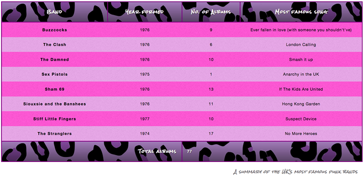
让我们首先查看一个典型的 HTML 表格。好吧,我说的是典型的 — 大多数 HTML 表格示例都是关于鞋子、天气或员工;我们决定通过英国著名朋克乐队的故事来让事情变得更有趣。标记看起来像这样:
¥Let's start by looking at a typical HTML table. Well, I say typical — most HTML table examples are about shoes, or the weather, or employees; we decided to make things more interesting by making it about famous punk bands from the UK. The markup looks like so:
<table>
  <caption>
    A summary of the UK's most famous punk bands
  </caption>
  <thead>
    <tr>
      <th scope="col">乐队</th>
      <th scope="col">成立年份</th>
      <th scope="col">不。专辑数量</th>
      <th scope="col">最著名的歌曲</th>
    </tr>
  </thead>
  <tbody>
    <tr>
      <th scope="row">嗡嗡声</th>
      <td>1976</td>
      <td>9</td>
      <td>曾经爱上过(爱上一个你不该爱上的人)</td>
    </tr>
    <tr>
      <th scope="row">冲突</th>
      <td>1976</td>
      <td>6</td>
      <td>伦敦的呼唤</td>
    </tr>
<tr>
  <th scope="row">绞杀者</th>
  <td>1974</td>
  <td>17</td>
  <td>不再有英雄</td>
</tr>
  </tbody>
  <tfoot>
    <tr>
      <th scope="row" colspan="2">专辑总数</th>
      <td colspan="2">77</td>
    </tr>
  </tfoot>
</table>
由于 scope、<caption>、<thead>、<tbody> 等功能,该表标记得很好,易于设置样式且易于访问。不幸的是,它在屏幕上渲染时看起来不太好(在 punk-bands-unstyled.html 上实时查看):
¥The table is nicely marked up, easily stylable, and accessible, thanks to features such as scope, <caption>, <thead>, <tbody>, etc. Unfortunately, it doesn't look good when rendered on the screen (see it live at punk-bands-unstyled.html):
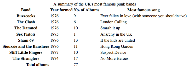
仅使用默认的浏览器样式,它看起来很拥挤、难以阅读且无聊。我们需要使用一些 CSS 来解决这个问题。
¥With only the default browser styling it looks cramped, hard to read, and boring. We need to use some CSS to fix this up.
设计我们的表格
¥Styling our table
让我们一起设计表格示例的样式。
¥Let's work through styling our table example together.
- 首先,制作 样本标记 的本地副本,下载两个映像(noise 和 leopardskin),然后将三个生成的文件放入本地计算机上某处的工作目录中。
- 接下来,创建一个名为
style.css的新文件并将其保存在与其他文件相同的目录中。 - 通过将以下 HTML 行放入
<head>中,将 CSS 链接到 HTML:html<link href="style.css" rel="stylesheet" />
间距和布局
¥Spacing and layout
我们需要做的第一件事是理清间距/布局 - 默认的表格样式太局促了!为此,请将以下 CSS 添加到 style.css 文件中:
¥The first thing we need to do is sort out the spacing/layout — default table styling is so cramped! To do this, add the following CSS to your style.css file:
/* spacing */

table {
  table-layout: fixed;
  width: 100%;
  border-collapse: collapse;
  border: 3px solid purple;
}

thead th:nth-child(1) {
  width: 30%;
}

thead th:nth-child(2) {
  width: 20%;
}

thead th:nth-child(3) {
  width: 15%;
}

thead th:nth-child(4) {
  width: 35%;
}

th,
td {
  padding: 20px;
}
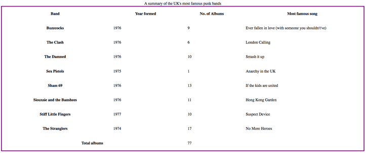
最需要注意的部分如下:
¥The most important parts to note are as follows:
-
在表上设置
table-layout值fixed通常是一个好主意,因为它使表在默认情况下的行为更加可预测。通常,表格列的大小往往根据它们包含的内容量来调整,这会产生一些奇怪的结果。使用table-layout: fixed,你可以根据标题的宽度调整列的大小,然后适当地处理其内容。这就是为什么我们使用thead th:nth-child(n)(:nth-child) 选择器选择四个不同的标题(“选择序列中<th>元素的第 n 个子元素,位于<thead>元素内”),并给它们设置百分比宽度。整个列的宽度遵循其标题的宽度,这是调整表格列大小的好方法。Chris Coyier 在 固定表格布局 中更详细地讨论了这项技术。 我们将其与 100% 的width结合起来,这意味着表格将填充它所放入的任何容器,并且响应良好(尽管仍然需要做更多的工作才能使其在窄屏幕宽度上看起来很好)。 border-collapse值collapse是任何表格样式工作的标准最佳实践。默认情况下,当你在表格元素上设置边框时,它们之间都会有间距,如下图所示:

这看起来不太好(尽管这可能是你想要的外观,谁知道呢?)。设置 border-collapse: collapse; 后,边框会合并为一个,看起来好多了:
¥This doesn't look very nice (although it might be the look you want, who knows?). With border-collapse: collapse; set, the borders collapse down into one, which looks much better:

- 我们在整个表格周围放置了
border,这是必需的,因为稍后我们将在表格页眉和页脚周围放置一些边框 - 当整个表格外部没有边框时,它看起来非常奇怪和脱节。 表格并最终出现间隙。 - 我们在
<th>和<td>元素上设置了一些padding— 这为数据项提供了一些喘息的空间,使表格看起来更加清晰。
此时,我们的表格看起来已经好多了:
¥At this point, our table already looks a lot better:
一些简单的排版
¥Some simple typography
现在我们将对文本进行一些整理。
¥Now we'll get our text sorted out a bit.
首先,我们在 谷歌字体 上找到了一种适合朋克乐队表格的字体。如果你愿意的话,你可以去那里找一个不同的;你只需将我们提供的 <link> 元素和自定义 font-family 声明替换为 Google Fonts 为你提供的元素即可。
¥First of all, we've found a font on Google Fonts that is suitable for a table about punk bands. You can go there and find a different one if you like; you'll just have to replace our provided <link> element and custom font-family declaration with the ones Google Fonts gives you.
首先,将以下 <link> 元素添加到 HTML 头部,位于现有 <link> 元素的上方:
¥First, add the following <link> element into your HTML head, just above your existing <link> element:
<link
  href="https://fonts.googleapis.com/css?family=Rock+Salt"
  rel="stylesheet"
  type="text/css" />
现在将以下 CSS 添加到 style.css 文件中,位于之前添加的下方:
¥Now add the following CSS into your style.css file, below the previous addition:
/* typography */

html {
  font-family: "helvetica neue", helvetica, arial, sans-serif;
}

thead th,
tfoot th {
  font-family: "Rock Salt", cursive;
}

th {
  letter-spacing: 2px;
}

td {
  letter-spacing: 1px;
}

tbody td {
  text-align: center;
}

tfoot th {
  text-align: right;
}
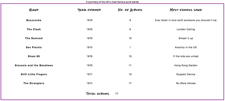
这里没有什么真正特定于表的;我们通常会调整字体样式以使内容更易于阅读:
¥There is nothing really specific to tables here; we are generally tweaking the font styling to make things easier to read:
- 我们设置了一个全局的无衬线字体堆栈;这纯粹是一种风格选择。我们还在
<thead>和<tfoot>元素内的标题上设置了自定义字体,以获得漂亮的蹩脚朋克外观。 - 我们在标题和单元格上设置了一些
letter-spacing,因为我们认为这有助于提高可读性。同样,主要是一种风格选择。 - 我们已将
<tbody>内的表格单元格中的文本居中对齐,以便它们与标题对齐。默认情况下,单元格的text-align值被指定为left,标题的值被指定为center,但通常将两者的对齐方式设置为相同看起来更好。标题字体的默认粗体足以区分它们的外观。 - 我们将
<tfoot>内的标题右对齐,以便在视觉上与其数据点更好地关联。
结果看起来更整洁一些:
¥The result looks a bit neater:
图形和颜色
¥Graphics and colors
现在介绍图形和颜色!因为表格充满了朋克和态度,所以我们需要给它一些明亮的气势样式来适应它。别担心,你不必把表格弄得这么吵 - 你可以选择更微妙、更有品味的东西。
¥Now onto graphics and colors! Because the table is full of punk and attitude, we need to give it some bright imposing styling to suit it. Don't worry, you don't have to make your tables this loud — you can opt for something more subtle and tasteful.
首先将以下 CSS 添加到 style.css 文件中(同样在底部):
¥Start by adding the following CSS to your style.css file, again at the bottom:
/* graphics and colors */

thead,
tfoot {
  background: url(leopardskin.jpg);
  color: white;
  text-shadow: 1px 1px 1px black;
}

thead th,
tfoot th,
tfoot td {
  background: linear-gradient(to bottom, rgb(0 0 0 / 10%), rgb(0 0 0 / 50%));
  border: 3px solid purple;
}
同样,这里没有任何特定于表格的内容,但值得注意一些事情。
¥Again, there's nothing specific to tables here, but it is worthwhile to note a few things.
我们在 <thead> 和 <tfoot> 中添加了 background-image,并将页眉和页脚内所有文本的 color 更改为白色(并为其指定了 text-shadow),以便可读。你应该始终确保文本与背景形成鲜明对比,以便可读。
¥We've added a background-image to the <thead> and <tfoot>, and changed the color of all the text inside the header and footer to white (and given it a text-shadow) so it is readable. You should always make sure your text contrasts well with your background, so it is readable.
我们还为页眉和页脚内的 <th> 和 <td> 元素添加了线性渐变,以获得漂亮的纹理,并为这些元素提供了明亮的紫色边框。拥有多个可用的嵌套元素很有用,这样你就可以将样式分层放置。是的,我们可以使用多个背景图片将背景图片和线性渐变放在 <thead> 和 <tfoot> 元素上,但我们决定单独进行,以方便不支持多个背景图片或线性渐变的旧浏览器。
¥We've also added a linear gradient to the <th> and <td> elements inside the header and footer for a nice bit of texture, as well as giving those elements a bright purple border. It is useful to have multiple nested elements available so you can layer styles on top of one another. Yes, we could have put both the background image and the linear gradient on the <thead> and <tfoot> elements using multiple background images, but we decided to do it separately for the benefit of older browsers that don't support multiple background images or linear gradients.
斑马条纹
¥Zebra striping
我们想专门用一个单独的部分来向你展示如何实现斑马条纹 - 交替的颜色行,使表中的不同数据行更易于解析和阅读。将以下 CSS 添加到 style.css 文件的底部:
¥We wanted to dedicate a separate section to showing you how to implement zebra stripes — alternating rows of color that make the different data rows in your table easier to parse and read. Add the following CSS to the bottom of your style.css file:
/* zebra striping */

tbody tr:nth-child(odd) {
  background-color: #ff33cc;
}

tbody tr:nth-child(even) {
  background-color: #e495e4;
}

tbody tr {
  background-image: url(noise.png);
}

table {
  background-color: #ff33cc;
}
- 之前你已经看到
:nth-child选择器用于选择特定的子元素。它还可以给定一个公式作为参数,因此它将选择一个元素序列。公式2n+1将选择所有奇数子项(1、3、5 等),公式2n将选择所有偶数子项(2、4、6 等)。我们使用了odd和even关键字 在我们的代码中,它的作用与上述公式完全相同。在这种情况下,我们为奇数行和偶数行提供不同的(鲜艳的)颜色。 - 我们还在所有主体行中添加了重复的背景图块,这只是一点噪音(半透明的
.png,上面有一点视觉失真)以提供一些纹理。 - 最后,我们为整个表格提供了纯色背景色,以便不支持
:nth-child选择器的浏览器的正文行仍然具有背景色。
这种颜色爆炸会产生以下外观:
¥This color explosion results in the following look:
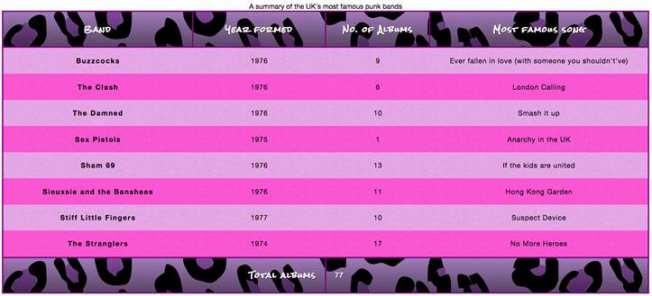
现在,这可能有点过头了,不符合你的口味,但我们在这里试图指出的一点是,表格不必是无聊和学术的。
¥Now, this may be a bit over the top and not to your taste, but the point we are trying to make here is that tables don't have to be boring and academic.
设置标题样式
¥Styling the caption
我们的表格还有最后一件事要做 - 设计标题。为此,请将以下内容添加到 style.css 文件的底部:
¥There is one last thing to do with our table — style the caption. To do this, add the following to the bottom of your style.css file:
/* caption */

caption {
  font-family: "Rock Salt", cursive;
  padding: 20px;
  font-style: italic;
  caption-side: bottom;
  color: #666;
  text-align: right;
  letter-spacing: 1px;
}
除了 caption-side 属性之外,这里没有什么值得注意的地方,该属性已被赋予值 bottom。这会导致标题位于表格的底部,它与其他声明一起为我们提供了最终的外观(在 punk-bands-complete.html 上实时查看):
¥There is nothing remarkable here, except for the caption-side property, which has been given a value of bottom. This causes the caption to be positioned on the bottom of the table, which along with the other declarations gives us this final look (see it live at punk-bands-complete.html):
表格样式快速提示
¥Table styling quick tips
在继续之前,我们认为我们应该为你提供上面所示的最有用的要点的快速列表:
¥Before moving on, we thought we'd provide you with a quick list of the most useful points illustrated above:
- 让你的表格标记尽可能简单,并保持灵活性,例如 通过使用百分比,使设计更具响应性。
- 使用
table-layout: fixed创建更可预测的表格布局,使你可以通过在标题 (<th>) 上设置width来轻松设置列宽。 - 使用
border-collapse: collapse使表格元素边框相互折叠,从而产生更整洁且更易于控制的外观。 - 使用
<thead>、<tbody>和<tfoot>将表格分解为逻辑块,并提供额外的位置来应用 CSS,因此如果需要,可以更轻松地将样式分层。 - 使用斑马条纹使替代行更易于阅读。
- 使用
text-align排列<th>和<td>文本,使内容更整洁、更容易理解。
测试你的技能!
¥Test your skills!
你已读完本文,但你还记得最重要的信息吗?在继续之前,你可以找到一些进一步的测试来验证你是否已保留此信息 - 请参阅 测试你的技能:表格。
¥You've reached the end of this article, but can you remember the most important information? You can find some further tests to verify that you've retained this information before you move on — see Test your skills: Tables.
概括
¥Summary
现在样式表已经抛在身后,我们需要一些其他的东西来打发我们的时间。下一篇文章将探讨 调试 CSS — 如何解决一些问题,例如布局看起来不像应有的样子,或者属性在你认为应该应用时却没有应用。这包括有关使用浏览器开发工具来查找问题解决方案的信息。
¥With styling tables now behind us, we need something else to occupy our time. The next article explores debugging CSS — how to solve problems such as layouts not looking like they should, or properties not applying when you think they should. This includes information on using browser DevTools to find solutions to your problems.