处理不同的文本方向
到目前为止,我们在 CSS 学习中遇到的许多属性和值都与屏幕的物理尺寸相关。例如,我们在盒子的顶部、右侧、底部和左侧创建边框。这些物理尺寸非常整齐地映射到水平查看的内容,并且默认情况下,网络倾向于比从右到左语言(例如阿拉伯语)更好地支持从左到右语言(例如英语或法语)。
¥Many of the properties and values that we have encountered so far in our CSS learning have been tied to the physical dimensions of our screen. We create borders on the top, right, bottom, and left of a box, for example. These physical dimensions map very neatly to content that is viewed horizontally, and by default the web tends to support left-to-right languages (e.g. English or French) better than right-to-left languages (such as Arabic).
然而,近年来,CSS 不断发展,以便更好地支持不同的内容方向性,包括从右到左以及从上到下的内容(例如日语) - 这些不同的方向性称为书写模式。随着你学习的进步并开始使用布局,了解写作模式将对你非常有帮助,因此我们现在将介绍它们。
¥In recent years however, CSS has evolved in order to better support different directionality of content, including right-to-left but also top-to-bottom content (such as Japanese) — these different directionalities are called writing modes. As you progress in your study and begin to work with layout, an understanding of writing modes will be very helpful to you, therefore we will introduce them now.
什么是写作模式?
¥What are writing modes?
CSS 中的书写模式是指文本是水平运行还是垂直运行。writing-mode 属性允许我们从一种写入模式切换到另一种写入模式。你不需要使用使用垂直书写模式的语言来执行此操作 - 你还可以出于创意目的更改布局部分的书写模式。
¥A writing mode in CSS refers to whether the text is running horizontally or vertically. The writing-mode property lets us switch from one writing mode to another. You don't need to be working in a language which uses a vertical writing mode to want to do this — you could also change the writing mode of parts of your layout for creative purposes.
在下面的示例中,我们使用 writing-mode: vertical-rl 显示标题。文本现在垂直运行。垂直文本在图形设计中很常见,并且可以成为为网页设计添加更有趣的外观和感觉的一种方式。
¥In the example below we have a heading displayed using writing-mode: vertical-rl. The text now runs vertically. Vertical text is common in graphic design, and can be a way to add a more interesting look and feel to your web design.
writing-mode 属性的三个可能值是:
¥The three possible values for the writing-mode property are:
horizontal-tb:从上到下阻止流动方向。句子横向排列。vertical-rl:从右到左阻止流向。句子垂直排列。vertical-lr:从左到右阻止流向。句子垂直排列。
因此,writing-mode 属性实际上设置了块级元素在页面上显示的方向 - 从上到下、从右到左或从左到右。然后,这决定了文本在句子中流动的方向。
¥So the writing-mode property is in reality setting the direction in which block-level elements are displayed on the page — either from top-to-bottom, right-to-left, or left-to-right. This then dictates the direction text flows in sentences.
书写模式以及块和内联布局
¥Writing modes and block and inline layout
我们已经讨论过 块布局和内联布局,以及一些东西显示为块元素而另一些东西显示为内联元素的事实。正如我们上面所描述的,块和内联与文档的书写模式相关,而不是与物理屏幕相关。如果你使用水平显示文本的书写模式(例如英语),则仅从页面顶部到底部显示块。
¥We have already discussed block and inline layout, and the fact that some things display as block elements and others as inline elements. As we have seen described above, block and inline is tied to the writing mode of the document, and not the physical screen. Blocks are only displayed from the top to the bottom of the page if you are using a writing mode that displays text horizontally, such as English.
如果我们看一个例子,这一点就会变得更清楚。在下一个示例中,我有两个包含标题和段落的框。第一种使用 writing-mode: horizontal-tb,一种横向书写、从页面顶部向下书写的书写模式。第二个使用 writing-mode: vertical-rl;这是一种从右向左垂直书写的书写方式。
¥If we look at an example this will become clearer. In this next example I have two boxes that contain a heading and a paragraph. The first uses writing-mode: horizontal-tb, a writing mode that is written horizontally and from the top of the page to the bottom. The second uses writing-mode: vertical-rl; this is a writing mode that is written vertically and from right to left.
当我们切换写入模式时,我们正在改变哪个方向是块,哪个方向是内联。horizontal-tb 写入模式下,块方向从上到下;在 vertical-rl 写入模式下,块方向从右到左水平延伸。所以块尺寸始终是块在使用的书写模式下在页面上显示的方向。内联维度始终是句子流动的方向。
¥When we switch the writing mode, we are changing which direction is block and which is inline. In a horizontal-tb writing mode the block direction runs from top to bottom; in a vertical-rl writing mode the block direction runs right-to-left horizontally. So the block dimension is always the direction blocks are displayed on the page in the writing mode in use. The inline dimension is always the direction a sentence flows.
该图显示了水平书写模式下的两个维度。
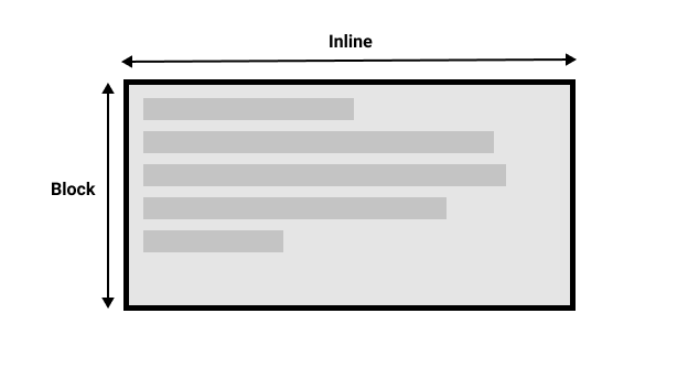
¥This figure shows the two dimensions when in a horizontal writing mode.
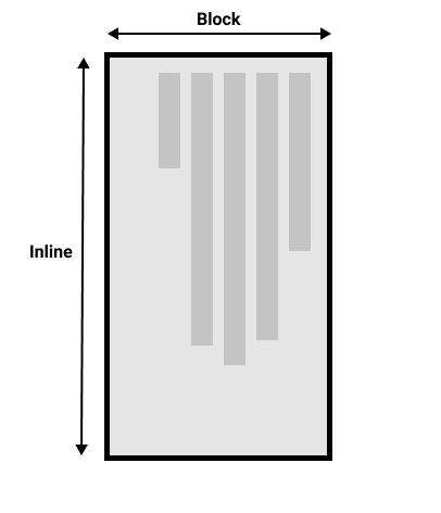
该图显示了垂直书写模式下的两个维度。
¥This figure shows the two dimensions in a vertical writing mode.
一旦你开始研究 CSS 布局,特别是较新的布局方法,块和内联的想法就变得非常重要。我们稍后会重新讨论它。
¥Once you start to look at CSS layout, and in particular the newer layout methods, this idea of block and inline becomes very important. We will revisit it later on.
方向
¥Direction
除了书写模式之外,我们还有文本方向。如上所述,某些语言(例如阿拉伯语)是水平书写的,但从右到左。这不是你可能会在创造性意义上使用的东西 - 如果你想在右侧排列一些东西,还有其他方法可以做到这一点 - 但是理解这一点是 CSS 本质的一部分很重要。网络不仅仅适用于从左到右显示的语言!
¥In addition to writing mode we also have text direction. As mentioned above, some languages such as Arabic are written horizontally, but right-to-left. This is not something you are likely to use in a creative sense — if you want to line something up on the right there are other ways to do so — however it is important to understand this as part of the nature of CSS. The web is not just for languages that are displayed left-to-right!
由于文本的书写模式和方向可以改变,较新的 CSS 布局方法不涉及左右、顶部和底部。相反,他们会谈论开始和结束以及内联和块的想法。现在不要太担心,但是当你开始考虑布局时,请记住这些想法;你会发现它对你理解 CSS 非常有帮助。
¥Due to the fact that writing mode and direction of text can change, newer CSS layout methods do not refer to left and right, and top and bottom. Instead they will talk about start and end along with this idea of inline and block. Don't worry too much about that right now, but keep these ideas in mind as you start to look at layout; you will find it really helpful in your understanding of CSS.
逻辑属性和值
¥Logical properties and values
在学习的这一点上谈论书写模式和方向的原因是,我们已经研究了许多与屏幕物理尺寸相关的属性,并且这些属性在水平书写模式下更有意义。
¥The reason to talk about writing modes and direction at this point in your learning is that we have already looked at a lot of properties that are tied to the physical dimensions of the screen, and these make more sense when in a horizontal writing mode.
让我们再看看我们的两个盒子 - 一个是 horizontal-tb 书写模式,一个是 vertical-rl。我已经给这两个盒子打了 width。你可以看到,当框处于垂直书写模式时,它仍然具有宽度,这导致文本溢出。
¥Let's take a look at our two boxes again — one with a horizontal-tb writing mode and one with vertical-rl. I have given both of these boxes a width. You can see that when the box is in the vertical writing mode, it still has a width, and this is causing the text to overflow.
在这种情况下,我们真正想要的是根据书写模式基本上交换高度和宽度。当我们处于垂直书写模式时,我们希望框在块维度上展开,就像在水平模式下一样。
¥What we really want in this scenario is to essentially swap height with width in accordance to the writing mode. When we're in a vertical writing mode we want the box to expand in the block dimension just like it does in the horizontal mode.
为了使这更容易,CSS 最近开发了一组映射属性。这些本质上用逻辑或流程相关版本取代了物理属性(例如 width 和 height)。
¥To make this easier, CSS has recently developed a set of mapped properties. These essentially replace physical properties — things like width and height — with logical, or flow relative versions.
在水平书写模式下映射到 width 的属性称为 inline-size — 它指的是内联维度中的大小。height 的属性名为 block-size,是块维度中的大小。你可以在下面的示例中看到它是如何工作的,我们将 width 替换为 inline-size。
¥The property mapped to width when in a horizontal writing mode is called inline-size — it refers to the size in the inline dimension. The property for height is named block-size and is the size in the block dimension. You can see how this works in the example below where we have replaced width with inline-size.
逻辑边距、边框和填充属性
¥Logical margin, border, and padding properties
在过去的两节课中,我们学习了 CSS 盒子模型和 CSS 边框。在边距、边框和填充属性中,你会发现许多物理属性的实例,例如 margin-top、padding-left 和 border-bottom。就像我们有宽度和高度的映射一样,这些属性也有映射。
¥In the last two lessons we have learned about the CSS box model, and CSS borders. In the margin, border, and padding properties you will find many instances of physical properties, for example margin-top, padding-left, and border-bottom. In the same way that we have mappings for width and height there are mappings for these properties.
margin-top 属性映射到 margin-block-start — 这将始终引用块维度开头的边距。
¥The margin-top property is mapped to margin-block-start — this will always refer to the margin at the start of the block dimension.
padding-left 属性映射到 padding-inline-start,即应用于内联方向开头的填充。这将是该写作模式下句子开始的地方。border-bottom 属性映射到 border-block-end,即块维度末尾的边框。
¥The padding-left property maps to padding-inline-start, the padding that is applied to the start of the inline direction. This will be where sentences start in that writing mode. The border-bottom property maps to border-block-end, which is the border at the end of the block dimension.
你可以在下面看到物理属性和逻辑属性之间的比较。
¥You can see a comparison between physical and logical properties below.
如果通过将 .box 上的 writing-mode 属性切换到 vertical-rl 来更改框的写入模式,你将看到物理属性如何与其物理方向保持联系,而逻辑属性如何随写入模式切换。
¥If you change the writing mode of the boxes by switching the writing-mode property on .box to vertical-rl, you will see how the physical properties stay tied to their physical direction, whereas the logical properties switch with the writing mode.
你还可以看到 h2 有一个黑色的 border-bottom。你能弄清楚如何使底部边框在两种书写模式下始终位于文本下方吗?
¥You can also see that the h2 has a black border-bottom. Can you work out how to make that bottom border always go below the text in both writing modes?
当你考虑所有单独的边框普通写法时,会有大量属性,并且你可以在 逻辑属性和值 的 MDN 页面上看到所有映射的属性。
¥There are a huge number of properties when you consider all of the individual border longhands, and you can see all of the mapped properties on the MDN page for Logical Properties and Values.
逻辑值
¥Logical values
到目前为止,我们已经了解了逻辑属性名称。还有一些属性采用 top、right、bottom 和 left 的物理值。这些值还具有到逻辑值的映射 - block-start、inline-end、block-end 和 inline-start。
¥We have so far looked at logical property names. There are also some properties that take physical values of top, right, bottom, and left. These values also have mappings, to logical values — block-start, inline-end, block-end, and inline-start.
例如,你可以将图片向左浮动以使文本环绕图片。你可以将 left 替换为 inline-start,如下例所示。
¥For example, you can float an image left to cause text to wrap round the image. You could replace left with inline-start as shown in the example below.
将本例中的写入模式更改为 vertical-rl,看看图片会发生什么情况。将 inline-start 更改为 inline-end 以更改浮动。
¥Change the writing mode on this example to vertical-rl to see what happens to the image. Change inline-start to inline-end to change the float.
在这里,我们还使用逻辑边距值来确保无论书写模式如何,边距都位于正确的位置。
¥Here we are also using logical margin values to ensure the margin is in the correct place no matter what the writing mode is.
你应该使用物理属性还是逻辑属性?
¥Should you use physical or logical properties?
逻辑属性和值比其物理等效项更新,因此最近才在浏览器中实现。你可以检查 MDN 上的任何属性页面,了解浏览器支持的历史版本。如果你不使用多种写入模式,那么现在你可能更喜欢使用物理版本。然而,最终我们希望人们会过渡到大多数事情的逻辑版本,因为一旦你也开始处理诸如 Flexbox 和网格之类的布局方法,它们就很有意义。
¥The logical properties and values are newer than their physical equivalents, and therefore have only recently been implemented in browsers. You can check any property page on MDN to see how far back the browser support goes. If you are not using multiple writing modes, then for now you might prefer to use the physical versions. However, ultimately we expect that people will transition to the logical versions for most things, as they make a lot of sense once you also start dealing with layout methods such as flexbox and grid.
测试你的技能!
¥Test your skills!
你已读完本文,但你还记得最重要的信息吗?在继续之前,你可以找到一些进一步的测试来验证你是否已保留此信息 - 请参阅 测试你的技能:书写模式和逻辑属性。
¥You've reached the end of this article, but can you remember the most important information? You can find some further tests to verify that you've retained this information before you move on — see Test your skills: Writing modes and logical properties.
概括
¥Summary
本课程中解释的概念在 CSS 中变得越来越重要。了解块和内联方向 - 以及文本流如何随着书写模式的变化而变化 - 将非常有用。即使你从未使用过水平书写模式以外的书写模式,它也会帮助你理解 CSS。
¥The concepts explained in this lesson are becoming increasingly important in CSS. An understanding of the block and inline direction — and how text flow changes with a change in writing mode — will be very useful going forward. It will help you in understanding CSS even if you never use a writing mode other than a horizontal one.
在下一篇文章中,我们将仔细研究 CSS 中的 overflow。
¥In the next article, we'll take a good look at overflow in CSS.