网格
CSS 网格布局 是一个二维网页布局系统。它允许你将内容组织成行和列,并提供许多功能来简化复杂布局的创建。本文将解释开始使用网格布局所需了解的所有信息。
¥CSS grid layout is a two-dimensional layout system for the web. It lets you organize content into rows and columns and offers many features to simplify the creation of complex layouts. This article will explain all you need to know to get started with grid layout.
什么是网格布局?
¥What is grid layout?
网格是水平和垂直线的集合,创建一个图案,我们可以根据该图案排列设计元素。它们帮助我们创建布局,当我们从一个页面移动到另一个页面时,我们的元素不会跳来跳去或改变宽度,从而在我们的网站上提供更大的一致性。
¥A grid is a collection of horizontal and vertical lines creating a pattern against which we can line up our design elements. They help us to create layouts in which our elements won't jump around or change width as we move from page to page, providing greater consistency on our websites.
网格通常有列、行以及每行和列之间的间隙。这些间隙通常称为装订线。
¥A grid will typically have columns, rows, and then gaps between each row and column. The gaps are commonly referred to as gutters.

在 CSS 中创建网格
¥Creating your grid in CSS
决定了设计所需的网格后,你可以使用 CSS 网格布局来创建它。我们将首先查看网格布局的基本功能,然后探索如何为你的项目创建一个简单的网格系统。以下视频提供了使用 CSS 网格的良好视觉解释:
¥Having decided on the grid that your design needs, you can use CSS grid layout to create it. We'll look at the basic features of grid layout first and then explore how to create a simple grid system for your project. The following video provides a nice visual explanation of using CSS grid:
定义网格
¥Defining a grid
让我们借助示例来尝试网格布局。下载并在文本编辑器和浏览器中打开 起点文件(也可以打开 在这里观看直播)。你将看到一个带有容器的示例,其中包含一些子项。默认情况下,这些项目以正常流程显示,导致它们一个接一个地显示。在本课程的第一部分,我们将使用此文件来查看其网格的行为方式。
¥Let's try out grid layouts with the help of an example. Download and open the starting point file in your text editor and browser (you can also see it live here). You will see an example with a container, which has some child items. By default, these items are displayed in a normal flow, causing them to appear one below the other. For the initial part of this lesson, we'll be using this file to see how its grid behaves.
与定义 Flexbox 的方式类似,你可以通过将 display 属性的值设置为 grid 来定义网格布局。与 Flexbox 的情况一样,display: grid 属性将容器的所有直接子项转换为网格项。将以下 CSS 添加到你的文件中:
¥Similar to how you define flexbox, you define a grid layout by setting the value of the display property to grid. As in the case of flexbox, the display: grid property transforms all the direct children of the container into grid items. Add the following CSS to your file:
.container {
  display: grid;
}
与 flexbox 不同,项目不会立即看起来有任何不同。声明 display: grid 将为你提供一列网格,因此你的项目将继续显示在另一列下方,就像在正常流程中一样。
¥Unlike flexbox, the items will not immediately look any different. Declaring display: grid gives you a one column grid, so your items will continue to display one below the other as they do in normal flow.
为了看到看起来更像网格的东西,我们需要向网格添加一些列。让我们添加三个 200 像素的列。你可以使用任何长度单位或百分比来创建这些列轨道。
¥To see something that looks more grid-like, we'll need to add some columns to the grid. Let's add three 200-pixel columns. You can use any length unit or percentage to create these column tracks.
.container {
  display: grid;
  grid-template-columns: 200px 200px 200px;
}
将第二个声明添加到 CSS 规则中,然后重新加载页面。你应该看到这些项目已重新排列,使得网格的每个单元格中都有一个。
¥Add the second declaration to your CSS rule, then reload the page. You should see that the items have rearranged themselves such that there's one in each cell of the grid.
body {
  width: 90%;
  max-width: 900px;
  margin: 2em auto;
  font:
    0.9em/1.2 Arial,
    Helvetica,
    sans-serif;
}

.container > div {
  border-radius: 5px;
  padding: 10px;
  background-color: rgb(207 232 220);
  border: 2px solid rgb(79 185 227);
}
<div class="container">
  <div>One</div>
  <div>Two</div>
  <div>Three</div>
  <div>Four</div>
  <div>Five</div>
  <div>Six</div>
  <div>Seven</div>
</div>
带有 fr 单元的灵活网格
¥Flexible grids with the fr unit
除了使用长度和百分比创建网格之外,我们还可以使用 fr。fr 单位表示网格容器中可用空间的一小部分,用于灵活调整网格行和列的大小。
¥In addition to creating grids using lengths and percentages, we can use fr. The fr unit represents one fraction of the available space in the grid container to flexibly size grid rows and columns.
将曲目列表更改为以下定义,创建三个 1fr 曲目:
¥Change your track listing to the following definition, creating three 1fr tracks:
.container {
  display: grid;
  grid-template-columns: 1fr 1fr 1fr;
}
你现在拥有灵活的轨道。fr 单元按比例分配空间。你可以为曲目指定不同的正值,如下所示:
¥You now have flexible tracks. The fr unit distributes space proportionally. You can specify different positive values for your tracks like so:
.container {
  display: grid;
  grid-template-columns: 2fr 1fr 1fr;
}
第一个轨道获得 2fr 的可用空间,其他两个轨道获得 1fr,从而使第一个轨道更大。你可以将 fr 单位与固定长度单位混合使用。在这种情况下,首先用完固定磁道所需的空间,然后将剩余空间分配给其他磁道。
¥The first track gets 2fr of the available space and the other two tracks get 1fr, making the first track larger. You can mix fr units with fixed length units. In this case, the space needed for the fixed tracks is used up first before the remaining space is distributed to the other tracks.
body {
  width: 90%;
  max-width: 900px;
  margin: 2em auto;
  font:
    0.9em/1.2 Arial,
    Helvetica,
    sans-serif;
}

.container > div {
  border-radius: 5px;
  padding: 10px;
  background-color: rgb(207 232 220);
  border: 2px solid rgb(79 185 227);
}
<div class="container">
  <div>One</div>
  <div>Two</div>
  <div>Three</div>
  <div>Four</div>
  <div>Five</div>
  <div>Six</div>
  <div>Seven</div>
</div>
注意:
fr单元分配可用空间,而不是所有空间。因此,如果你的轨道之一内部有较大的内容,则可供共享的可用空间就会减少。¥Note: The
frunit distributes available space, not all space. Therefore, if one of your tracks has something large inside it, there will be less free space to share.
轨道之间的间隙
¥Gaps between tracks
为了在轨道之间创建间隙,我们使用以下属性:
¥To create gaps between tracks, we use the properties:
column-gap表示列之间的间隙row-gap表示行之间的间隙gap作为两者的简写
.container {
  display: grid;
  grid-template-columns: 2fr 1fr 1fr;
  gap: 20px;
}
这些间隙可以是任何长度单位或百分比,但不能是 fr 单位。
¥These gaps can be any length unit or percentage, but not an fr unit.
body {
  width: 90%;
  max-width: 900px;
  margin: 2em auto;
  font:
    0.9em/1.2 Arial,
    Helvetica,
    sans-serif;
}

.container > div {
  border-radius: 5px;
  padding: 10px;
  background-color: rgb(207 232 220);
  border: 2px solid rgb(79 185 227);
}
<div class="container">
  <div>One</div>
  <div>Two</div>
  <div>Three</div>
  <div>Four</div>
  <div>Five</div>
  <div>Six</div>
  <div>Seven</div>
</div>
注意:
gap属性(column-gap、row-gap和gap)过去以grid-为前缀。规范已更改,但带前缀的版本将作为别名保留。为了安全起见并使你的代码更加防弹,你可以添加这两个属性:¥Note: The
gapproperties (column-gap,row-gapandgap) used to be prefixed bygrid-. The spec has changed but the prefixed versions will be maintained as an alias. To be on the safe side and make your code more bulletproof, you can add both properties:css.container { display: grid; grid-template-columns: 2fr 1fr 1fr; grid-gap: 20px; gap: 20px; }
重复曲目列表
¥Repeating track listings
你可以使用 CSS repeat() 功能重复曲目列表的全部或仅一部分。将你的曲目列表更改为以下内容:
¥You can repeat all or merely a section of your track listing using the CSS repeat() function.
Change your track listing to the following:
.container {
  display: grid;
  grid-template-columns: repeat(3, 1fr);
  gap: 20px;
}
现在,你将像以前一样获得三个 1fr 曲目。传递给 repeat() 函数的第一个值指定你希望列表重复的次数,而第二个值是曲目列表,可能是你想要重复的一个或多个曲目。
¥You'll now get three 1fr tracks just as before. The first value passed to the repeat() function specifies the number of times you want the listing to repeat, while the second value is a track listing, which may be one or more tracks that you want to repeat.
隐式和显式网格
¥Implicit and explicit grids
到目前为止,我们仅指定了列轨道,但会自动创建行来保存内容。这个概念强调了显式网格和隐式网格之间的区别。以下是有关两种类型网格之间差异的更多信息:
¥Up to this point, we've specified only column tracks, but rows are automatically created to hold the content. This concept highlights the distinction between explicit and implicit grids. Here's a bit more about the difference between the two types of grids:
- 显式网格是使用
grid-template-columns或grid-template-rows创建的。 - 当内容放置在网格之外时,隐式网格扩展了定义的显式网格,例如通过绘制附加网格线放置到行中。
默认情况下,在隐式网格中创建的轨道的大小为 auto,这通常意味着它们足够大以包含其内容。如果你希望为隐式网格轨道指定大小,可以使用 grid-auto-rows 和 grid-auto-columns 属性。如果将值为 100px 的 grid-auto-rows 添加到 CSS,你将看到这些创建的行现在高为 100 像素。
¥By default, tracks created in the implicit grid are auto sized, which in general means that they're large enough to contain their content. If you wish to give implicit grid tracks a size, you can use the grid-auto-rows and grid-auto-columns properties. If you add grid-auto-rows with a value of 100px to your CSS, you'll see that those created rows are now 100 pixels tall.
body {
  width: 90%;
  max-width: 900px;
  margin: 2em auto;
  font:
    0.9em/1.2 Arial,
    Helvetica,
    sans-serif;
}

.container > div {
  border-radius: 5px;
  padding: 10px;
  background-color: rgb(207 232 220);
  border: 2px solid rgb(79 185 227);
}
<div class="container">
  <div>One</div>
  <div>Two</div>
  <div>Three</div>
  <div>Four</div>
  <div>Five</div>
  <div>Six</div>
  <div>Seven</div>
</div>
.container {
  display: grid;
  grid-template-columns: repeat(3, 1fr);
  grid-auto-rows: 100px;
  gap: 20px;
}
minmax() 函数
¥The minmax() function
如果我们将内容添加到高于 100 像素的轨道中,那么 100 像素高的轨道将不会很有用,在这种情况下会导致溢出。轨道的高度至少为 100 像素可能会更好,并且如果添加更多内容,轨道仍然可以扩展。关于网络的一个相当基本的事实是,你永远不会真正知道某个东西会有多高 - 额外的内容或更大的字体大小可能会导致试图在每个维度都保持像素完美的设计出现问题。
¥Our 100-pixel tall tracks won't be very useful if we add content into those tracks that is taller than 100 pixels, in which case it would cause an overflow. It might be better to have tracks that are at least 100 pixels tall and can still expand if more content becomes added. A fairly basic fact about the web is that you never really know how tall something is going to be — additional content or larger font sizes can cause problems with designs that attempt to be pixel perfect in every dimension.
minmax() 函数让我们可以设置轨道的最小和最大尺寸,例如 minmax(100px, auto)。最小尺寸为 100 像素,但最大尺寸为 auto,它将扩展以容纳更多内容。尝试更改 grid-auto-rows 以使用 minmax 值:
¥The minmax() function lets us set a minimum and maximum size for a track, for example, minmax(100px, auto). The minimum size is 100 pixels, but the maximum is auto, which will expand to accommodate more content. Try changing grid-auto-rows to use a minmax value:
.container {
  display: grid;
  grid-template-columns: repeat(3, 1fr);
  grid-auto-rows: minmax(100px, auto);
  gap: 20px;
}
如果你添加额外的内容,你会看到轨道会扩展以适应。请注意,扩展是沿着行进行的。
¥If you add extra content, you'll see that the track expands to allow it to fit. Note that the expansion happens right along the row.
适合的列数尽可能多
¥As many columns as will fit
我们可以结合我们学到的一些关于曲目列表、重复符号和 minmax() 的经验教训来创建一个有用的模式。有时,能够要求网格创建适合容器的尽可能多的列会很有帮助。我们通过使用 repeat() 函数设置 grid-template-columns 的值来实现此目的,但不是传递数字,而是传递关键字 auto-fit。对于函数的第二个参数,我们使用 minmax(),其最小值等于我们想要的最小磁道尺寸,最大值为 1fr。
¥We can combine some of the lessons we've learned about track listing, repeat notation, and minmax() to create a useful pattern. Sometimes it's helpful to be able to ask grid to create as many columns as will fit into the container. We do this by setting the value of grid-template-columns using the repeat() function, but instead of passing in a number, pass in the keyword auto-fit. For the second parameter of the function we use minmax() with a minimum value equal to the minimum track size that we would like to have and a maximum of 1fr.
现在使用下面的 CSS 在你的文件中尝试一下:
¥Try this in your file now using the CSS below:
body {
  width: 90%;
  max-width: 900px;
  margin: 2em auto;
  font:
    0.9em/1.2 Arial,
    Helvetica,
    sans-serif;
}

.container > div {
  border-radius: 5px;
  padding: 10px;
  background-color: rgb(207 232 220);
  border: 2px solid rgb(79 185 227);
}
<div class="container">
  <div>One</div>
  <div>Two</div>
  <div>Three</div>
  <div>Four</div>
  <div>Five</div>
  <div>Six</div>
  <div>Seven</div>
</div>
.container {
  display: grid;
  grid-template-columns: repeat(auto-fit, minmax(200px, 1fr));
  grid-auto-rows: minmax(100px, auto);
  gap: 20px;
}
这是可行的,因为网格正在创建尽可能多的 200 像素列,以适合容器,然后在所有列之间共享剩余空间。最大值为 1fr,正如我们所知,它在轨道之间均匀分配空间。
¥This works because grid is creating as many 200-pixel columns as will fit into the container, then sharing whatever space is leftover among all the columns. The maximum is 1fr which, as we already know, distributes space evenly between tracks.
基于线路的布局
¥Line-based placement
我们现在从创建网格转向将事物放置在网格上。我们的网格总是有行 - 这些行编号从 1 开始,并与文档的 书写模式 相关。例如,英语中的列线 1(从左到右书写)将位于网格的左侧,行线 1 位于顶部,而在阿拉伯语中(从右到左书写),列线 1 将位于网格的左侧 将位于右侧。
¥We now move on from creating a grid to placing things on the grid. Our grid always has lines — these are numbered beginning with 1 and relate to the writing mode of the document. For example, column line 1 in English (written left-to-right) would be on the left-hand side of the grid and row line 1 at the top, while in Arabic (written right-to-left), column line 1 would be on the right-hand side.
要沿着这些线定位项目,我们可以指定应放置项目的网格区域的起始线和结束线。我们可以使用四个属性来做到这一点:
¥To position items along these lines, we can specify the start and end lines of the grid area where an item should be placed. There are four properties we can use to do this:
这些属性接受行号作为它们的值,因此我们可以指定一个项目应该在第 1 行开始并在第 3 行结束。或者,你还可以使用简写属性,让你同时指定开始行和结束行,并用正斜杠 / 分隔:
¥These properties accept line numbers as their values, so we can specify that an item should start on line 1 and end on line 3, for example.
Alternatively, you can also use shorthand properties that let you specify the start and end lines simultaneously, separated by a forward slash /:
grid-column是grid-column-start和grid-column-end的简写grid-row是grid-row-start和grid-row-end的简写
要查看实际效果,请下载 基于线的放置起点文件 或 在这里观看直播。它有一个明确的网格和一篇简单的文章概述。你可以看到自动放置将每个项目放置到网格中自己的单元格中。
¥To see this in action, download the line-based placement starting point file or see it live here. It has a defined grid and a simple article outlined. You can see that auto-placement is placing each item into its own cell in the grid.
让我们使用网格线来排列我们网站的所有元素。将以下规则添加到 CSS 底部:
¥Let's arrange all of the elements for our site by using the grid lines. Add the following rules to the bottom of your CSS:
header {
  grid-column: 1 / 3;
  grid-row: 1;
}

article {
  grid-column: 2;
  grid-row: 2;
}

aside {
  grid-column: 1;
  grid-row: 2;
}

footer {
  grid-column: 1 / 3;
  grid-row: 3;
}
body {
  width: 90%;
  max-width: 900px;
  margin: 2em auto;
  font:
    0.9em/1.2 Arial,
    Helvetica,
    sans-serif;
}

.container {
  display: grid;
  grid-template-columns: 1fr 3fr;
  gap: 20px;
}

header,
footer {
  border-radius: 5px;
  padding: 10px;
  background-color: rgb(207 232 220);
  border: 2px solid rgb(79 185 227);
}

aside {
  border-right: 1px solid #999;
}
<div class="container">
  <header>This is my lovely blog</header>
  <article>
    <h1>My article</h1>
    <p>
      Duis felis orci, pulvinar id metus ut, rutrum luctus orci. Cras porttitor
      imperdiet nunc, at ultricies tellus laoreet sit amet. Sed auctor cursus
      massa at porta. Integer ligula ipsum, tristique sit amet orci vel, viverra
      egestas ligula. Curabitur vehicula tellus neque, ac ornare ex malesuada
      et. In vitae convallis lacus. Aliquam erat volutpat. Suspendisse ac
      imperdiet turpis. Aenean finibus sollicitudin eros pharetra congue. Duis
      ornare egestas augue ut luctus. Proin blandit quam nec lacus varius
      commodo et a urna. Ut id ornare felis, eget fermentum sapien.
    </p>

    <p>
      Nam vulputate diam nec tempor bibendum. Donec luctus augue eget malesuada
      ultrices. Phasellus turpis est, posuere sit amet dapibus ut, facilisis sed
      est. Nam id risus quis ante semper consectetur eget aliquam lorem. Vivamus
      tristique elit dolor, sed pretium metus suscipit vel. Mauris ultricies
      lectus sed lobortis finibus. Vivamus eu urna eget velit cursus viverra
      quis vestibulum sem. Aliquam tincidunt eget purus in interdum. Cum sociis
      natoque penatibus et magnis dis parturient montes, nascetur ridiculus mus.
    </p>
  </article>
  <aside>
    <h2>Other things</h2>
    <p>
      Nam vulputate diam nec tempor bibendum. Donec luctus augue eget malesuada
      ultrices. Phasellus turpis est, posuere sit amet dapibus ut, facilisis sed
      est.
    </p>
  </aside>
  <footer>Contact me@example.com</footer>
</div>
注意:你还可以使用值
-1来定位结束列或行线,然后使用负值从末尾开始向内计数。另请注意,行数始终从显式网格的边缘开始计算,而不是从 隐式网格 开始。¥Note: You can also use the value
-1to target the end column or row line, then count inwards from the end using negative values. Note also that lines count always from the edges of the explicit grid, not the implicit grid.
使用网格模板区域定位
¥Positioning with grid-template-areas
在网格上排列项目的另一种方法是使用 grid-template-areas 属性并为设计的各个元素命名。
¥An alternative way to arrange items on your grid is to use the grid-template-areas property and give the various elements of your design a name.
从上一个示例中删除基于行的定位(或重新下载文件以获得新的起点)并添加以下 CSS。
¥Remove the line-based positioning from the last example (or re-download the file to have a fresh starting point) and add the following CSS.
.container {
  display: grid;
  grid-template-areas:
    "header header"
    "sidebar content"
    "footer footer";
  grid-template-columns: 1fr 3fr;
  gap: 20px;
}

header {
  grid-area: header;
}

article {
  grid-area: content;
}

aside {
  grid-area: sidebar;
}

footer {
  grid-area: footer;
}
重新加载页面,你将看到你的项目已像以前一样放置,而我们不需要使用任何行号!
¥Reload the page and you will see that your items have been placed just as before without us needing to use any line numbers!
body {
  width: 90%;
  max-width: 900px;
  margin: 2em auto;
  font:
    0.9em/1.2 Arial,
    Helvetica,
    sans-serif;
}

header,
footer {
  border-radius: 5px;
  padding: 10px;
  background-color: rgb(207 232 220);
  border: 2px solid rgb(79 185 227);
}

aside {
  border-right: 1px solid #999;
}
<div class="container">
  <header>This is my lovely blog</header>
  <article>
    <h1>My article</h1>
    <p>
      Duis felis orci, pulvinar id metus ut, rutrum luctus orci. Cras porttitor
      imperdiet nunc, at ultricies tellus laoreet sit amet. Sed auctor cursus
      massa at porta. Integer ligula ipsum, tristique sit amet orci vel, viverra
      egestas ligula. Curabitur vehicula tellus neque, ac ornare ex malesuada
      et. In vitae convallis lacus. Aliquam erat volutpat. Suspendisse ac
      imperdiet turpis. Aenean finibus sollicitudin eros pharetra congue. Duis
      ornare egestas augue ut luctus. Proin blandit quam nec lacus varius
      commodo et a urna. Ut id ornare felis, eget fermentum sapien.
    </p>

    <p>
      Nam vulputate diam nec tempor bibendum. Donec luctus augue eget malesuada
      ultrices. Phasellus turpis est, posuere sit amet dapibus ut, facilisis sed
      est. Nam id risus quis ante semper consectetur eget aliquam lorem. Vivamus
      tristique elit dolor, sed pretium metus suscipit vel. Mauris ultricies
      lectus sed lobortis finibus. Vivamus eu urna eget velit cursus viverra
      quis vestibulum sem. Aliquam tincidunt eget purus in interdum. Cum sociis
      natoque penatibus et magnis dis parturient montes, nascetur ridiculus mus.
    </p>
  </article>
  <aside>
    <h2>Other things</h2>
    <p>
      Nam vulputate diam nec tempor bibendum. Donec luctus augue eget malesuada
      ultrices. Phasellus turpis est, posuere sit amet dapibus ut, facilisis sed
      est.
    </p>
  </aside>
  <footer>Contact me@example.com</footer>
</div>
grid-template-areas 的规则如下:
¥The rules for grid-template-areas are as follows:
- 你需要填充网格的每个单元格。
- 要跨越两个单元格,请重复该名称。
- 要将单元格留空,请使用
.(句点)。 - 区域必须是矩形的 - 例如,不能有 L 形区域。
- 区域不能在不同位置重复。
你可以尝试我们的布局,将页脚更改为仅位于文章下方,将侧边栏更改为一直向下。这是描述布局的一种非常好的方式,因为只需查看 CSS 就可以清楚地知道到底发生了什么。
¥You can play around with our layout, changing the footer to only sit underneath the article and the sidebar to span all the way down. This is a very nice way to describe a layout because it's clear just from looking at the CSS to know exactly what's happening.
嵌套网格和子网格
¥Nesting grids and subgrid
可以将一个网格嵌套在另一个网格中,从而创建 "subgrid"。你可以通过在网格项上设置 display: grid 属性来完成此操作。
¥It's possible to nest a grid within another grid, creating a "subgrid".
You can do this by setting the display: grid property on a grid item.
让我们通过添加文章容器并使用嵌套网格来控制多篇文章的布局来扩展前面的示例。虽然我们在嵌套网格中仅使用一列,但我们可以使用 grid-template-rows 属性定义要按 2:1:1 比例拆分的行。这种方法允许我们创建一个布局,其中页面顶部的一篇文章具有较大的显示,而其他文章则具有较小的、类似于预览的布局。
¥Let's expand on the previous example by adding a container for articles and using a nested grid to control the layout of multiple articles.
While we're using only one column in the nested grid, we can define the rows to be split in a 2:1:1 ratio by using the grid-template-rows property.
This approach allows us to create a layout where one article at the top of the page has a large display, while the others have a smaller, preview-like layout.
<div class="container">
  <header>This is my lovely blog</header>
  <div class="articles">
    <article>
      <h1>Darmok and Jalad had a picnic at Tanagra</h1>

      <p>
        Duis felis orci, pulvinar id metus ut, rutrum luctus orci. Cras
        porttitor imperdiet nunc, at ultricies tellus laoreet sit amet. Sed
        auctor cursus massa at porta. Integer ligula ipsum, tristique sit amet
        orci vel, viverra egestas ligula. Curabitur vehicula tellus neque, ac
        ornare ex malesuada et. In vitae convallis lacus. Aliquam erat volutpat.
        Suspendisse ac imperdiet turpis. Aenean finibus sollicitudin eros
        pharetra congue. Duis ornare egestas augue ut luctus. Proin blandit quam
        nec lacus varius commodo et a urna. Ut id ornare felis, eget fermentum
        sapien.
      </p>

      <button>Read more</button>
    </article>
    <article>
      <h1>Temba held his arms wide</h1>
      <p>
        Duis felis orci, pulvinar id metus ut, rutrum luctus orci. Cras
        porttitor imperdiet nunc, at ultricies tellus laoreet sit amet. Sed
        auctor cursus massa at porta. Integer ligula ipsum, tristique sit amet
        orci vel, viverra egestas ligula. Curabitur vehicula tellus neque, ac
        ornare ex malesuada et ...
      </p>
      <button>Read more</button>
    </article>
    <article>
      <h1>Gilgamesh, a king, at Uruk</h1>
      <p>
        Duis felis orci, pulvinar id metus ut, rutrum luctus orci. Cras
        porttitor imperdiet nunc, at ultricies tellus laoreet sit amet. Sed
        auctor cursus massa at porta ...
      </p>
      <button>Read more</button>
    </article>
  </div>
  <aside>
    <h2>Other things</h2>
    <p>
      Nam vulputate diam nec tempor bibendum. Donec luctus augue eget malesuada
      ultrices. Phasellus turpis est, posuere sit amet dapibus ut, facilisis sed
      est.
    </p>
    <button>Read more</button>
  </aside>
  <footer>Contact me@example.com</footer>
</div>
body {
  width: 90%;
  max-width: 900px;
  margin: 2em auto;
  font:
    0.9em/1.2 Arial,
    Helvetica,
    sans-serif;
}

header,
footer {
  border-radius: 5px;
  padding: 10px;
  background-color: rgb(207 232 220);
  border: 2px solid rgb(79 185 227);
}
header {
  grid-area: header;
}

aside {
  border-right: 1px solid #999;
  grid-area: sidebar;
  padding-right: 10px;
  font-size: 0.8em;
}

footer {
  grid-area: footer;
}
.container {
  display: grid;
  grid-template-areas:
    "header header"
    "sidebar content"
    "footer footer";
  grid-template-columns: 1fr 3fr;
  gap: 20px;
}
.articles {
  display: grid;
  grid-template-rows: 2fr 1fr 1fr;
  gap: inherit;
}

article {
  padding: 10px;
  border: 2px solid rgb(79 185 227);
  border-radius: 5px;
}
为了更轻松地使用嵌套网格中的布局,你可以在 grid-template-rows 和 grid-template-columns 属性上使用 subgrid。这允许你利用父网格中定义的轨道。
¥To make it easier to work with layouts in nested grids, you can use subgrid on grid-template-rows and grid-template-columns properties. This allows you to leverage the tracks defined in the parent grid.
在下面的示例中,我们使用 基于行的布局,使嵌套网格能够跨越父网格的多个列和行。我们添加了 subgrid 来继承父网格的列轨道,同时为嵌套网格中的行添加不同的布局。
¥In the following example, we're using line-based placement, enabling the nested grid to span multiple columns and rows of the parent grid.
We've added subgrid to inherit the parent grid's column tracks while adding a different layout for the rows within the nested grid.
body {
  width: 90%;
  max-width: 900px;
  margin: 2em auto;
  font:
    0.9em/1.2 Arial,
    Helvetica,
    sans-serif;
}

.container div {
  border-radius: 5px;
  padding: 10px;
  background-color: rgb(207 232 220);
  border: 2px solid rgb(79 185 227);
}
<div class="container">
  <div>One</div>
  <div>Two</div>
  <div>Three</div>
  <div>Four</div>
  <div id="subgrid">
    <div>Five</div>
    <div>Six</div>
    <div>Seven</div>
    <div>Eight</div>
  </div>
  <div>Nine</div>
  <div>Ten</div>
</div>
.container {
  display: grid;
  grid-template-columns: repeat(4, 1fr);
  grid-template-rows: repeat(1, 1fr);
  gap: 10px;
}

#subgrid {
  grid-column: 1 / 4;
  grid-row: 2 / 4;
  display: grid;
  gap: inherit;
  grid-template-columns: subgrid;
  grid-template-rows: 2fr 1fr;
}
网格框架
¥Grid frameworks
有许多网格框架可供使用,提供 12 或 16 列网格,以帮助布局你的内容。好消息是,你可能不需要任何第三方框架来帮助你创建基于网格的布局 - 网格功能已包含在规范中,并且大多数现代浏览器都支持。
¥Numerous grid frameworks are available, offering a 12 or 16-column grid, to help with laying out your content. The good news is that you probably won't need any third-party frameworks to help you create grid-based layouts — grid functionality is already included in the specification and is supported by most modern browsers.
下载起点文件。它有一个定义了 12 列网格的容器,以及我们在前两个示例中使用的相同标记。现在,我们可以使用基于行的放置将内容放置在 12 列网格上。
¥Download the starting point file. This has a container with a 12-column grid defined and the same markup we used in the previous two examples. We can now use line-based placement to place our content on the 12-column grid.
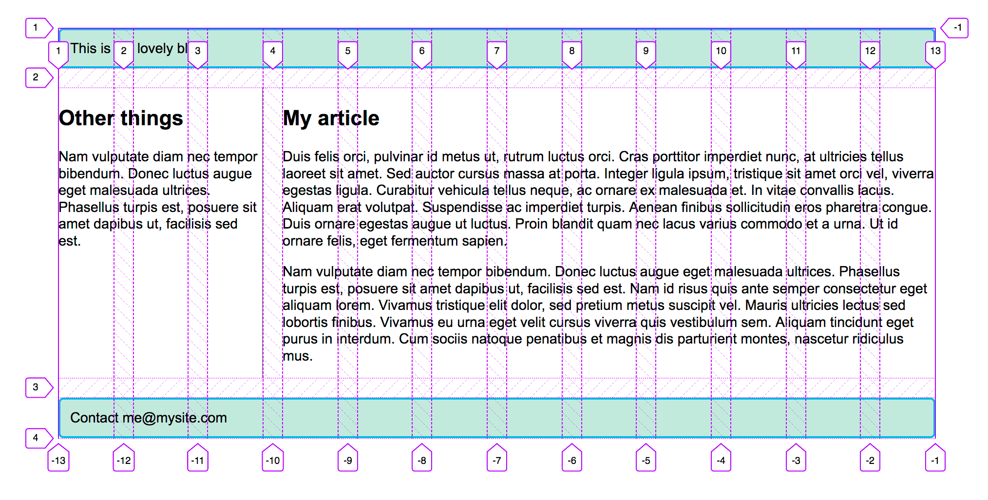
header {
  grid-column: 1 / 13;
  grid-row: 1;
}

article {
  grid-column: 4 / 13;
  grid-row: 2;
}

aside {
  grid-column: 1 / 4;
  grid-row: 2;
}

footer {
  grid-column: 1 / 13;
  grid-row: 3;
}
body {
  width: 90%;
  max-width: 900px;
  margin: 2em auto;
  font:
    0.9em/1.2 Arial,
    Helvetica,
    sans-serif;
}

.container {
  display: grid;
  grid-template-columns: repeat(12, minmax(0, 1fr));
  gap: 20px;
}

header,
footer {
  border-radius: 5px;
  padding: 10px;
  background-color: rgb(207 232 220);
  border: 2px solid rgb(79 185 227);
}

aside {
  border-right: 1px solid #999;
}
<div class="container">
  <header>This is my lovely blog</header>
  <article>
    <h1>My article</h1>
    <p>
      Duis felis orci, pulvinar id metus ut, rutrum luctus orci. Cras porttitor
      imperdiet nunc, at ultricies tellus laoreet sit amet. Sed auctor cursus
      massa at porta. Integer ligula ipsum, tristique sit amet orci vel, viverra
      egestas ligula. Curabitur vehicula tellus neque, ac ornare ex malesuada
      et. In vitae convallis lacus. Aliquam erat volutpat. Suspendisse ac
      imperdiet turpis. Aenean finibus sollicitudin eros pharetra congue. Duis
      ornare egestas augue ut luctus. Proin blandit quam nec lacus varius
      commodo et a urna. Ut id ornare felis, eget fermentum sapien.
    </p>

    <p>
      Nam vulputate diam nec tempor bibendum. Donec luctus augue eget malesuada
      ultrices. Phasellus turpis est, posuere sit amet dapibus ut, facilisis sed
      est. Nam id risus quis ante semper consectetur eget aliquam lorem. Vivamus
      tristique elit dolor, sed pretium metus suscipit vel. Mauris ultricies
      lectus sed lobortis finibus. Vivamus eu urna eget velit cursus viverra
      quis vestibulum sem. Aliquam tincidunt eget purus in interdum. Cum sociis
      natoque penatibus et magnis dis parturient montes, nascetur ridiculus mus.
    </p>
  </article>
  <aside>
    <h2>Other things</h2>
    <p>
      Nam vulputate diam nec tempor bibendum. Donec luctus augue eget malesuada
      ultrices. Phasellus turpis est, posuere sit amet dapibus ut, facilisis sed
      est.
    </p>
  </aside>
  <footer>Contact me@example.com</footer>
</div>
如果你使用 Firefox 网格检查器 在你的设计上覆盖网格线,你可以看到我们的 12 列网格的工作原理。
¥If you use the Firefox grid inspector to overlay the grid lines on your design, you can see how our 12-column grid works.
测试你的技能!
¥Test your skills!
你已读完本文,但你还记得最重要的信息吗?在继续之前,你可以找到一些进一步的测试来验证你是否已保留此信息 - 请参阅 测试你的技能:网格。
¥You've reached the end of this article, but can you remember the most important information? You can find some further tests to verify that you've retained this information before you move on — see Test your skills: Grid.
概括
¥Summary
在本概述中,我们介绍了 CSS 网格布局的主要功能。你应该能够开始在你的设计中使用它。要进一步了解规范,请阅读我们关于网格布局的指南,可在下面找到。
¥In this overview, we've toured the main features of CSS grid layout. You should be able to start using it in your designs. To dig further into the specification, read our guides on grid layout, which can be found below.
也可以看看
¥See also
- 与 CSS 网格布局相关的 指南清单
- 子网格 指南
- Firefox-source-docs 上的 CSS 网格检查器:检查网格布局
- CSS 网格完整指南,CSS-Tricks 视觉指南 (2023)
- 网格花园,一款学习和更好地理解 cssgridgarden.com 上的网格基础知识的教育游戏