盒子模型
CSS 中的所有内容都有一个框围绕它,理解这些框是能够使用 CSS 创建更复杂的布局或将项目与其他项目对齐的关键。在本课中,我们将了解 CSS 盒子模型。你将了解它的工作原理以及与之相关的术语。
¥Everything in CSS has a box around it, and understanding these boxes is key to being able to create more complex layouts with CSS, or to align items with other items. In this lesson, we will take a look at the CSS Box Model. You'll get an understanding of how it works and the terminology that relates to it.
块和内嵌框
¥Block and inline boxes
在 CSS 中,我们有几种类型的框,通常分为块框和内联框。类型是指框在页面流方面以及相对于页面上其他框的行为方式。盒子有内展示型和外展示型。
¥In CSS we have several types of boxes that generally fit into the categories of block boxes and inline boxes. The type refers to how the box behaves in terms of page flow and in relation to other boxes on the page. Boxes have an inner display type and an outer display type.
通常,你可以使用 display 属性为显示类型设置各种值,该属性可以有各种值。
¥In general, you can set various values for the display type using the display property, which can have various values.
外显型
¥Outer display type
如果盒子的外部显示类型为 block,则:
¥If a box has an outer display type of block, then:
- 该框将换行。
width和height属性受到尊重。- 内边距、边距和边框将导致其他元素被推离盒子。
- 如果未指定
width,则框将沿内联方向延伸以填充其容器中的可用空间。在大多数情况下,盒子将变得与其容器一样宽,从而填满 100% 的可用空间。
某些 HTML 元素(例如 <h1> 和 <p>)默认使用 block 作为其外部显示类型。
¥Some HTML elements, such as <h1> and <p>, use block as their outer display type by default.
如果盒子的外部显示类型为 inline,则:
¥If a box has an outer display type of inline, then:
某些 HTML 元素,例如 <a>、<span>、<em> 和 <strong> 默认使用 inline 作为其外部显示类型。
¥Some HTML elements, such as <a>, <span>, <em> and <strong> use inline as their outer display type by default.
内显式
¥Inner display type
框还有内部显示类型,它决定框内元素的布局方式。
¥Boxes also have an inner display type, which dictates how elements inside that box are laid out.
块布局和内联布局是 Web 上的默认行为方式。默认情况下,在没有任何其他指令的情况下,框内的元素也以 正常流量 布局,并表现为块框或内联框。
¥Block and inline layout is the default way things behave on the web. By default and without any other instruction, the elements inside a box are also laid out in normal flow and behave as block or inline boxes.
你可以更改内部显示类型,例如通过设置 display: flex;。该元素仍将使用外部显示类型 block,但这会将内部显示类型更改为 flex。该框的任何直接子项都将成为弹性项目并根据 弹性盒 规范运行。
¥You can change the inner display type for example by setting display: flex;. The element will still use the outer display type block but this changes the inner display type to flex. Any direct children of this box will become flex items and behave according to the Flexbox specification.
当你继续更详细地了解 CSS 布局时,你将遇到 flex 以及你的框可以具有的各种其他内部值,例如 grid。
¥When you move on to learn about CSS Layout in more detail, you will encounter flex, and various other inner values that your boxes can have, for example grid.
注意:要了解有关显示值以及框如何在块布局和内联布局中工作的更多信息,请查看 MDN 指南 块布局和内联布局。
¥Note: To read more about the values of display, and how boxes work in block and inline layout, take a look at the MDN guide Block and Inline Layout.
不同显示类型的示例
¥Examples of different display types
下面的示例具有三个不同的 HTML 元素,所有这些元素的外部显示类型均为 block。
¥The example below has three different HTML elements, all of which have an outer display type of block.
- CSS 中添加边框的段落。浏览器将其呈现为块框。该段落另起一行并扩展整个可用宽度。
- 使用
display: flex排列的列表。这为容器的子项(即 Flex 项目)建立了 Flex 布局。列表本身是一个块框,并且像段落一样扩展到整个容器宽度并换行。 - 一个块级段落,里面有两个
<span>元素。这些元素通常为inline,但是,其中一个元素的类为 "block",该类被设置为display: block。
在下一个示例中,我们可以看到 inline 元素的行为方式。
¥In the next example, we can see how inline elements behave.
- 第一段中的
<span>元素默认是内联的,因此不会强制换行。 - 设置为
display: inline-flex的<ul>元素创建一个包含一些弹性项目的内联框。 - 两段均设置为
display: inline。内联弹性容器和段落都在一行上一起运行,而不是换行(如果它们显示为块级元素,它们就会这样做)。
要在显示模式之间切换,你可以将 display: inline 更改为 display: block 或将 display: inline-flex 更改为 display: flex。
¥To toggle between the display modes, you can change display: inline to display: block or display: inline-flex to display: flex.
现在要记住的关键是:更改 display 属性的值可以更改框的外部显示类型是块还是内联。这会改变它与布局中其他元素一起显示的方式。
¥The key thing to remember for now is: Changing the value of the display property can change whether the outer display type of a box is block or inline. This changes the way it displays alongside other elements in the layout.
什么是 CSS 盒模型?
¥What is the CSS box model?
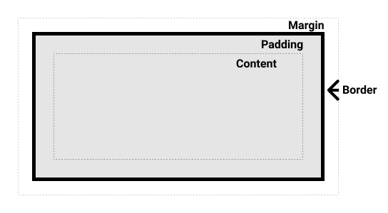
CSS 框模型作为一个整体适用于块框,并定义了框的不同部分(边距、边框、内边距和内容)如何协同工作来创建你可以在页面上看到的框。内联框仅使用框模型中定义的一些行为。
¥The CSS box model as a whole applies to block boxes and defines how the different parts of a box — margin, border, padding, and content — work together to create a box that you can see on a page. Inline boxes use just some of the behavior defined in the box model.
为了增加复杂性,有一个标准盒模型和一个替代盒模型。默认情况下,浏览器使用标准盒模型。
¥To add complexity, there is a standard and an alternate box model. By default, browsers use the standard box model.
盒子的零件
¥Parts of a box
在 CSS 中组成一个块框,我们有:
¥Making up a block box in CSS we have the:
- 内容框:显示你的内容的区域;使用
inline-size和block-size或width和height等属性调整其大小。 - 填充盒:填充位于内容周围作为空白;使用
padding和相关属性调整其大小。 - 边框框:边框包裹着内容和任何填充;使用
border和相关属性调整其大小。 - 边距框:margin 是最外层,将内容、padding 和 border 作为此框与其他元素之间的空白包裹起来;使用
margin和相关属性调整其大小。
下图显示了这些层:
¥The below diagram shows these layers:
标准 CSS 盒模型
¥The standard CSS box model
在标准盒模型中,如果在盒上设置 inline-size 和 block-size(或 width 和 height)属性值,这些值将定义内容盒的 inline-size 和 block-size(横向语言中的 width 和 height)。然后将所有内边距和边框添加到这些尺寸中,以获得框所占用的总大小(参见下图)。
¥In the standard box model, if you set inline-size and block-size (or width and height) property values on a box, these values define the inline-size and block-size (width and height in horizontal languages) of the content box. Any padding and borders are then added to those dimensions to get the total size taken up by the box (see the image below).
如果我们假设一个盒子有以下 CSS:
¥If we assume that a box has the following CSS:
.box {
  width: 350px;
  height: 150px;
  margin: 10px;
  padding: 25px;
  border: 5px solid black;
}
盒子实际占用的空间为 410 像素宽(350 + 25 + 25 + 5 + 5)和 210 像素高(150 + 25 + 25 + 5 + 5)。
¥The actual space taken up by the box will be 410px wide (350 + 25 + 25 + 5 + 5) and 210px high (150 + 25 + 25 + 5 + 5).
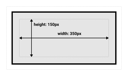
注意:边距不计入框的实际大小 - 当然,它会影响框在页面上占用的总空间,但仅影响框外的空间。盒子的区域停在边界处 - 它没有延伸到边缘。
¥Note: The margin is not counted towards the actual size of the box — sure, it affects the total space that the box will take up on the page, but only the space outside the box. The box's area stops at the border — it does not extend into the margin.
另一种 CSS 盒模型
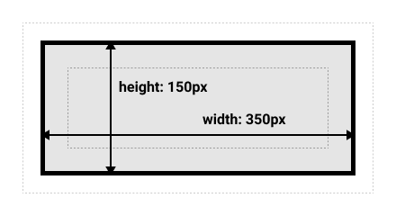
¥The alternative CSS box model
在替代盒模型中,任何宽度都是页面上可见盒的宽度。内容区域宽度是该宽度减去填充和边框的宽度(见下图)。无需添加边框和内边距即可获得盒子的实际大小。
¥In the alternative box model, any width is the width of the visible box on the page. The content area width is that width minus the width for the padding and border (see image below). No need to add up the border and padding to get the real size of the box.
要打开元素的替代模型,请在其上设置 box-sizing: border-box:
¥To turn on the alternative model for an element, set box-sizing: border-box on it:
.box {
  box-sizing: border-box;
}
如果我们假设盒子具有与上面相同的 CSS:
¥If we assume the box has the same CSS as above:
.box {
  width: 350px;
  inline-size: 350px;
  height: 150px;
  block-size: 150px;
  margin: 10px;
  padding: 25px;
  border: 5px solid black;
}
现在,盒子实际占用的空间在内联方向上为 350px,在块方向上为 150px。
¥Now, the actual space taken up by the box will be 350px in the inline direction and 150px in the block direction.
要对所有元素使用替代盒模型(这是开发者的常见选择),请在 <html> 元素上设置 box-sizing 属性,并将所有其他元素设置为继承该值:
¥To use the alternative box model for all of your elements (which is a common choice among developers), set the box-sizing property on the <html> element and set all other elements to inherit that value:
html {
  box-sizing: border-box;
}

*,
*::before,
*::after {
  box-sizing: inherit;
}
要了解基本思想,你可以阅读 关于盒子大小的 CSS 技巧文章。
¥To understand the underlying idea, you can read the CSS Tricks article on box-sizing.
玩转盒子模型
¥Playing with box models
在下面的示例中,你可以看到两个框。两者都有 .box 类,这给了它们相同的 width、height、margin、border 和 padding。唯一的区别是第二个盒子已设置为使用替代盒子模型。
¥In the example below, you can see two boxes. Both have a class of .box, which gives them the same width, height, margin, border, and padding. The only difference is that the second box has been set to use the alternative box model.
你可以更改第二个框的大小(通过将 CSS 添加到 .alternate 类)以使其在宽度和高度上与第一个框匹配吗?
¥Can you change the size of the second box (by adding CSS to the .alternate class) to make it match the first box in width and height?
注意:你可以找到此任务 此处 的解决方案。
¥Note: You can find a solution for this task here.
使用浏览器 DevTools 查看盒子模型
¥Use browser DevTools to view the box model
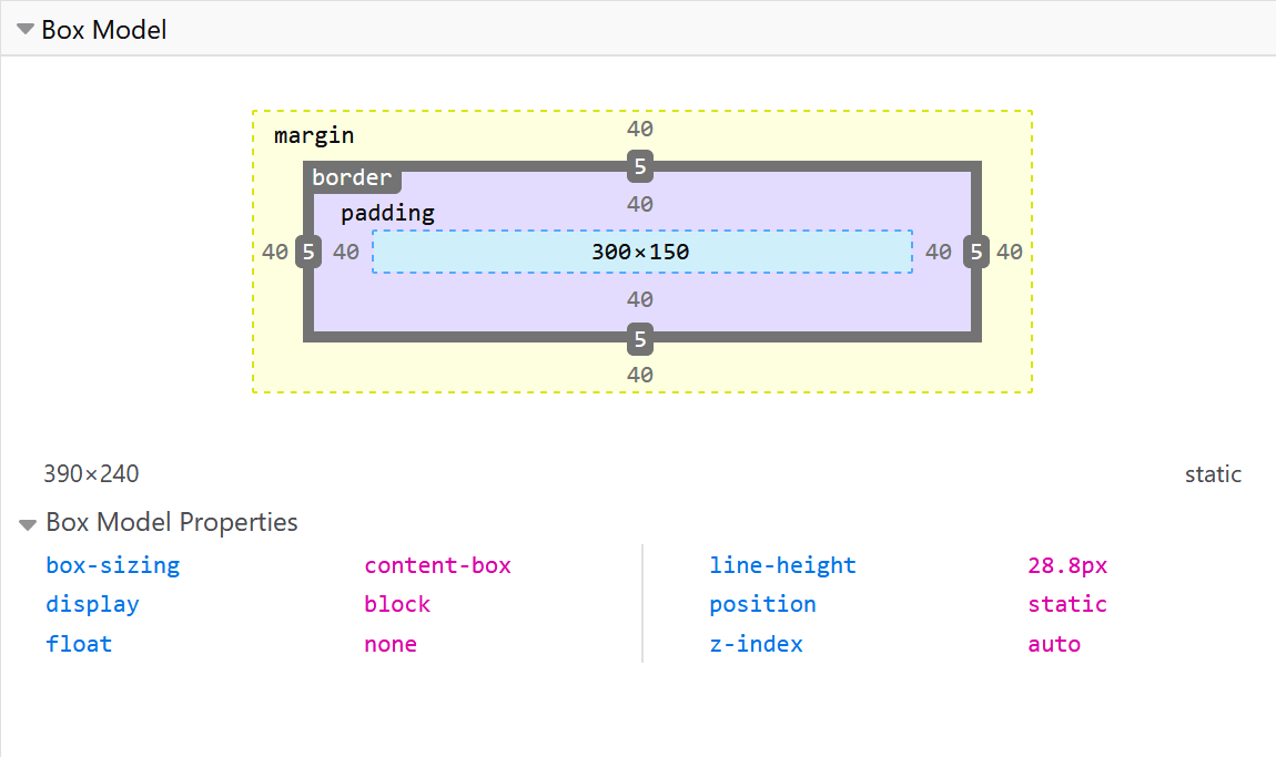
你的 浏览器开发者工具 可以让你更轻松地理解盒子模型。如果你在 Firefox 的 DevTools 中检查某个元素,你可以看到该元素的大小以及其边距、内边距和边框。以这种方式检查元素是查明你的盒子是否确实是你认为的尺寸的好方法!
¥Your browser developer tools can make understanding the box model far easier. If you inspect an element in Firefox's DevTools, you can see the size of the element plus its margin, padding, and border. Inspecting an element in this way is a great way to find out if your box is really the size you think it is!
边距、内边距和边框
¥Margins, padding, and borders
你已经在上面的示例中看到了 margin、padding 和 border 属性的作用。该示例中使用的属性是简写,允许我们一次设置盒子的所有四个边。这些速记也具有等效的普通属性,允许单独控制框的不同侧面。
¥You've already seen the margin, padding, and border properties at work in the example above. The properties used in that example are shorthands and allow us to set all four sides of the box at once. These shorthands also have equivalent longhand properties, which allow control over the different sides of the box individually.
让我们更详细地探讨这些属性。
¥Let's explore these properties in more detail.
利润
¥Margin
边距是盒子周围不可见的空间。它将其他元素推离盒子。边距可以有正值或负值。在框的一侧设置负边距可能会导致它与页面上的其他内容重叠。无论你使用标准盒模型还是替代盒模型,始终会在计算可见盒的大小后添加边距。
¥The margin is an invisible space around your box. It pushes other elements away from the box. Margins can have positive or negative values. Setting a negative margin on one side of your box can cause it to overlap other things on the page. Whether you are using the standard or alternative box model, the margin is always added after the size of the visible box has been calculated.
我们可以使用 margin 属性一次控制元素的所有边距,或者使用等效的普通属性单独控制每一侧:
¥We can control all margins of an element at once using the margin property, or each side individually using the equivalent longhand properties:
在下面的示例中,尝试更改边距值,以查看由于边距在该元素和包含元素之间创建或删除空间(如果是负边距)而导致框被推来推去。
¥In the example below, try changing the margin values to see how the box is pushed around due to the margin creating or removing space (if it is a negative margin) between this element and the containing element.
利润崩溃
¥Margin collapsing
根据边距接触的两个元素是正边距还是负边距,结果会有所不同:
¥Depending on whether two elements whose margins touch have positive or negative margins, the results will be different:
- 两个正余量将合并为一个余量。其大小将等于最大的单个边距。
- 两个负边距将折叠,并且将使用最小(距离零最远)的值。
- 如果某一边距为负数,则将从总数中减去该边距的值。
在下面的示例中,我们有两个段落。顶部段落的 margin-bottom 为 50 像素,另一段的 margin-top 为 30 像素。边距已折叠在一起,因此框之间的实际边距为 50 像素,而不是两个边距的总和。
¥In the example below, we have two paragraphs. The top paragraph has a margin-bottom of 50 pixels, the other has a margin-top of 30 pixels. The margins have collapsed together so the actual margin between the boxes is 50 pixels and not the total of the two margins.
你可以通过将第二段的 margin-top 设置为 0 来测试这一点。两个段落之间的可见边距不会改变 - 它保留在第一段的 margin-bottom 中设置的 50 像素。如果将其设置为 -10px,你将看到整体边距变为 40px — 它从 50px 中减去。
¥You can test this by setting the margin-top of paragraph two to 0. The visible margin between the two paragraphs will not change — it retains the 50 pixels set in the margin-bottom of paragraph one. If you set it to -10px, you'll see that the overall margin becomes 40px — it subtracts from the 50px.
许多规则规定了边距何时会塌陷以及不塌陷。欲了解更多信息,请参阅 掌握边距折叠 的详细页面。要记住的主要事情是,如果你正在创建带有边距的空间并且没有获得你期望的空间,那么边距折叠就会发生。
¥A number of rules dictate when margins do and do not collapse. For further information see the detailed page on mastering margin collapsing. The main thing to remember is that margin collapsing is a thing that happens if you are creating space with margins and don't get the space you expect.
边框
¥Borders
边框绘制在框的边距和内边距之间。如果你使用的是标准盒模型,则边框的大小将添加到内容盒的 width 和 height 中。如果你使用替代框模型,则边框越大,内容框就越小,因为边框占用了元素框的一些可用 width 和 height。
¥The border is drawn between the margin and the padding of a box. If you are using the standard box model, the size of the border is added to the width and height of the content box. If you are using the alternative box model, then the bigger the border is, the smaller the content box is, as the border takes up some of that available width and height of the element box.
对于样式边框,有大量的属性 - 有四个边框,每个边框都有我们可能想要操作的样式、宽度和颜色。
¥For styling borders, there are a large number of properties — there are four borders, and each border has a style, width, and color that we might want to manipulate.
你可以使用 border 属性一次设置所有四个边框的宽度、样式或颜色。
¥You can set the width, style, or color of all four borders at once using the border property.
要单独设置每一面的属性,请使用:
¥To set the properties of each side individually, use:
要设置所有边的宽度、样式或颜色,请使用:
¥To set the width, style, or color of all sides, use:
要设置单边的宽度、样式或颜色,请使用更精细的普通属性之一:
¥To set the width, style, or color of a single side, use one of the more granular longhand properties:
border-top-widthborder-top-styleborder-top-colorborder-right-widthborder-right-styleborder-right-colorborder-bottom-widthborder-bottom-styleborder-bottom-colorborder-left-widthborder-left-styleborder-left-color
在下面的示例中,我们使用了各种简写和简写来创建边框。尝试不同的属性以检查你是否了解它们的工作原理。边框属性的 MDN 页面为你提供有关不同可用边框样式的信息。
¥In the example below, we have used various shorthands and longhands to create borders. Play around with the different properties to check that you understand how they work. The MDN pages for the border properties give you information about the different available border styles.
填充
¥Padding
填充位于边框和内容区域之间,用于将内容推离边框。与边距不同,你不能使用负填充。应用于元素的任何背景都将显示在填充后面。
¥The padding sits between the border and the content area and is used to push the content away from the border. Unlike margins, you cannot have a negative padding. Any background applied to your element will display behind the padding.
padding 属性控制元素所有边的填充。要单独控制每一侧,请使用以下普通属性:
¥The padding property controls the padding on all sides of an element. To control each side individually, use these longhand properties:
在下面的示例中,你可以更改 .box 类上的填充值,以查看文本相对于框的开始位置的变化。你还可以更改 .container 类上的填充,以在容器和框之间创建空间。你可以更改任何元素上的填充,以在其边框和元素内部的任何内容之间创建空间。
¥In the example below, you can change the values for padding on the class .box to see that this changes where the text begins in relation to the box. You can also change the padding on the class .container to create space between the container and the box. You can change the padding on any element to create space between its border and whatever is inside the element.
盒子模型和内嵌盒子
¥The box model and inline boxes
以上所有内容完全适用于块盒。某些属性也适用于内联框,例如由 <span> 元素创建的属性。
¥All of the above fully applies to block boxes. Some of the properties can apply to inline boxes too, such as those created by a <span> element.
在下面的示例中,段落中有 <span>。我们对其应用了 width、height、margin、border 和 padding。你可以看到宽度和高度被忽略。顶部和底部边距、填充和边框受到尊重,但不会更改其他内容与行内框的关系。填充和边框与段落中的其他单词重叠。左右内边距、边距和边框将其他内容移离框。
¥In the example below, we have a <span> inside a paragraph. We have applied a width, height, margin, border, and padding to it. You can see that the width and height are ignored. The top and bottom margin, padding, and border are respected but don't change the relationship of other content to our inline box. The padding and border overlap other words in the paragraph. The left and right padding, margins, and borders move other content away from the box.
使用显示:inline-block
¥Using display: inline-block
display: inline-block 是 display 的特殊值,它提供了 inline 和 block 之间的中间立场。如果你不希望某个项目换行,但又希望它尊重 width 和 height 并避免上面看到的重叠,请使用它。
¥display: inline-block is a special value of display, which provides a middle ground between inline and block. Use it if you do not want an item to break onto a new line, but do want it to respect width and height and avoid the overlapping seen above.
带有 display: inline-block 的元素执行我们已经知道的块事情的子集:
¥An element with display: inline-block does a subset of the block things we already know about:
width和height属性受到尊重。padding、margin和border将导致其他元素被推离盒子。
但是,它不会换行,并且只有在显式添加 width 和 height 属性时才会变得比其内容大。
¥It does not, however, break onto a new line, and will only become larger than its content if you explicitly add width and height properties.
在下一个示例中,我们已将 display: inline-block 添加到 <span> 元素中。尝试将其更改为 display: block 或完全删除该行以查看显示型号的差异。
¥In this next example, we have added display: inline-block to our <span> element. Try changing this to display: block or removing the line completely to see the difference in display models.
当你想通过添加 padding 为链接提供更大的点击区域时,这会很有用。<a> 与 <span> 一样是内联元素;你可以使用 display: inline-block 来允许在其上设置填充,使用户更容易单击链接。
¥Where this can be useful is when you want to give a link a larger hit area by adding padding. <a> is an inline element like <span>; you can use display: inline-block to allow padding to be set on it, making it easier for a user to click the link.
你在导航栏中经常看到这种情况。下面的导航使用 Flexbox 显示在一行中,我们已经向 <a> 元素添加了填充,因为我们希望能够在 <a> 悬停时更改 background-color。填充似乎与 <ul> 元素上的边框重叠。这是因为 <a> 是内联元素。
¥You see this fairly frequently in navigation bars. The navigation below is displayed in a row using flexbox and we have added padding to the <a> element as we want to be able to change the background-color when the <a> is hovered. The padding appears to overlap the border on the <ul> element. This is because the <a> is an inline element.
使用 .links-list a 选择器将 display: inline-block 添加到规则中,你将看到它如何通过使其他元素尊重填充来解决此问题。
¥Add display: inline-block to the rule with the .links-list a selector, and you will see how it fixes this issue by causing the padding to be respected by other elements.
测试你的技能!
¥Test your skills!
你已读完本文,但你还记得最重要的信息吗?在继续之前,你可以找到一些进一步的测试来验证你是否已保留此信息 - 请参阅 测试你的技能:盒子模型。
¥You've reached the end of this article, but can you remember the most important information? You can find some further tests to verify that you've retained this information before you move on — see Test your skills: The box model.
概括
¥Summary
这就是你需要了解的有关盒模型的大部分内容。如果你发现自己对布局中的盒子有多大感到困惑,你可能希望将来返回到本课程。
¥That's most of what you need to understand about the box model. You may want to return to this lesson in the future if you ever find yourself confused about how big boxes are in your layout.
在下一篇文章中,我们将看看如何使用 背景和边框 让你的普通盒子看起来更有趣。
¥In the next article, we'll take a look at how backgrounds and borders can be used to make your plain boxes look more interesting.