弹性盒
弹性盒 是一种一维布局方法,用于按行或列排列项目。项目可以弯曲(展开)以填充额外的空间或收缩以适应较小的空间。本文解释了所有基础知识。
¥Flexbox is a one-dimensional layout method for arranging items in rows or columns. Items flex (expand) to fill additional space or shrink to fit into smaller spaces. This article explains all the fundamentals.
为什么是 flexbox?
¥Why flexbox?
CSS 灵活框布局使你能够:
¥CSS flexible box layout enables you to:
- 将内容块垂直居中在其父级内。
- 使容器的所有子项占用相同数量的可用宽度/高度,无论可用的宽度/高度是多少。
- 使多列布局中的所有列采用相同的高度,即使它们包含不同数量的内容。
Flexbox 功能可能是满足你的一维布局需求的完美解决方案。让我们深入研究并找出答案!
¥Flexbox features may be the perfect solution for your one dimensional layout needs. Let's dig in and find out!
介绍一个简单的例子
¥Introducing a simple example
在本文中,你将完成一系列练习来帮助你了解 Flexbox 的工作原理。首先,你应该从我们的 GitHub 存储库中制作第一个入门文件 flexbox0.html 的本地副本。将其加载到现代浏览器(如 Firefox 或 Chrome)中,然后在代码编辑器中查看代码。你也可以 在这里观看直播。
¥In this article, you'll work through a series of exercises to help you understand how flexbox works. To get started, you should make a local copy of the first starter file — flexbox0.html from our GitHub repo. Load it in a modern browser (like Firefox or Chrome) and have a look at the code in your code editor. You can also see it live here.
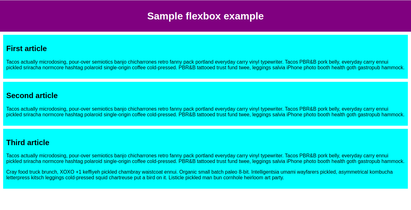
你将看到我们有一个 <header> 元素,其中有一个顶层标题,还有一个 <section> 元素,其中包含三个 <article>。我们将使用它们来创建一个相当标准的三列布局。
¥You'll see that we have a <header> element with a top level heading inside it and a <section> element containing three <article>s. We're going to use these to create a fairly standard three column layout.
指定将哪些元素布局为灵活框
¥Specifying what elements to lay out as flexible boxes
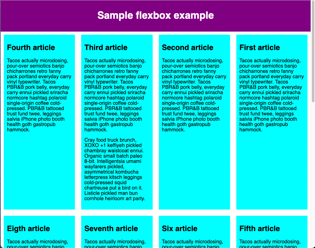
首先,我们需要选择将哪些元素布局为灵活框。为此,我们在要影响的元素的父元素上设置一个特殊值 display。在本例中,我们想要布局 <article> 元素,因此我们将其设置在 <section> 上:
¥To start with, we need to select which elements are to be laid out as flexible boxes. To do this, we set a special value of display on the parent element of the elements you want to affect. In this case we want to lay out the <article> elements, so we set this on the <section>:
section {
  display: flex;
}
这会导致 <section> 元素成为 Flex 容器,并且其子元素成为 Flex 项目。它看起来是这样的:
¥This causes the <section> element to become a flex container and its children become flex items. This is what it looks like:
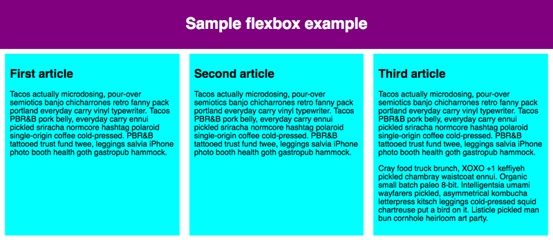
这个单一的声明为我们提供了我们需要的一切。难以置信,对吧?我们有一个多列布局,其中列大小相等,并且列的高度都相同。这是因为给予 Flex 项目(Flex 容器的子项)的默认值是为了解决此类常见问题而设置的。
¥This single declaration gives us everything we need. Incredible, right? We have a multiple column layout with equal-sized columns, and the columns are all the same height. This is because the default values given to flex items (the children of the flex container) are set up to solve common problems such as this.
让我们回顾一下这里发生的事情。将 display 值 flex 添加到元素使其成为 Flex 容器。就容器与页面其余部分的交互方式而言,该容器显示为 块级内容。当元素转换为 Flex 容器时,其子元素将转换为(并布局为)Flex 项目。
¥Let's recap what's happening here. Adding a display value of flex to an element makes it a flex container. The container is displayed as Block-level content in terms of how it interacts with the rest of the page. When the element is converted to a flex container, its children are converted to (and laid out as) flex items.
你可以使用 超出 display 值(例如 display: inline flex)使容器内联,这会影响容器本身在页面中的布局方式。旧版 inline-flex 显示值也将容器显示为内联。在本教程中,我们将重点关注容器内容的行为方式,但如果你想查看内联布局与块布局的效果,可以查看 display 属性页上的 价值比较。
¥You can make the container inline using an outside display value (e.g., display: inline flex), which affects how the container itself is laid out in the page.
The legacy inline-flex display value displays the container as inline as well.
We'll focus on how the contents of the container behave in this tutorial, but if you want to see the effect of inline versus block layout, you can have a look at the value comparison on the display property page.
接下来的部分将更详细地解释什么是 Flex 项目以及当你将其设为 Flex 容器时元素内部会发生什么。
¥The next sections explain in more detail what flex items are and what happens inside an element when you make it a flex container.
弹性模型
¥The flex model
当元素布局为弹性项目时,它们沿两个轴布局:
¥When elements are laid out as flex items, they are laid out along two axes:
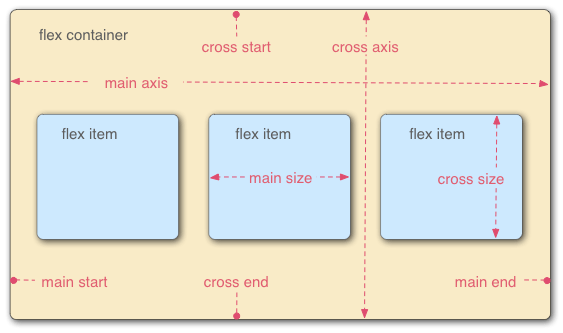
- 主轴是沿 Flex 项目布局方向运行的轴(例如,作为跨页面的行,或沿页面向下的列)。该轴的起点和终点称为主起点和主终点 结尾。从弹性项目起始边到弹性项目结束边的长度是主尺寸。
- 横轴是垂直于弹性项目布局方向的轴。该轴的起点和终点称为交叉起点和交叉终点。从交叉起始边到交叉结束边的长度是交叉大小。
- 设置了
display: flex的父元素(在我们的示例中为<section>)称为 Flex 容器。 - 在 Flex 容器内布置为灵活框的项目称为 Flex 项目(我们示例中的
<article>元素)。
当你阅读后续部分时,请记住这个术语。如果你对所使用的任何术语感到困惑,你可以随时参考它。
¥Bear this terminology in mind as you go through subsequent sections. You can always refer back to it if you get confused about any of the terms being used.
列还是行?
¥Columns or rows?
Flexbox 提供了一个名为 flex-direction 的属性,用于指定主轴运行的方向(Flexbox 子项的布局方向)。默认情况下,此值设置为 row,这会导致它们按照浏览器默认语言的工作方向排成一行(对于英语浏览器,从左到右)。
¥Flexbox provides a property called flex-direction that specifies which direction the main axis runs (which direction the flexbox children are laid out in). By default this is set to row, which causes them to be laid out in a row in the direction your browser's default language works in (left to right, in the case of an English browser).
尝试将以下声明添加到你的 <section> 规则中:
¥Try adding the following declaration to your <section> rule:
flex-direction: column;
你会看到这会将项目放回到列布局中,就像我们添加任何 CSS 之前一样。在继续之前,请从示例中删除此声明。
¥You'll see that this puts the items back in a column layout, much like they were before we added any CSS. Before you move on, delete this declaration from your example.
注意:你还可以使用
row-reverse和column-reverse值以相反方向布置 Flex 项目。也尝试一下这些值!¥Note: You can also lay out flex items in a reverse direction using the
row-reverseandcolumn-reversevalues. Experiment with these values too!
封装
¥Wrapping
当布局中的宽度或高度固定时出现的一个问题是,最终你的 Flexbox 子项将溢出其容器,从而破坏布局。看一下我们的 flexbox-wrap0.html 示例并尝试 观看直播(如果你想遵循此示例,请立即获取此文件的本地副本):
¥One issue that arises when you have a fixed width or height in your layout is that eventually your flexbox children will overflow their container, breaking the layout. Have a look at our flexbox-wrap0.html example and try viewing it live (take a local copy of this file now if you want to follow along with this example):
在这里我们看到子级们确实正在冲破他们的容器。默认情况下,如果 flex-direction 设置为 row,浏览器会尝试将所有弹性项目放在一行中,如果 flex-direction 设置为 column,则放在一列中。解决此问题的一种方法是将以下声明添加到 <section> 规则中:
¥Here we see that the children are indeed breaking out of their container. By default, the browser tries to place all the flex items in a single row if the flex-direction is set to row or a single column if the flex-direction is set to column. One way in which you can fix this is to add the following declaration to your <section> rule:
flex-wrap: wrap;
另外,将以下声明添加到你的 <article> 规则中:
¥Also, add the following declaration to your <article> rule:
flex: 200px;
现在就试试这个。你会发现布局看起来好多了,包括:
¥Try this now. You'll see that the layout looks much better with this included:
我们现在有多行。每行都安装了尽可能多的弹性盒子项。任何溢出都会移至下一行。文章上设置的 flex: 200px 声明意味着每个文章的宽度至少为 200px。我们稍后将更详细地讨论这个属性。你可能还会注意到,最后一行的最后几个子项都变宽了,以便整行仍然被填满。
¥We now have multiple rows. Each row has as many flexbox children fitted into it as is sensible. Any overflow is moved down to the next line. The flex: 200px declaration set on the articles means that each will be at least 200px wide. We'll discuss this property in more detail later on. You might also notice that the last few children on the last row are each made wider so that the entire row is still filled.
但我们在这里还可以做更多的事情。首先,尝试将 flex-direction 属性值更改为 row-reverse。现在你将看到仍然具有多行布局,但它从浏览器窗口的对角开始并反向流动。
¥But there's more we can do here. First of all, try changing your flex-direction property value to row-reverse. Now you'll see that you still have your multiple row layout, but it starts from the opposite corner of the browser window and flows in reverse.
弹性流简写
¥flex-flow shorthand
此时值得注意的是 flex-direction 和 flex-wrap 存在简写:flex-flow。因此,例如,你可以替换
¥At this point it's worth noting that a shorthand exists for flex-direction and flex-wrap: flex-flow. So, for example, you can replace
flex-direction: row;
flex-wrap: wrap;
with
flex-flow: row wrap;
弹性项目的灵活尺寸
¥Flexible sizing of flex items
现在让我们回到第一个示例,看看如何控制弹性项目与其他弹性项目相比所占用的空间比例。打开 flexbox0.html 的本地副本,或将 flexbox1.html 的副本作为新的起点(现场观看)。
¥Let's now return to our first example and look at how we can control what proportion of space flex items take up compared to the other flex items. Open your local copy of flexbox0.html, or take a copy of flexbox1.html as a new starting point (see it live).
首先,将以下规则添加到 CSS 底部:
¥First, add the following rule to the bottom of your CSS:
article {
  flex: 1;
}
这是一个无单位的比例值,指示每个弹性项目与其他弹性项目相比沿主轴将占用多少可用空间。在这种情况下,我们为每个 <article> 元素赋予相同的值(1 的值),这意味着在设置诸如填充和边距等属性后,它们都将占用相同数量的剩余空间。该值在弹性项目之间按比例共享:给每个弹性项目一个 400000 的值将具有完全相同的效果。
¥This is a unitless proportion value that dictates how much available space along the main axis each flex item will take up compared to other flex items. In this case, we're giving each <article> element the same value (a value of 1), which means they'll all take up an equal amount of the spare space left after properties like padding and margin have been set. This value is proportionally shared among the flex items: giving each flex item a value of 400000 would have exactly the same effect.
现在在前一条规则下面添加以下规则:
¥Now add the following rule below the previous one:
article:nth-of-type(3) {
  flex: 2;
}
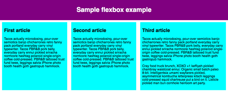
现在,当你刷新时,你会看到第三个 <article> 占用的可用宽度是其他两个的两倍。现在总共有四个可用的比例单位(因为 1 + 1 + 2 = 4)。前两个弹性项目各有一个单位,因此它们各自占用 1/4 的可用空间。第三个有两个单元,因此占用了可用空间的 2/4(或二分之一)。
¥Now when you refresh, you'll see that the third <article> takes up twice as much of the available width as the other two. There are now four proportion units available in total (since 1 + 1 + 2 = 4). The first two flex items have one unit each, so they each take 1/4 of the available space. The third one has two units, so it takes up 2/4 of the available space (or one-half).
你还可以指定 Flex 值内的最小尺寸值。尝试更新现有的文章规则,如下所示:
¥You can also specify a minimum size value within the flex value. Try updating your existing article rules like so:
article {
  flex: 1 200px;
}

article:nth-of-type(3) {
  flex: 2 200px;
}
这基本上表明,“每个弹性项目将首先获得 200px 个可用空间。之后,剩余的可用空间将按照比例单位进行共享。”尝试刷新,你会发现空间共享方式有所不同。
¥This basically states, "Each flex item will first be given 200px of the available space. After that, the rest of the available space will be shared according to the proportion units." Try refreshing and you'll see a difference in how the space is shared.
所有弹性项目的最小宽度为 200 像素 - 使用 'flex' 设置。前两个 flex 项目的 flex 值为 1,第三个项目的 flex 值为 2。这会将弹性容器中的剩余空间分成 4 个比例单位。前两个弹性项目各分配一个单位,第三个弹性项目分配两个单位,使得第三个弹性项目比其他两个弹性项目更宽,而其他两个弹性项目的宽度相同。
¥All the flex items have a minimum width of 200 pixels—set using 'flex'. The value of flex for first two flex items is 1 and for the third item is 2. This splits the remaining space in the flex container into 4 proportion units. One unit is assigned to each of the first two flex items and 2 units are assigned to the third flex item, making the third flex item wider than the other two, which are of the same width.
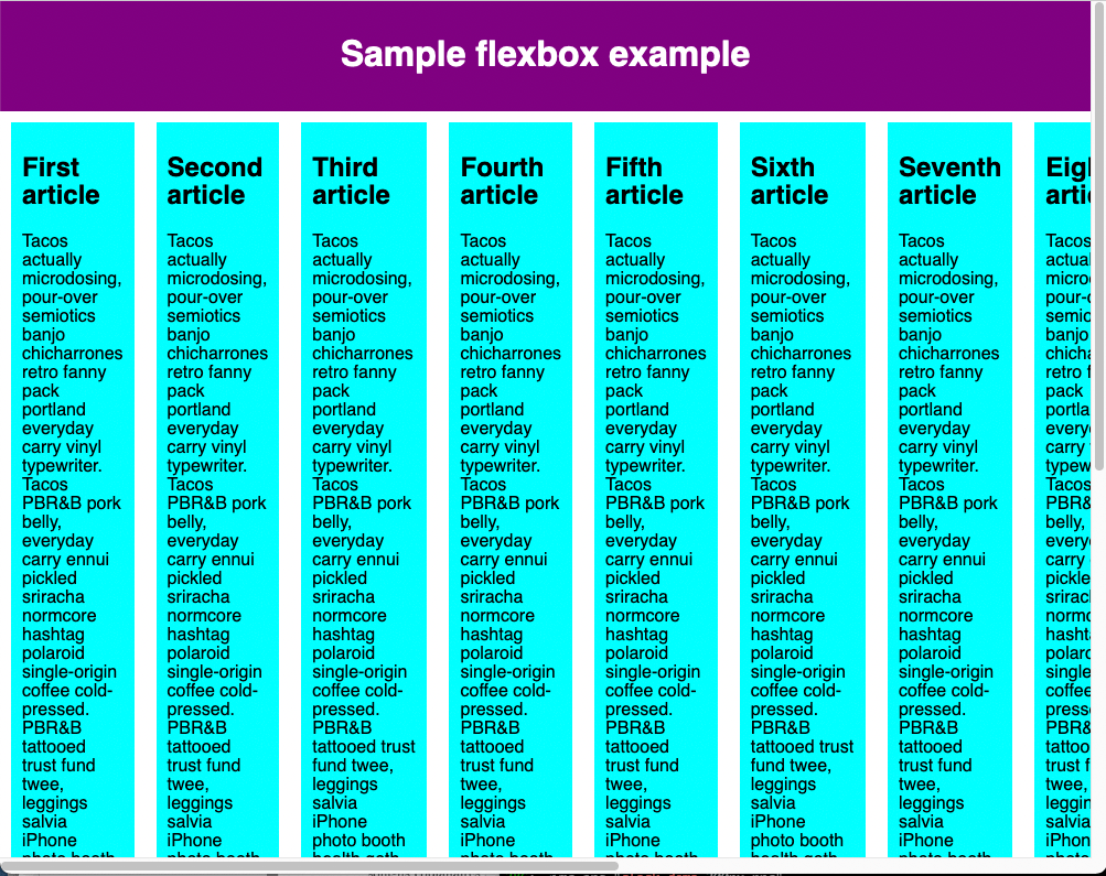
Flexbox 的真正价值可以体现在它的灵活性/响应能力上。如果你调整浏览器窗口的大小或添加另一个 <article> 元素,布局仍然可以正常工作。
¥The real value of flexbox can be seen in its flexibility/responsiveness. If you resize the browser window or add another <article> element, the layout continues to work just fine.
弹性:速记与普通记法
¥flex: shorthand versus longhand
flex 是一个简写属性,最多可以指定三个不同的值:
¥flex is a shorthand property that can specify up to three different values:
- 我们上面讨论的无单位比例值。这可以使用
flex-grow普通属性单独指定。 - 第二个无单位比例值
flex-shrink,当弹性项目溢出其容器时发挥作用。该值指定项目将收缩多少以防止溢出。这是一个相当高级的 Flexbox 功能,我们不会在本文中进一步介绍它。 - 我们上面讨论的最小尺寸值。这可以使用
flex-basis普通值单独指定。
我们建议不要使用普通的 Flex 属性,除非你确实必须这样做(例如,覆盖之前设置的内容)。它们导致编写大量额外的代码,并且可能有些令人困惑。
¥We'd advise against using the longhand flex properties unless you really have to (for example, to override something previously set). They lead to a lot of extra code being written and can be somewhat confusing.
水平和垂直对齐
¥Horizontal and vertical alignment
你还可以使用 Flexbox 功能沿主轴或交叉轴对齐 Flex 项目。让我们通过一个新示例来探讨这一点:flex-align0.html (也看到它直播).我们将把它变成一个整洁、灵活的按钮/工具栏。此时,你将看到一个水平菜单栏,其中一些按钮塞在左上角。
¥You can also use flexbox features to align flex items along the main or cross axis. Let's explore this by looking at a new example: flex-align0.html (see it live also). We're going to turn this into a neat, flexible button/toolbar. At the moment you'll see a horizontal menu bar with some buttons jammed into the top left-hand corner.

首先,获取此示例的本地副本。
¥First, take a local copy of this example.
现在,将以下内容添加到示例 CSS 的底部:
¥Now, add the following to the bottom of the example's CSS:
div {
  display: flex;
  align-items: center;
  justify-content: space-around;
}
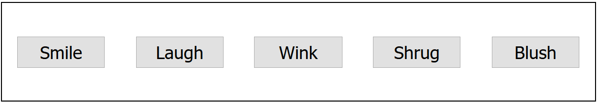
刷新页面,你会发现按钮现在水平和垂直居中。我们通过两个新属性做到了这一点。通过将 align-items 属性设置为 center,弹性项目位于横轴的中心。通过将 justify-content 属性设置为 space-around,弹性项目沿主轴均匀分布。
¥Refresh the page and you'll see that the buttons are now nicely centered horizontally and vertically. We've done this via two new properties. The flex items are positioned at the center of the cross-axis by setting the align-items property to center. The flex items are spaced evenly along the main-axis by setting the justify-content property to space-around.
align-items 属性控制弹性项目在横轴上的位置。
¥The align-items property controls where the flex items sit on the cross axis.
- 默认情况下,值
normal在 flexbox 中表现为stretch。这会拉伸所有弹性项目以在横轴方向上填充父级。如果父级在横轴方向上没有固定大小,则所有弹性项目将变得与最高(或最宽)的弹性项目一样高(或宽)。这就是我们的第一个示例默认情况下具有相等高度的列的方式。 - 我们在上面的代码中使用的
center值使项目保持其固有尺寸,但沿横轴居中。这就是我们当前示例的按钮垂直居中的原因。 - 你还可以拥有像
flex-start、self-start或start和flex-end、self-end或end这样的值,它们将分别将所有项目对齐到横轴的开始和结束处。baseline值将根据其基线排列 flex 项;基本上,每个弹性项目第一行文本的底部将与元素第一行的底部对齐,元素的交叉起点与基线之间的距离最大。完整详细信息请参见align-items。
你可以通过将 align-self 属性应用于各个 Flex 项目来覆盖它们的 align-items 行为。例如,尝试将以下内容添加到你的 CSS 中:
¥You can override the align-items behavior for individual flex items by applying the align-self property to them. For example, try adding the following to your CSS:
button:first-child {
  align-self: flex-end;
}
看看这会产生什么影响,完成后再次将其删除。
¥Have a look at what effect this has and remove it again when you've finished.
justify-content 控制弹性项目在主轴上的位置。
¥justify-content controls where the flex items sit on the main axis.
- 默认值为
normal,其行为与start相同,使所有项目位于主轴的起点。 - 你可以使用
end或flex-end使它们位于最后。 left和right值的行为取决于写入模式方向,表现为start或end。center也是justify-content的值。它将使弹性项目位于主轴的中心。- 我们上面使用的值
space-around非常有用 - 它沿着主轴均匀分布所有项目,并在两端留有一点空间。 - 还有另一个值
space-between,它与space-around非常相似,只是它两端不留任何空格。
Flexbox 布局中会忽略 justify-items 属性。
¥The justify-items property is ignored in flexbox layouts.
我们鼓励你在继续之前先尝试一下这些价值观,看看它们是如何发挥作用的。
¥We'd like to encourage you to play with these values to see how they work before you continue.
订购弹性项目
¥Ordering flex items
Flexbox 还具有更改 Flex 项目的布局顺序而不影响源顺序的功能。这又是传统布局方式无法做到的事情。
¥Flexbox also has a feature for changing the layout order of flex items without affecting the source order. This is another thing that is impossible to do with traditional layout methods.
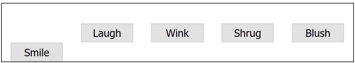
尝试将以下 CSS 添加到按钮栏示例代码中:
¥Try adding the following CSS to your button bar example code:
button:first-child {
  order: 1;
}
刷新后,你将看到 "微笑" 按钮已移动到主轴的末尾。让我们更详细地讨论一下它是如何工作的:
¥Refresh and you'll see that the "Smile" button has moved to the end of the main axis. Let's talk about how this works in a bit more detail:
- 默认情况下,所有弹性项目的
order值都是0。 - 具有较高指定订单值的 Flex 项目在显示顺序中将比具有较低订单值的项目晚出现。
- 具有相同订单值的 Flex 商品将显示在其源订单中。因此,如果你有四个项目的顺序值分别设置为
2、1、1和0,则它们的显示顺序将是第 4、第 2、第 3,然后是第 1。 - 第三项出现在第二项之后,因为它具有相同的顺序值并且在源顺序中位于第二项之后。
你可以设置负顺序值以使项目比值为 0 的项目更早出现。例如,你可以使用以下规则使 "脸红" 按钮显示在主轴的开头:
¥You can set negative order values to make items appear earlier than items whose value is 0. For example, you could make the "Blush" button appear at the start of the main axis using the following rule:
button:last-child {
  order: -1;
}
虽然你可以使用 order 更改顺序,但制表符顺序与代码顺序保持不变。更改可聚焦元素的顺序会对键盘用户的可用性产生负面影响!
¥While you can change the order using order, the tabbing order remains the same as the code order. Changing the order of focusable elements can negatively impact usability for your keyboard users!
嵌套弹性盒
¥Nested flex boxes
可以使用 Flexbox 创建一些相当复杂的布局。将一个弹性项目设置为一个弹性容器是完全可以的,这样它的子项也像弹性盒子一样布局。看看 complex-flexbox.html(也看到它直播)。
¥It's possible to create some pretty complex layouts with flexbox. It's perfectly OK to set a flex item to also be a flex container, so that its children are also laid out like flexible boxes. Have a look at complex-flexbox.html (see it live also).
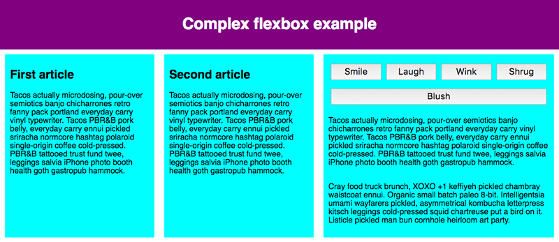
这个复杂的布局有几个弹性项目,它们也是弹性容器。此 HTML 相当简单。我们有一个包含三个 <article> 的 <section> 元素。第三个 <article> 包含三个 <div>,第一个 <div> 包含五个 <button>:
¥This complex layout has a few flex items that are also flex containers. The HTML for this is fairly straightforward. We've got a <section> element containing three <article>s. The third <article> contains three <div>s, and the first <div> contains five <button>s:
section - article
          article
          article - div - button
                    div   button
                    div   button
                          button
                          button
让我们看一下用于布局的代码。
¥Let's look at the code we've used for the layout.
首先,我们将 <section> 的子项设置为灵活的盒子。
¥First of all, we set the children of the <section> to be laid out as flexible boxes.
section {
  display: flex;
}
接下来,我们在 <article> 本身上设置一些弹性值。请特别注意这里的第二条规则:我们将第三个 <article> 设置为其子项也像弹性项目一样布局,但这次我们将它们像列一样布局。
¥Next, we set some flex values on the <article>s themselves. Take special note of the second rule here: we're setting the third <article> to have its children laid out like flex items too, but this time we're laying them out like a column.
article {
  flex: 1 200px;
}

article:nth-of-type(3) {
  flex: 3 200px;
  display: flex;
  flex-flow: column;
}
接下来,我们选择第一个 <div>。我们首先使用 flex: 1 100px; 有效地为其提供 100px 的最小高度,然后我们将其子元素(<button> 元素)也设置为像弹性项目一样布局。在这里,我们将它们放在一个环绕行中,并将它们对齐在可用空间的中心,就像我们之前看到的单个按钮示例一样。
¥Next, we select the first <div>. We first use flex: 1 100px; to effectively give it a minimum height of 100px, then we set its children (the <button> elements) to also be laid out like flex items. Here we lay them out in a wrapping row and align them in the center of the available space as we did with the individual button example we saw earlier.
article:nth-of-type(3) div:first-child {
  flex: 1 100px;
  display: flex;
  flex-flow: row wrap;
  align-items: center;
  justify-content: space-around;
}
最后,我们在按钮上设置一些大小。这次通过赋予其 flex 值 1 auto。这有一个非常有趣的效果,如果你尝试调整浏览器窗口宽度,你就会看到这种效果。这些按钮将占用尽可能多的空间。在一条线上,只要舒服,就可以容纳尽可能多的人;除此之外,它们将下降到新的一行。
¥Finally, we set some sizing on the button. This time by giving it a flex value of 1 auto. This has a very interesting effect, which you'll see if you try resizing your browser window width. The buttons will take up as much space as they can. As many will fit on a line as is comfortable; beyond that, they'll drop to a new line.
button {
  flex: 1 auto;
  margin: 5px;
  font-size: 18px;
  line-height: 1.5;
}
测试你的技能!
¥Test your skills!
你已读完本文,但你还记得最重要的信息吗?在继续之前,你可以找到一些进一步的测试来验证你是否已保留此信息 - 请参阅 测试你的技能:弹性盒。
¥You've reached the end of this article, but can you remember the most important information? You can find some further tests to verify that you've retained this information before you move on — see Test your skills: Flexbox.
概括
¥Summary
至此,我们对 flexbox 基础知识的了解就到此结束。我们希望你玩得开心,并在进一步学习的过程中玩得开心。接下来,我们将看看 CSS 布局的另一个重要方面:CSS 网格。
¥That concludes our tour of the basics of flexbox. We hope you had fun and will have a good play around with it as you proceed further with your learning. Next, we'll have a look at another important aspect of CSS layouts: CSS grids.
也可以看看
¥See also
- 弹性框的基本概念
- 在弹性容器中对齐项目
- 订购弹性项目
- 控制主轴上的弹性项目比率
- CSS 弹性框布局 模块
- 弹性框的 CSS 技巧指南 — 一篇以视觉吸引力的方式解释有关 flexbox 的所有内容的文章
- Flexbox 青蛙 — 一个教育游戏,用于学习和更好地理解 flexbox 的基础知识