<input type="tel">
tel 类型的 <input> 元素用于让用户输入和编辑调用号码。与 <input type="email"> 和 <input type="url"> 不同,在提交表单之前,输入值不会自动验证为特定格式,因为世界各地的调用号码格式差异很大。
¥<input> elements of type tel are used to let the user enter and edit a telephone number. Unlike <input type="email"> and <input type="url">, the input value is not automatically validated to a particular format before the form can be submitted, because formats for telephone numbers vary so much around the world.
Try it
尽管 tel 类型的输入在功能上与标准 text 输入相同,但它们确实具有有用的用途;其中最明显的是移动浏览器 - 尤其是手机上的浏览器 - 可能会选择提供一个针对输入调用号码而优化的自定义键盘。对调用号码使用特定的输入类型还可以使添加自定义验证和调用号码处理变得更加方便。
¥Despite the fact that inputs of type tel are functionally identical to standard text inputs, they do serve useful purposes; the most quickly apparent of these is that mobile browsers — especially on mobile phones — may opt to present a custom keypad optimized for entering phone numbers. Using a specific input type for telephone numbers also makes adding custom validation and handling of phone numbers more convenient.
注意:不支持
tel类型的浏览器会回退为标准 text 输入。¥Note: Browsers that don't support type
telfall back to being a standard text input.
值
附加属性
list
列表属性的值是位于同一文档中的 <datalist> 元素的 id。<datalist> 提供了一个预定义值列表来建议用户进行此输入。列表中与 type 不兼容的任何值都不包含在建议选项中。提供的值是建议,而不是要求:用户可以从此预定义列表中进行选择或提供不同的值。
¥The values of the list attribute is the id of a <datalist> element located in the same document. The <datalist> provides a list of predefined values to suggest to the user for this input. Any values in the list that are not compatible with the type are not included in the suggested options. The values provided are suggestions, not requirements: users can select from this predefined list or provide a different value.
maxlength
用户可以在调用号码字段中输入的最大字符串长度(以 UTF-16 代码单位测量)。这必须是 0 或更大的整数值。如果未指定 maxlength,或者指定了无效值,则调用号码字段没有最大长度。该值还必须大于或等于 minlength 的值。
¥The maximum string length (measured in UTF-16 code units) that the user can enter into the telephone number field. This must be an integer value of 0 or higher. If no maxlength is specified, or an invalid value is specified, the telephone number field has no maximum length. This value must also be greater than or equal to the value of minlength.
如果输入字段的文本长度大于 maxlength UTF-16 代码单元长度,则输入将失败 约束验证。仅当用户更改值时才应用约束验证。
¥The input will fail constraint validation if the length of the text entered into the field is greater than maxlength UTF-16 code units long. Constraint validation is only applied when the value is changed by the user.
minlength
用户可以在调用号码字段中输入的最小字符串长度(以 UTF-16 代码单位测量)。该值必须是小于或等于 maxlength 指定值的非负整数值。如果未指定 minlength,或者指定了无效值,则输入的调用号码没有最小长度。
¥The minimum string length (measured in UTF-16 code units) that the user can enter into the telephone number field. This must be a non-negative integer value smaller than or equal to the value specified by maxlength. If no minlength is specified, or an invalid value is specified, the telephone number input has no minimum length.
如果输入到该字段的文本长度小于 minlength UTF-16 代码单元长度,则调用号码字段将失败 约束验证。仅当用户更改值时才应用约束验证。
¥The telephone number field will fail constraint validation if the length of the text entered into the field is fewer than minlength UTF-16 code units long. Constraint validation is only applied when the value is changed by the user.
pattern
指定时,pattern 属性是一个正则表达式,输入的 value 必须与该正则表达式匹配才能传递 约束验证 的值。它必须是有效的 JavaScript 正则表达式,如 RegExp 类型所使用的,以及我们的 正则表达式指南 中记录的;编译正则表达式时指定 'u' 标志,以便将模式视为 Unicode 代码点序列,而不是 ASCII。模式文本周围不应指定正斜杠。
¥The pattern attribute, when specified, is a regular expression that the input's value must match for the value to pass constraint validation. It must be a valid JavaScript regular expression, as used by the RegExp type, and as documented in our guide on regular expressions; the 'u' flag is specified when compiling the regular expression so that the pattern is treated as a sequence of Unicode code points, instead of as ASCII. No forward slashes should be specified around the pattern text.
如果指定的模式未指定或无效,则不应用正则表达式,并且完全忽略该属性。
¥If the specified pattern is not specified or is invalid, no regular expression is applied and this attribute is ignored completely.
注意:使用
title属性指定大多数浏览器将显示为工具提示的文本,以解释匹配模式的要求。你还应该在附近添加其他解释性文字。¥Note: Use the
titleattribute to specify text that most browsers will display as a tooltip to explain what the requirements are to match the pattern. You should also include other explanatory text nearby.
有关详细信息和示例,请参阅下面的 模式验证。
¥See Pattern validation below for details and an example.
placeholder
placeholder 属性是一个字符串,向用户提供有关该字段中期望的信息类型的简短提示。它应该是一个单词或短语,展示预期的数据类型,而不是解释性消息。文本不得包含回车或换行。
¥The placeholder attribute is a string that provides a brief hint to the user as to what kind of information is expected in the field. It should be a word or short phrase that demonstrates the expected type of data, rather than an explanatory message. The text must not include carriage returns or line feeds.
如果控件的内容具有一个方向性(LTR 或 RTL),但需要以相反的方向性呈现占位符,则可以使用 Unicode 双向算法格式化字符来覆盖占位符内的方向性;请参阅 如何使用 Bidi 文本的 Unicode 控件 了解更多信息。
¥If the control's content has one directionality (LTR or RTL) but needs to present the placeholder in the opposite directionality, you can use Unicode bidirectional algorithm formatting characters to override directionality within the placeholder; see How to use Unicode controls for bidi text for more information.
注意:如果可以的话,请避免使用
placeholder属性。它在语义上不如解释表单的其他方法那么有用,并且可能会导致内容出现意外的技术问题。请参阅<input>标签 了解更多信息。¥Note: Avoid using the
placeholderattribute if you can. It is not as semantically useful as other ways to explain your form, and can cause unexpected technical issues with your content. See<input>labels for more information.
readonly
布尔属性,如果存在,则意味着用户无法编辑该字段。然而,它的 value 仍然可以通过 JavaScript 代码直接设置 HTMLInputElement value 属性来更改。
¥A Boolean attribute which, if present, means this field cannot be edited by the user. Its value can, however, still be changed by JavaScript code directly setting the HTMLInputElement value property.
注意:由于只读字段不能有值,因此
required对同时指定了readonly属性的输入没有任何影响。¥Note: Because a read-only field cannot have a value,
requireddoes not have any effect on inputs with thereadonlyattribute also specified.
size
size 属性是一个数值,指示输入字段应有多少个字符宽。该值必须是大于零的数字,默认值为 20。由于字符宽度各不相同,因此这可能准确,也可能不准确,因此不应依赖于此;结果输入可能比指定的字符数更窄或更宽,具体取决于字符和字体(使用的 font 设置)。
¥The size attribute is a numeric value indicating how many characters wide the input field should be. The value must be a number greater than zero, and the default value is 20. Since character widths vary, this may or may not be exact and should not be relied upon to be so; the resulting input may be narrower or wider than the specified number of characters, depending on the characters and the font (font settings in use).
这不会限制用户可以在该字段中输入的字符数。它仅指定一次大约可以看到多少个。要设置输入数据长度的上限,请使用 maxlength 属性。
¥This does not set a limit on how many characters the user can enter into the field. It only specifies approximately how many can be seen at a time. To set an upper limit on the length of the input data, use the maxlength attribute.
非标准属性
autocorrect
动作提示 {{deprecated\_inline}}
¥mozactionhint {{deprecated\_inline}}
一个 Mozilla 扩展,它提供有关如果用户在编辑字段时按 Enter 或 Return 键将采取何种操作的提示。
¥A Mozilla extension, which provides a hint as to what sort of action will be taken if the user presses the Enter or Return key while editing the field.
已弃用:请改用 enterkeyhint。
¥Deprecated: Use enterkeyhint instead.
使用调用输入
¥Using tel inputs
调用号码是网络上非常常见的收集数据类型。例如,在创建任何类型的注册或电子商务网站时,你可能需要向用户询问调用号码,无论是出于商业目的还是出于紧急联系目的。不幸的是,鉴于输入的调用号码非常普遍,用于验证调用号码的 "一种尺寸适合所有人" 解决方案并不实用。
¥Telephone numbers are a very commonly collected type of data on the web. When creating any kind of registration or e-commerce site, for example, you will likely need to ask the user for a telephone number, whether for business purposes or for emergency contact purposes. Given how commonly-entered phone numbers are, it's unfortunate that a "one size fits all" solution for validating phone numbers is not practical.
幸运的是,你可以考虑自己站点的要求并自行实现适当级别的验证。详情请参阅下文 验证。
¥Fortunately, you can consider the requirements of your own site and implement an appropriate level of validation yourself. See Validation, below, for details.
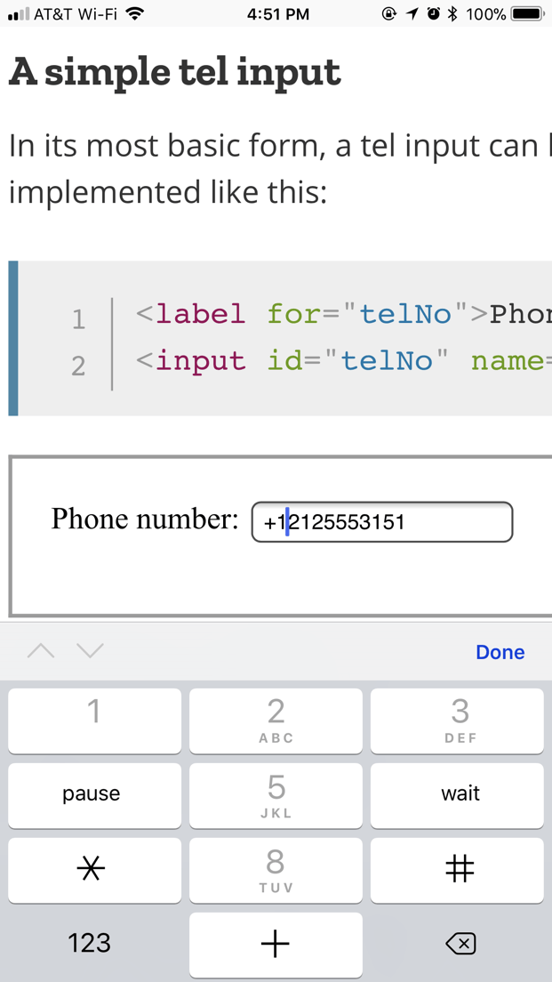
定制键盘
¥Custom keyboards
<input type="tel"> 的主要优点之一是它使移动浏览器显示用于输入调用号码的特殊键盘。例如,以下是一些设备上键盘的外观。
¥One of the main advantages of <input type="tel"> is that it causes mobile browsers to display a special keyboard for entering phone numbers. For example, here's what the keypads look like on a couple of devices.
| 安卓版火狐浏览器 | WebKit iOS (Safari/Chrome/Firefox) |
|---|---|
|
|
简单的调用输入
¥A simple tel input
在最基本的形式中,调用输入可以这样实现:
¥In its most basic form, a tel input can be implemented like this:
<label for="telNo">Phone number:</label>
<input id="telNo" name="telNo" type="tel" />
这里没有什么神奇的事情发生。当提交到服务器时,上述输入的数据将表示为例如 telNo=+12125553151。
¥There is nothing magical going on here. When submitted to the server, the above input's data would be represented as, for example, telNo=+12125553151.
占位符
¥Placeholders
有时,提供有关输入数据应采用什么形式的上下文提示会很有帮助。如果页面设计没有为每个 <input> 提供描述性标签,这一点尤其重要。这就是占位符发挥作用的地方。占位符是一个值,通过提供有效值的示例来演示 value 应采用的形式,当元素的 value 为 "" 时,该值将显示在编辑框中。一旦数据输入到框中,占位符就会消失;如果该框被清空,则占位符会重新出现。
¥Sometimes it's helpful to offer an in-context hint as to what form the input data should take. This can be especially important if the page design doesn't offer descriptive labels for each <input>. This is where placeholders come in. A placeholder is a value that demonstrates the form the value should take by presenting an example of a valid value, which is displayed inside the edit box when the element's value is "". Once data is entered into the box, the placeholder disappears; if the box is emptied, the placeholder reappears.
在这里,我们有一个带有占位符 123-4567-8901 的 tel 输入。请注意当你操作编辑字段的内容时占位符如何消失和重新出现。
¥Here, we have an tel input with the placeholder 123-4567-8901. Note how the placeholder disappears and reappears as you manipulate the contents of the edit field.
<input id="telNo" name="telNo" type="tel" placeholder="123-4567-8901" />
控制输入大小
¥Controlling the input size
你不仅可以控制输入框的物理长度,还可以控制输入文本本身允许的最小和最大长度。
¥You can control not only the physical length of the input box, but also the minimum and maximum lengths allowed for the input text itself.
物理输入元素大小
¥Physical input element size
输入框的物理尺寸可以使用 size 属性来控制。使用它,你可以指定输入框一次可以显示的字符数。例如,在此示例中,tel 编辑框的宽度为 20 个字符:
¥The physical size of the input box can be controlled using the size attribute. With it, you can specify the number of characters the input box can display at a time. In this example, for instance, the tel edit box is 20 characters wide:
<input id="telNo" name="telNo" type="tel" size="20" />
元素值长度
¥Element value length
size 与输入调用号码的长度限制无关。你可以使用 minlength 属性指定输入的调用号码的最小长度(以字符为单位);同样,使用 maxlength 设置输入调用号码的最大长度。
¥The size is separate from the length limitation on the entered telephone number. You can specify a minimum length, in characters, for the entered telephone number using the minlength attribute; similarly, use maxlength to set the maximum length of the entered telephone number.
下面的示例创建一个 20 字符宽的调用号码输入框,要求内容不少于 9 个字符且不超过 14 个字符。
¥The example below creates a 20-character wide telephone number entry box, requiring that the contents be no shorter than 9 characters and no longer than 14 characters.
<input
  id="telNo"
  name="telNo"
  type="tel"
  size="20"
  minlength="9"
  maxlength="14" />
注意:上述属性确实会影响 验证 — 如果值的长度小于 9 个字符或大于 14 个字符,则上述示例的输入将被视为无效。大多数浏览器甚至不允许你输入超过最大长度的值。
¥Note: The above attributes do affect Validation — the above example's inputs will count as invalid if the length of the value is less than 9 characters, or more than 14. Most browser won't even let you enter a value over the max length.
提供默认选项
¥Providing default options
使用 value 属性提供单个默认值
¥Providing a single default using the value attribute
与往常一样,你可以通过设置 value 属性来为 tel 输入框提供默认值:
¥As always, you can provide a default value for an tel input box by setting its value attribute:
<input id="telNo" name="telNo" type="tel" value="333-4444-4444" />
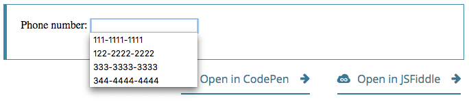
提供建议值
¥Offering suggested values
更进一步,你可以提供默认调用号码值列表,用户可以从中进行选择。为此,请使用 list 属性。这并不限制用户只能使用这些选项,而是允许他们更快地选择常用的调用号码。这也给 autocomplete 提供了提示。list 属性指定 <datalist> 元素的 ID,该元素又包含每个建议值一个 <option> 元素;每个 option 的 value 是调用号码输入框对应的建议值。
¥Taking it a step further, you can provide a list of default phone number values from which the user can select. To do this, use the list attribute. This doesn't limit the user to those options, but does allow them to select commonly-used telephone numbers more quickly. This also offers hints to autocomplete. The list attribute specifies the ID of a <datalist> element, which in turn contains one <option> element per suggested value; each option's value is the corresponding suggested value for the telephone number entry box.
<label for="telNo">Phone number: </label>
<input id="telNo" name="telNo" type="tel" list="defaultTels" />

<datalist id="defaultTels">
  <option value="111-1111-1111"></option>
  <option value="122-2222-2222"></option>
  <option value="333-3333-3333"></option>
  <option value="344-4444-4444"></option>
</datalist>
当 <datalist> 元素及其 <option> 就位后,浏览器将提供指定的值作为调用号码的潜在值;这通常显示为包含建议的弹出或下拉菜单。虽然特定的用户体验可能因浏览器而异,但通常单击编辑框会显示建议调用号码的下拉菜单。然后,当用户键入时,列表会调整为仅显示过滤后的匹配值。每个键入的字符都会缩小列表范围,直到用户做出选择或键入自定义值。
¥With the <datalist> element and its <option>s in place, the browser will offer the specified values as potential values for the phone number; this is typically presented as a popup or drop-down menu containing the suggestions. While the specific user experience may vary from one browser to another, typically clicking in the edit box presents a drop-down of the suggested phone numbers. Then, as the user types, the list is adjusted to show only filtered matching values. Each typed character narrows down the list until the user makes a selection or types a custom value.
下面是它的屏幕截图:
¥Here's a screenshot of what that might look like:
验证
¥Validation
正如我们之前提到的,为调用号码提供一种通用的客户端验证解决方案非常困难。所以,我们能做些什么?让我们考虑一些选择。
¥As we've touched on before, it's quite difficult to provide a one-size-fits-all client-side validation solution for phone numbers. So what can we do? Let's consider some options.
警告:HTML 表单验证不能替代服务器端脚本,服务器端脚本可确保输入的数据在允许进入数据库之前采用正确的格式。对于某人来说,对 HTML 进行调整以绕过验证或完全删除它太容易了。其他人也有可能完全绕过你的 HTML 并将数据直接提交到你的服务器。如果你的服务器端代码无法验证其接收到的数据,则当格式不正确的数据(或数据太大、类型错误等)输入数据库时,可能会发生灾难。
¥Warning: HTML form validation is not a substitute for server-side scripts that ensure the entered data is in the proper format before it is allowed into the database. It's far too easy for someone to make adjustments to the HTML that allow them to bypass the validation, or to remove it entirely. It's also possible for someone to bypass your HTML entirely and submit the data directly to your server. If your server-side code fails to validate the data it receives, disaster could strike when improperly-formatted data (or data which is too large, is of the wrong type, and so forth) is entered into your database.
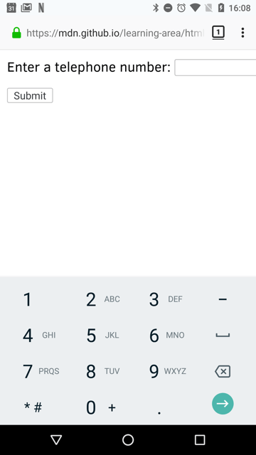
将调用号码设置为必填项
¥Making telephone numbers required
你可以使用 required 属性使空输入无效,并且不会将其提交到服务器。例如,让我们使用以下 HTML:
¥You can make it so that an empty input is invalid and won't be submitted to the server using the required attribute. For example, let's use this HTML:
<form>
  <div>
    <label for="telNo">Enter a telephone number (required): </label>
    <input id="telNo" name="telNo" type="tel" required />
    <span class="validity"></span>
  </div>
  <div>
    <button>Submit</button>
  </div>
</form>
让我们添加以下 CSS,以用复选标记高亮有效条目,并用叉号高亮无效条目:
¥And let's include the following CSS to highlight valid entries with a checkmark and invalid entries with a cross:
div {
  margin-bottom: 10px;
  position: relative;
}

input[type="number"] {
  width: 100px;
}

input + span {
  padding-right: 30px;
}

input:invalid + span::after {
  position: absolute;
  content: "✖";
  padding-left: 5px;
  color: #8b0000;
}

input:valid + span::after {
  position: absolute;
  content: "✓";
  padding-left: 5px;
  color: #009000;
}
输出如下所示:
¥The output looks like this:
模式验证
¥Pattern validation
如果你想进一步限制输入的数字,使它们也必须符合特定模式,你可以使用 pattern 属性,该属性将输入的值必须匹配的 regular expression 作为其值。
¥If you want to further restrict entered numbers so they also have to conform to a specific pattern, you can use the pattern attribute, which takes as its value a regular expression that entered values have to match.
在此示例中,我们将使用与之前相同的 CSS,但我们的 HTML 更改为如下所示:
¥In this example we'll use the same CSS as before, but our HTML is changed to look like this:
<form>
  <div>
    <label for="telNo">
      Enter a telephone number (in the form xxx-xxx-xxxx):
    </label>
    <input
      id="telNo"
      name="telNo"
      type="tel"
      required
      pattern="[0-9]{3}-[0-9]{3}-[0-9]{4}" />
    <span class="validity"></span>
  </div>
  <div>
    <button>Submit</button>
  </div>
</form>
div {
  margin-bottom: 10px;
  position: relative;
}

input[type="number"] {
  width: 100px;
}

input + span {
  padding-right: 30px;
}

input:invalid + span::after {
  position: absolute;
  content: "✖";
  padding-left: 5px;
  color: #8b0000;
}

input:valid + span::after {
  position: absolute;
  content: "✓";
  padding-left: 5px;
  color: #009000;
}
请注意,除非模式 xxx-xxx-xxxx 匹配,否则输入的值如何被报告为无效;例如,41-323-421 将不被接受。800-MDN-ROCKS 也不会。但是,865-555-6502 将被接受。这种特定的模式显然只对某些区域设置有用 - 在实际应用中,你可能必须根据用户的区域设置来改变所使用的模式。
¥Notice how the entered value is reported as invalid unless the pattern xxx-xxx-xxxx is matched; for instance, 41-323-421 won't be accepted. Neither will 800-MDN-ROCKS. However, 865-555-6502 will be accepted. This particular pattern is obviously only useful for certain locales — in a real application you'd probably have to vary the pattern used depending on the locale of the user.
示例
¥Examples
在此示例中,我们提供了一个简单的界面,其中包含 <select> 元素,让用户选择他们所在的国家/地区,以及一组 <input type="tel"> 元素,让用户输入调用号码的每个部分;你没有理由不能拥有多个 tel 输入。
¥In this example, we present a simple interface with a <select> element that lets the user choose which country they're in, and a set of <input type="tel"> elements to let them enter each part of their phone number; there is no reason why you can't have multiple tel inputs.
每个输入都有一个 placeholder 属性,用于向视力正常的用户显示要输入什么内容的提示,一个 pattern 属性,用于强制所需部分使用特定数量的字符,以及一个 aria-label 属性,用于包含向屏幕阅读器用户读出的提示 关于要输入什么内容。
¥Each input has a placeholder attribute to show a hint to sighted users about what to enter into it, a pattern to enforce a specific number of characters for the desired section, and an aria-label attribute to contain a hint to be read out to screen reader users about what to enter into it.
<form>
  <div>
    <label for="country">Choose your country:</label>
    <select id="country" name="country">
      <option>UK</option>
      <option selected>US</option>
      <option>Germany</option>
    </select>
  </div>
  <div>
    <p>Enter your telephone number:</p>
    <span class="areaDiv">
      <input
        id="areaNo"
        name="areaNo"
        type="tel"
        required
        placeholder="Area code"
        pattern="[0-9]{3}"
        aria-label="Area code" />
      <span class="validity"></span>
    </span>
    <span class="number1Div">
      <input
        id="number1"
        name="number1"
        type="tel"
        required
        placeholder="First part"
        pattern="[0-9]{3}"
        aria-label="First part of number" />
      <span class="validity"></span>
    </span>
    <span class="number2Div">
      <input
        id="number2"
        name="number2"
        type="tel"
        required
        placeholder="Second part"
        pattern="[0-9]{4}"
        aria-label="Second part of number" />
      <span class="validity"></span>
    </span>
  </div>
  <div>
    <button>Submit</button>
  </div>
</form>
JavaScript 相对简单 — 它包含一个 onchange 事件处理程序,当 <select> 值更改时,该处理程序会更新 <input> 元素的 pattern、placeholder 和 aria-label 以适应该国家/地区的调用号码格式。
¥The JavaScript is relatively simple — it contains an onchange event handler that, when the <select> value is changed, updates the <input> element's pattern, placeholder, and aria-label to suit the format of telephone numbers in that country/territory.
const selectElem = document.querySelector("select");
const inputElems = document.querySelectorAll("input");

selectElem.onchange = () => {
  for (let i = 0; i < inputElems.length; i++) {
    inputElems[i].value = "";
  }

  if (selectElem.value === "US") {
    inputElems[2].parentNode.style.display = "inline";

    inputElems[0].placeholder = "Area code";
    inputElems[0].pattern = "[0-9]{3}";

    inputElems[1].placeholder = "First part";
    inputElems[1].pattern = "[0-9]{3}";
    inputElems[1].setAttribute("aria-label", "First part of number");

    inputElems[2].placeholder = "Second part";
    inputElems[2].pattern = "[0-9]{4}";
    inputElems[2].setAttribute("aria-label", "Second part of number");
  } else if (selectElem.value === "UK") {
    inputElems[2].parentNode.style.display = "none";

    inputElems[0].placeholder = "Area code";
    inputElems[0].pattern = "[0-9]{3,6}";

    inputElems[1].placeholder = "Local number";
    inputElems[1].pattern = "[0-9]{4,8}";
    inputElems[1].setAttribute("aria-label", "Local number");
  } else if (selectElem.value === "Germany") {
    inputElems[2].parentNode.style.display = "inline";

    inputElems[0].placeholder = "Area code";
    inputElems[0].pattern = "[0-9]{3,5}";

    inputElems[1].placeholder = "First part";
    inputElems[1].pattern = "[0-9]{2,4}";
    inputElems[1].setAttribute("aria-label", "First part of number");

    inputElems[2].placeholder = "Second part";
    inputElems[2].pattern = "[0-9]{4}";
    inputElems[2].setAttribute("aria-label", "Second part of number");
  }
};
该示例如下所示:
¥The example looks like this:
这是一个有趣的想法,它展示了处理国际调用号码问题的潜在解决方案。当然,你必须扩展示例才能为可能的每个国家/地区提供正确的模式,这将需要大量工作,并且仍然无法万无一失地保证用户正确输入其号码。
¥This is an interesting idea, which goes to show a potential solution to the problem of dealing with international phone numbers. You would have to extend the example of course to provide the correct pattern for potentially every country, which would be a lot of work, and there would still be no foolproof guarantee that the users would enter their numbers correctly.
这让你想知道是否值得在客户端解决所有这些麻烦,因为你可以让用户在客户端以他们想要的任何格式输入他们的号码,然后在服务器上验证和清理它。但这个选择是你自己做出的。
¥It makes you wonder if it is worth going to all this trouble on the client-side, when you could just let the user enter their number in whatever format they wanted on the client-side and then validate and sanitize it on the server. But this choice is yours to make.
div {
  margin-bottom: 10px;
  position: relative;
}

input[type="number"] {
  width: 100px;
}

input + span {
  padding-right: 30px;
}

input:invalid + span::after {
  position: absolute;
  content: "✖";
  padding-left: 5px;
  color: #8b0000;
}

input:valid + span::after {
  position: absolute;
  content: "✓";
  padding-left: 5px;
  color: #009000;
}
技术摘要
¥Technical Summary
| 值 | 代表调用号码的字符串,或者为空 | |
| 活动 | change 和 input |
|
| 支持的通用属性 |
autocomplete、
list、
maxlength、
minlength、
pattern、
placeholder、
readonly 和
size
|
|
| IDL 属性 |
list、 selectionStart、
selectionEnd、 selectionDirection 和
value
|
|
| DOM 接口 | ||
| 方法 | select(), setRangeText(), setSelectionRange() |
|
| 隐式 ARIA 角色 |
没有 list 属性:
textbox
|
具有 list 属性: combobox |
规范
| Specification |
|---|
| HTML Standard # telephone-state-(type=tel) |
浏览器兼容性
BCD tables only load in the browser