测试你的技能:响应式网页设计和媒体查询
该技能测试的目的是评估你是否理解 如何使用媒体查询 并让你通过实际任务进行响应式网页设计。CSS 布局模块 中的布局课程涵盖了完成此任务所需了解的所有内容。
¥The aim of this skill test is to assess whether you understand how to use media queries and get you working with responsive web design with a practical task. Everything you need to know to complete this task is covered in the layout lessons in the CSS layout module.
注意:由于你需要在多种屏幕尺寸下测试你的设计,因此我们在此页面上没有交互式编辑器。下载代码并在本地工作,或使用在线编辑器,例如 CodePen、JSFiddle 或 Glitch。
¥Note: Because you need to test your design in multiple screen sizes, we do not have interactive editors on this page. Download the code and work locally, or use an online editor such as CodePen, JSFiddle, or Glitch.
如果你遇到困难,可以通过我们的 沟通渠道 之一与我们联系。
¥If you get stuck, you can reach out to us in one of our communication channels.
任务
¥Task
下载此任务的起点。在浏览器中打开下载的 HTML 文件,你将发现一个线框站点,该站点将以可读的方式加载到移动设备中。你可以将窗口拖动得更小,或者使用 Firefox DevTools 中的响应式设计视图 来查看此内容,就像在手机上一样。
¥Download the starting point for this task. Open the downloaded HTML file in your browser and you will find a wireframed site which will load in a mobile device in a readable manner. You can drag your window smaller or use the responsive design view in Firefox DevTools to view this as if on a phone.
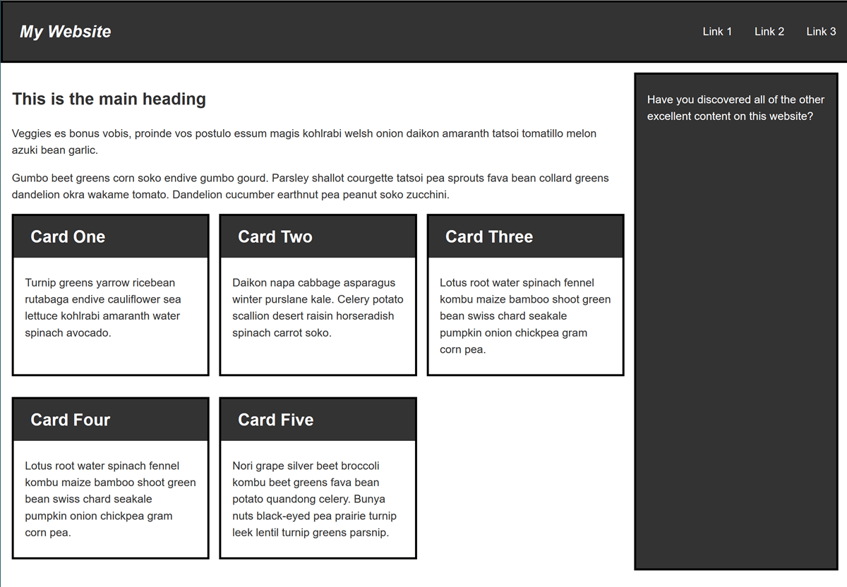
你的任务是创建此布局的桌面版本,该版本会在有足够的屏幕宽度来容纳它时显示。你的最终结果应如下图所示:
¥Your task is to create a desktop version of this layout which displays when there is enough screen width to accommodate it. Your final result should look like the image below:

你可以通过多种方式创建桌面布局,尽情尝试吧。你还可以添加第二个断点,也许可以创建一个在平板电脑上的纵向模式下运行良好的布局。
¥There are a number of ways that you could create the desktop layout, enjoy experimenting. You could also add a second breakpoint perhaps creating a layout that would work well on a tablet in portrait mode.